By at least 1916 1 , Lanston Monotype was publishing its specimen books in loose-leaf format. Because of the flexibility of this format, there is no such thing as a "standard" Lanston specimen book for most of the 20th century. Each individual copy potentially differs from all others.
Through at least 1922 2 , Lanston did not name its typefaces. They were identified only by their series number. At a point no later than 1935 (but probably much earlier), these typefaces were given names. This Notebook is a composite of all of the specimen pages and sections I can find, compiled as if they constituted a single specimen book, from Lanston Monotype loose-leaf specimen books with named typefaces.
For earlier Lanston Monotype specimen books where the faces were only numbered (and for other Lanston specimen material), see the Notebook of "Other Lanston Monotype Specimens".
This "composite specimen" covers Lanston Monotype Machine Company typefaces insofar as they were offered in composition ("cellular") matrices at least in part. In other words, if the type was offered in composition mats, or both composition and display mats, it's here. If it was offered only display, it is not. For Lanston display matrix/type information, see ../../../ Noncomposing Typecasters -> Foundry Specimens & Typography -> Lanston Monotype Machine Company.
This Notebook covers only the American firm, the Lanston Monotype Machine Company (and its successors). For a bibliography of specimen books for the English firm, known best as The Monotype Corporation Limited, go "up and over" one level to the Notebook of "Matrix Data, Specimens, & Typography (UK): The Monotype Corporation Limited.
See also the List of All Type Specimen and Matrix Information on CircuitousRoot for non-Lanston-Monotype material.
[Note: This Notebook is obviously unfinished. It's a big book and I'm taking it slowly.]
Each thumbnail image here links to a reduced-resolution version of the document. These are not too unreasonable in size (a few Megabytes each) and for most purposes should be perfectly usable. (They're PDFs composed, effectively, of 300 DPI JPG (= lossy) images.) If you want the full-resolution version (a PDF composed of 600 DPI PNG (= lossless) images), click on the link to that version provided. These full-resolution versions are, however, quite large (typically 10 times the file size of the reduced-resolution versions; some exceed 200 Megabytes).
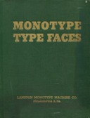
Monotype Type Faces (cover only)
For those of you whose lives would not be complete without a 64 Megabyte scan of a green binder cover.
I believe that this particular copy dates from at least 1943 (the date of the introduction of numeric postal zones for some cities), but it contains some material dated as early as 1935.
In CircuitousRoot bibliographies, I'll refer to the composite specimen presented in this present Notebook as {MTF1}.
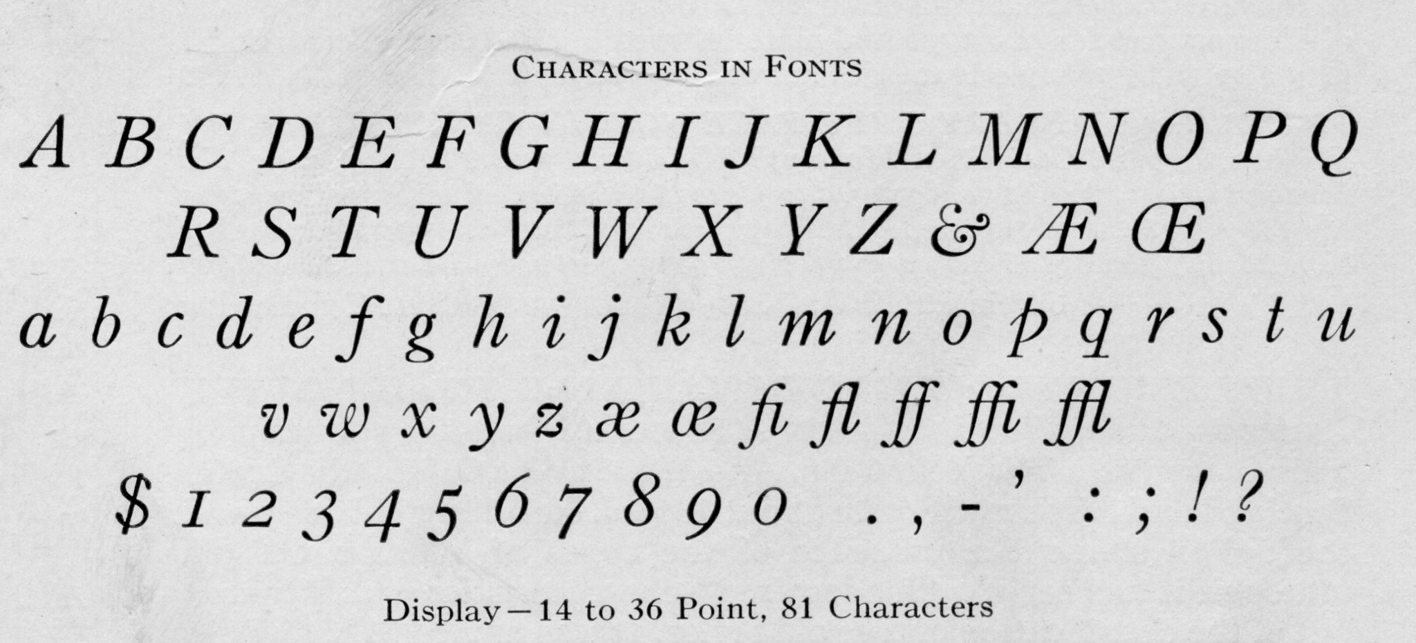
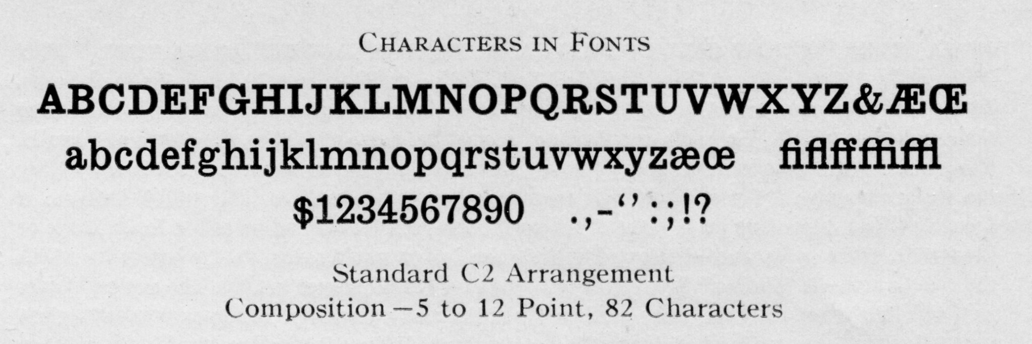
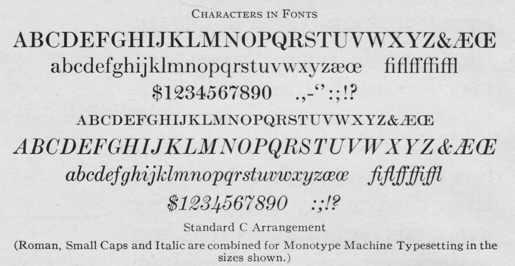
Arranged by Series number, sorted in character order. Thus, No. 2111 comes between No. 21 and No. 26.
Each entry for which a specimen exists is illustrated with a PDF version of the specimen (with both a reasonable resolution version and a full resolution version) and an image of a snippet showing at least one cutting of the face (often the face as cut for cellular differed from the face as cut for display or Giant). You can download any of these to your own computer. Please do, as this reduces network traffic.
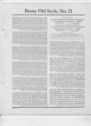
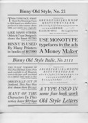
No. 21, Binny Old Style
[click image to view larger]

Adapted in 1908 from See MacKellar, Smiths and Jordan's Old Style No. 77 (ca. 1886), itself based on "a face cut in Scotland about 1863 as a modernization of Caslon." Named for Archibald Binny, co-founder of Binny & Ronaldson, predecessor of MS&J. The related italic is No. 2111, Binny Old Style Italic (not No. 211, which is DeVinne in 5 1/2 point). {MTF1} {McGrew 36-37}
See also No. 321, Binny Old Style Modified and Binny Old Style Modified Italic, for Curtis Publishing Company. See also No. 221 ("Overgrown No. 80" and "Overgrown No. 80 Italic") for Ladies' Home Journal. {McGrew 36-37}
"... one of the best faces available for everyday 'bread and butter' use in sizes 14-point and below; in larger sizes it is most unsatisfactory." Douglas C. McMurtrie, cited in {McGrew 37}
Click here for the full-resolution version (37 Megabytes).
No. 2111, Binny Old Style Italic
[click image to view larger]
See the related roman, No. 21, Binny Old Style {MTF1} (the specimen here is a copy of the specimen for No. 21). {MTF1}
Click here for the full-resolution version (37 Megabytes, same specimen as No. 21 {MTF1}).

No. 26, Modern Antique
[click image to view larger]
The name is pure postmodern poetry. An Egyptian face adapted by Lanston Monotype in 1909 {McGrew 218-219}. No corresponding italic. Shown in {MTF1} in 5, 6, 7, 8, 9, 10, and 12 point, 82 characters, for composition; no display.
McGrew gives Mergenthaler Linotype Antique No. 4 as an equivalent, and compares it to Ionic No. 4. See also Lanston No. 76, Modern Antique Condensed, which was introduced simultaneously.
The specimen in {MTF1} contains the following rather nicely made typographic distinction: "['Antique' faces generally] are distinguished by their monotone weight ... there are innumerable forms of antique letters, the serifs playing an important part in classifying the various members ... this [present] form is unbracketed and is usually called Antique; if bracketed, and depending on the size of the serif curve, the face would be called Ionic, Doric or Clarendon. If the serifs were eliminated entirely the design would resemble the letters for which the popular name is 'Gothic.'"
Click here for the full-resolution version (20 Megabytes).
Note: The verso of this specimen contains No. 76, Modern Antique Condensed {MTF1} (scanned separately).
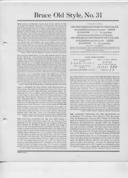
No. 31, Bruce Old Style
[click image to view larger]

This has the dual distinction of being the first Sol Hess design for Lanston Monotype (1902) and, in the version redesigned by him in 1909 the first kerning italic for the Monotype. Hess adapted it from "Bruce Old Style, Series No. 20" of the George Bruce's Son & Company typefoundry (by 1869). {McGrew 52-53} {MTF1}
The Roman, Roman Small Caps, and Italic all bear the same series number (No. 31). They were supplied with alternate characters with long descenders, for which see the full PDF of the specimen.
The Specimen here calls the face "Bruce Old Style," but the various typeface and matrix information sections of the {MTF1} specimen book call it by the original Bruce foundry identification for this face, "Bruce Old Style, No. 20" (while still, of course, giving (Lanston Monotype) No. 31 as its series number).
McGrew cites this as "31EFG", using the matrix identifying suffixes to indicate Old Style Roman ('E'), Old Style Roman Small Caps ('F'), and Old Style Italic ('G').
McGrew compares to Linotype Old Style No. 3 and Italic.
Click here for the full-resolution version (38 Megabytes).

No. 311, Russian Adaptation of No. 11 Series
No. 311 is not the italic of No. 31, but rather is the Russian Adaptation of No. 11 Series, see below. {McGrew 364} and Alphabetical List of Type Faces [in {MTF1}]. The italic of No. 31 is a part of No. 31.
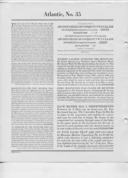
No. 35, Atlantic
[click image to view larger]
Cut by Monotype in 1909 for The Atlantic Monthly. (Sometimes known (by Monotype? informally?) as "Atlantic Monthly", sometimes called "Modern" by Monotype.) "... recut and new sizes added in 1936." [presumably without change in series number] {McGrew 18-19} {MTF1}
The Roman, Roman Small Caps, and Italic all bear the same series number (No. 35).
McGrew compares to Lanston Monotype Scotch Roman, No. 36 (1908).
Click here for the full-resolution version (19 Megabytes).
Note: The recto of this specimen contains No. 334, Artcraft {MTF1} (scanned separately).
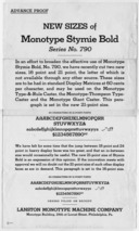
No. 790, Stymie Bold, 16 & 21 Point
This is an "Advance Proof" (but really just an adverting sheet) for new cuttings of Series No. 790, Stymie Bold, in 16 point and 21 point. Cut only for display. (It is not a part of {MTF1}; I obtained it as a separate sheet.)
Since this is a specimen of type from display matrices only, the icon here links "up and over" to its actual presentation in the Lanston Monotype section of the "Foundry Specimens & Typography" Notebooks
Sometimes Lanston grouped related specimens together into small "booklets" (with their own pagination) within the overall specimen book. In some cases, these included additional information (e.g., matrix identification for Greek).
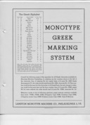
Monotype Greek Marking System
"Monotype Greek Marking System." 16pp. This includes the numbering scheme for Greek matrices and abbreviated specimens for: Porson Greek (Series No. 155), Title Greek (Series No. 160), Vertical Greek (Series No. 83), and Inscription Greek (Series No. 183). It also includes a section on "Greek Display Faces," with one-line showings of Greek sorts which might be added to Roman matrix fonts to allow Greek display (14-36 point) type to be cast.
93 Megabyte PDF.
Rule (but not generally decorative border material) and type cast for the hand setting of boxes, ruled forms, and similar material. See also Ruled Form System for Machine Composition (the next section).
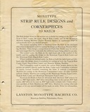
Strip Rule and Cornerpieces
"Monotype Strip Rule Designs and Cornerpieces to Match." (Philadelphia, PA: Lanston Monotype Machine Company, n.d.) This is a specimen of non-ornamental rule and corresponding corner-pieces with matrices to be used in the Type-&-Rule Caster, the Material Making Machine / Junior Material Making Machine, or both. Since it refers to the Junior Material Making Machine, it must date from no earlier than the introduction of that machine in 1931. As this is the case, it is curious that this specimen makes no mention of the Giant Caster (introduced 1925). The non-Material-Making-Machine matrices in this specimen include both display matrices and composition (cellular) matrices (although the latter are not used for machine composition in it).
The icon here links "up and over" to the presentation of this document in the Lanston Monotype Material Making Machine Notebooks.
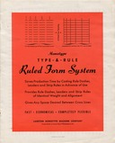
Type-&-Rule Ruled Form System
"Monotype Type-&-Rule Ruled Form System." (Philadelpha, PA: Lanston Monotype Machine Company, n.d. [but 1943 or later, as it uses a city zone code]). Rule Dashes, Leaders, and Strip Rule cast on the Type-&-Rule Caster for ruleform composition by hand.
Since this is a specimen of type from display and stripcasting matrices only, the icon here links "up and over" to its actual presentation in the Lanston Monotype section of the "Foundry Specimens & Typography" Notebooks
Ruleform composition by machine. See also Rule and Related Type for Hand Setting (the previous section).
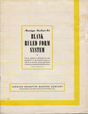
Machine-Set Blank Ruled Form System
"Monotype Machine-Set Blank Ruled Form System." (Philadelphia, PA: Lanston Monotype Machine Co., n.d.) Eight page brochure. Undated, but 1943 or later as it uses a city zone code in its address.
"Perfected by Wade H. Patton."
Thanks are due to Sky Shipley of Skyline Type Foundry for preserving this document and making it available.
The icon links to a presentation of this document on The Internet Archive, where it may be read online. Here is a local copy of the PDF (68 Megabytes) as presented in the Other Lanston Monotype Specimens: ../other-specimens/monotype-machine-set-blank-ruled-form-system-brochure-stf-0600rgbjpg.pdf
New Blank Ruled Form System (Suggestions)
"New Monotype Blank Ruled Form System: Suggestions to Monotype Keyboard and Caster Operators." (Philadelphia, PA: Lanston Monotype Machine Co., n.d.) A two-page sheet of hints and tips. Undated, but probably prior to 1943 (no use of city zone code in the address).
The icon here links "up and over" to the presentation of this document in the Other Lanston Monotype Specimens Notebooks.
Thanks are due to Sky Shipley of Skyline Type Foundry for preserving this document and making it available.
Typically the italic variation on a series is indicated in the series number with an appended '1'. To help keep things together, I've collated the series numbers here as if the roman variations had an appended '0'. Thus No. 353 (Baskerville (roman)) is treated as if it were No. 3530, and is followed by No. 3531 (Baskerville Italic); this, in turn, comes before (say) No. 358 (Pendrawn).
Note 1: Sometimes the italic adds '11', as in No. 21 (Binny Old Style) and No. 2111 (Binny Old Style Italic.) (No. 211 is DeVinne for 5 1/2 point body.) When this happens I'll collate them as if the roman variations had an appended '00'. Thus No. 2111 (Binny Old Style Italic) goes after No. 21 (Binny Old Style), not after No. 210 (De Vinne Extra Condensed No. 2).
Note 2: Sometimes series ending in '1' are simply their own series (not the italic of another series). However, there are often numerological relationships to related series. Thus No. 321 is Binny Old Style Modified (prepending a '3' to No. 21, Binny Old Style).
Note 3: Sometimes the italic of a series bears a number apparently unrelated to its roman, although deeper relationships may lie hidden. Example: No. 790, Stymie Bold, has No. 1891, Stymie Bold Italic. History sometimes helps here. Stymie Bold (ATF) was M. F. Benton's re-drawing of Rockwell Antique (ATF), itself a reissue of Litho Antique (Inland). Lanston Monotype copied ATF's Rockwell Antique but "erroneously" {McGrew} called it Stymie Bold "in some literature." Lanston Monotype Rockwell Antique is No. 189. Lanston also issued a full series of Stymie, so named. Their Stymie Bold is No. 790. But Stymie Bold Italic is No. 1891.
Note 4: Sometimes the italic and roman both bear the same series number. E.g. Recut Bodoni Bold and Recut Bodoni Bold Italic, both of which are No. 975.
Note 5: Sometimes numbers were recycled. Thus series No. 56 is both Lining Gothic (No. 525) and Ionic. {McGrew} indicates these in his list of series numbers as one number with the two faces separated by a slash. In my spreadsheets I have separate lines for each.
This recycling gets especially interesting when it interacts with the nonstandard use of a suffixed '1'. So No. 321 was its own face (Binny Old Style Modified and Binny Old Style Modified Italic, available only in 5 1/2 point for the Curtis Publishing Company) rather than the italic of some No. 32. Then a No. 32 was introduced (in 1956), Tallone Max Factor. Its italic was numbered 321, taking over the old Binny Old Style Modified and Italic position. This isn't so difficult as history, but it complicates the making of tables (as "321" must now appear both after 32 and as a literal 321).
Note 6: Even though some series have the same number for roman and italic, it is at times useful to distinguish them (and duplicate the series number in lists, for example) because the roman and italic were cut for different machines. So for instance No. 186 Cheltenham Medium was cut in roman for cellular, display, and giant but was cut in italic only for cellular.
To take a more complex example, No. 95 is Cloister Black (cut for cellular and display). No. 95M is the German Adapatation of Cloister Black (signified by the 'M' suffix), cut for cellular only. No. 495 (no suffix) is also a German Adaptation of Cloister Black, cut for display only.
Note 7: And things get interesting when the base face is something much like an italic. Thus Inclined Gothic is No. 254 in cellular sizes (listed as No. 254K, where the 'K' suffix indicates "Boldface Italic"; the face is bold, but is not really an italic) and No. 2541 in display sizes. Some Lanston Monotype literature, though, lists it only as No. 2541.
In a stranger example, No. 89 is Clearface, the Lanston copy of the regular-weight ATF No. 91 Clearface (Benton & Benton, 1905). There are two italics for this: the expected No. 891, Clearface Italic (cut in cellular and display) and the unexpected No. 289, Clearface Italic (cut in cellular only; listed in Alphabetical List of Monotype Type Faces, but not given a specimen in {MTF1}). Handy Index of 'Monotype' Rental Matrices gives No. 2891 as "Clearface Italic (Light)", which would be a variation in weight on No. 289, not an italic version (289 is already an italic). Neither {MTF1} nor {McGrew} list No. 2891.
Note 8: Then sometimes it just seems as if the system breaks down. For example, Copperplate Gothic Bold is No. 345, which would suggest that Copperplate Gothic Bold Italic ought to be No. 3451. But instead it is No. 3461.
Sometimes the system seems just to be getting underway. For example, series No. 1 is Modern Condensed. But the italic for this is No. 411, Modern Condensed Italic (the number for which can't come from No. 4 (Cosmopolitan) suffixed by 11).
Note 9: Cellular matrices were marked not only with the series number but with a suffix indicating the classification of the face (see p. 7 of Matrix Information (ca. 1935-1940s), above, for a list). Thus matrices of the series No. 31, Bruce Old Style (which was available only in cellular sizes) would be marked "31E" (for the Old Style Roman), "31F" (for the Old Style Roman small caps), or "31G" (for the Old Style italic). Display and Giant matrices did not bear these suffixes. I have omitted them entirely here since they involve matrices rather than typeface series. (I really could dispense with this present note entirely, save that McGrew sometimes, and without explanation, uses them; thus McGrew lists Bruce Old Style as "31EFG".)
Note 10: Notwithstanding the above, the two cellular matrix suffixes 'M' (foreign faces) and 'S' (swash characters) usually (but not always) were used with both cellular and display faces in lists of faces (such as Alphabetical List of Monotype Faces {MTF1}). The presence of these suffixes does not present any confusion in the sorting order of these lists.
(However, at times very closely related series will bear very different numbers. Thus the German Adaptation of Washington Text in cellular is No. 102M, but in display is No. 4102.)
Note 11: I still don't understand the 'o' in No. 361So, Scotch Open Shaded Italic. The 'S' is the symbol for swash, and these are swash initials, but the coding of the 'o' escapes me.
(If there weren't confusing exeptions, it wouldn't be any fun at all.)
1. The Monotype Specimen Book of Type Faces from 1916 was published in loose-leaf format. (I have not examined a physical copy, and you cannot tell this from the page images as scanned by Google, but it is clear from references in the text to insertable/inserted pages that this is so.)
2. The Monotype Specimen Book of Type Faces from 1922 still does not name its typefaces. By the issue of the "Monotype Library Faces" list dated August 15, 1935, reproduced above, typefaces were named.
The Monotype Type Faces specimen book identified here as "MTF1", and each element of its contents individually, was (were) published in the US without copyright notice at a time when such notice was required to secure copyright. It (they) therefore passed into the public domain upon initial publication. Their digital reprints here remain in the public domain.
The Lanston Monotype publication(s) "Broad-Stroke" was (were) published in the US without copyright notice at a time when such notice was required to secure copyright. It (they) therefore passed into the public domain upon initial publication. Their digital reprints here remain in the public domain.
All portions of this document not noted otherwise are Copyright © 2010, 2017 by David M. MacMillan.
Circuitous Root is a Registered Trademark of David M. MacMillan and Rollande Krandall.
This work is licensed under the Creative Commons "Attribution - ShareAlike" license, version 4.0 International. See http://creativecommons.org/licenses/by-sa/4.0/ for its terms.
Presented originally by Circuitous Root®