Nicholas J. Werner was a printer who became deeply involved in typefounding. He originated and promoted the modern conception of the lining of type as a systematic undertaking throughout the foundry. He was present at the Central Type Foundry when the first pantographic making of matrices in America occurred. Later he joined in partnership with Gustave F. Schroeder (who made the working patterns for the pantographic engraving of those matrices) and set up the first independent pantographic matrix engraving company in the world. Most importantly, toward the end of his long life, he wrote about this.
Werner's own writings both best convey his accomplishments and provide us with a view of the tremendous changes in type-making which began in the 1880s. Yet it is easy to lose track of the most important articles in the overall volume of his work. Here are lists of his more significant articles:
1. Of importance to pantographc matrix, patrix, and punch making:
2. Of importance to the development of lining as a system:
In several important areas of type-making, our knowledge of events (or of alleged events) comes down to either the word of Nicholas J. Werner or the word of Henry Lewis Bullen. Often they contradict each other. Who do you trust?
Throughout the 20th century, and continuing today, Bullen has had the upper hand. He basically wrote the history of type-making in the late 19th century, and from the 1920s on most other histories simply copied him (often verbatim). Yet time and again I find that whenever I can verify something Bullen said against another source, Bullen is incorrect. Moreover, his errors are egregious. He twisted the past (his evaluation of Mergenthaler is libelous and without merit), and he got technical details wrong (his account of the ejector pin in the pivotal caster has misled generations). Worst, he simply made stuff up - fabricating sometimes elaborate stories of events which cannot have occurred. The central example of this is his story of how P. T. Dodge of the Mergenthaler company convinced Linn Boyd Benton to attempt to cut punches in steel on his patrix-engraving pantograph. Bullen tells a story, he recounts questions asked and answers given, he mentions specific sums of money put up ... yet the event never happened. In 1884, two years before the Linotype entered commercial service and four years before anyone involved with it was aware of Benton's machine, Benton was advertising the ability to cut punches in steel.
Werner, by way of contrast, has been ignored. What he reported - especially the matter of priority in pantographic engraving - undermined the mythology created by Bullen and ATF. Moreover, it is clear from annotations by Bullen to his copy of Werner's 1931 Address in St. Louis that Bullen didn't like Werner. (This is reported in {Mullen 2005}, p. 174 (Note 16 to Chapter 3.))
Werner does make mistakes, and he does sometimes contradict himself. But his errors are those of an old man writing sometimes 50 years after the events. They are mistakes of on the order of getting a date slightly wrong (e.g., 1882 vs. 1880) or clear transpositions ("Inland Type Foundry" when he clearly meant "Central.") The transpositions are easy to correct. The small errors in the dates sometimes give us a fuzzy range when we would prefer a precise date. But these are small things. In no case where I have been able to cross-check Werner against other sources is there any evidence that he made anything up. In particular, we have confirmation in the word of Gustave F. Schroeder that they really were engraving matrices by pantograph at the Central Type Foundry in the early years of the 1880s.
Finally, Werner speaks from his own experience. Bullen always speaks secondhand. When Werner speaks of pantograph engraving in the 1880s, he speaks from the point of view of an owner and operator of the machines. Both Bullen and Werner started out as printers, but Werner went on to become a (machine) engraver of matrices. When you hold in your hand a font of DeVinne, the matrices of which he cut, you hold tangible evidence that Werner knew what he was talking about.
In short, Bullen's fabrications have compelled me to disallow him as a source for anything. If Bullen's story cannot be corroborated by an independent account, it cannot be accepted into the historical record. Werner, on the other hand, told the truth.
(For more on this, see the CircuitousRoot Notebook on my Issues with Bullen. )
Werner occupies a significant place in the history of American machine-based type making both because participated in the beginnings of matrix engraving and because he later wrote about it. He and his business partner Schroeder may have been the first independent commercial matrix engravers in the country; they were certainly the first to do so and to produce a lasting body of work.
Werner was born 1858-03-14 in Belleville, IL. Loy (1899) has an interesting account of his introduction to typefounding and matrix making. Loy says that he began as a printer and, after various jobs, became a compositor in the specimen department of the Central Type Foundry in St. Louis. Loy says that:
"Finding that there was not enough work in the printing line to occupy him constantly, he between times learned the process of dressing and finishing type, at which occupation he spent a considerable portion of his time. Later he had the keeping of matrix and manufacturing records, and his opinions and judgment on new faces and the fitting of them began to be called for, and to a large extent were respected by his superiors. In this way he became more intimately associated with the business of type designing and engraving, as well as with the engravers employed in the house, especially with Gustav Schroeder, with whom he later on was associated with under the title of Schroeder & Werner, both severing their direct connection with the [Central Type] foundry."
The activity at the Central Type Foundry in this period is particularly interesting (in my opinion Loy is too dismissive of it). In 1882, Central acquired a pantograph matrix engraving machine that had been made in Germany and imported in 1880 by the Cincinnati Type Foundry. With this machine, William A. Schraubstädter Gustav F. Schroder cut the working patterns for this (though it is not yet clear whether he did so by hand or by pantograph). Werner seems to have been just an observer for at least the first three faces cut ( Geometric, Geometric Italic, and Morning Glory), but when later the first typewriter-based face, Central's Type Writer was made in the same way Werner notes with pride that he was the first to compose with it and pull a proof of it. (For this history, see primarily Werner's "St. Louis' Place on the Type-Founders' Map" and slightly later "Address".) This was the first production in the US of matrices using pantographic engraving techniques; the first record of Benton's patrix and punch engraving pantograph dates from July 1884. It was also direct matrix engraving about 18 years before Benton revised his pantographs for such work. [1]
Werner and Schroeder left Central in either 1888 (according to "St. Louis' Place ...") or 1889 (according to Loy) and went into partnership as independent commercial matrix engravers ( Schroeder & Werner). Schroeder purchased the Central Type Foundry pantograph and also designed and had made a new machine (which I'm calling, for lack of a real name, the Schroeder-Boyer Pantograph. [2]) In this partnership they cut matrices under contract to various type foundries, including Schroeder's DeVinne for Central (which they started; Werner later finished it on his own). This partnership, though brief, is significant because it was one of the first commercial matrix engraving firms [3]
In 1891, Schroeder decided to move to California (to Mill Valley in the San Francisco bay area). Werner wished to remain in St. Louis (in his later writings he was a great partisan of that city). Schroeder would have been about 30 at that time, and Werner 33. Both continued to work as independent matrix engravers. I presume that the dissolution of this partnership was amicable, as Werner later spoke very highly of Schroeder.
As I write this, I still do not know the answer to the obvious question: who got the pantographs? Schroeder had been trained in hand engraving, so in principle he could have continued working by hand in California. Yet Werner says that he was the owner of the Central pantograph and the designer of the Schroeder-Boyer machine. It would seem odd for him not to retain them. Werner, on the other hand, had no training in hand engraving and must certainly have been using a pantograph in his continued work (which included finishing DeVinne, presumably from working patterns already made).
Around 1889, he says in his "Address", he "functioned, by way of avocation, as editor of Mr. John E. Mangan's Artist Printer."
At some point after the 1895 founding of the Inland Type Foundry by Carl Schraubstädter's sons, Werner joined it and cut several faces. [4] While he was at Inland, they sold a pantograph of their design to the German typefoundry Genzsch & Heyse. Werner instructed (in St. Louis) "one of the proprietors [of G&H], and later their head of machinery construction" (see "An Address").
At Inland, he also instructed Sarah Osborne in pantographic matrix engraving (again, see "An Address").
Inland continued until its purchase in 1912 by ATF, but by at least 1906 Werner was associated with Charles H. Schokmiller (who later founded the Western Type Foundry and the Laclede Type Foundry). In that year he traveled to England to install a Schokmiller pantograph at Stephenson, Blake in Sheffield.
His matrix engraving activities after this are unknown to me, but he continued to write for the trade press, contributing a delightfully curmudgeonly perspective (e.g., "as if the present-day artists amounted to a hill of beans" in "An Address"), some very bad poetry, and a body of information about matrix making and typefounding in the 1880s and 1890s without which our understanding of this great transitional period would be very much impoverished.
Loy, William E., Alastair M. Johnston and Stephen O. Saxe, eds. Nineteenth-Century American Designers and Engravers of Type. New Castle, DE: Oak Knoll Books, 2009.
The Saxe/Johnston volume is a reprint, with substantial editorial matter and a comprehensive set of typographical showings, of a series of articles by Loy which appeared in The Inland Printer from 1898 to 1900. I've reprinted the original article by Loy, but, really, you need the Saxe/Johnston edition.
Werner wrote quite a bit, and not everything is of interest to the student of type making. Still, here's a chronological list [UNFINISHED!], with reprints when possible, of everything I've been able to find that Werner wrote. It is possible that some of the more obscure items that I have not yet been able to locate copies of are by some other "N.J.Werner."

"Erratic Printing Type" (AP, 1889)
"Erratic Printing Type," Artist Printer, No. 1 (June 1889): 9-11. [FIND]
"Some Suggestions to Correct Type" (AP, 1889)
"Some Suggestions to Correct Type," Artist Printer, No. 8 (January 1890): 10-12. [FIND]
"On the Lining of Typefaces" (AP, 1891)
"On the Lining of Typefaces," Artist Printer, No. 23 (May 1891): 355-356. [FIND]
"Pedantri and Langwej." (1904)
"Pedantri and Langwej. [no location]: Fonic Publishing House, 1904. Scanned by Google Books, but not yet released. 7 pages.
"Paper Sizes ..." (1904)
Paper Sizes and Their Proportions. [no location]: "University Press," 1911. Scanned by Google Books, but not yet released. 18 pages.
"A Soliloquy on Spelling." (1910)
"A Soliloquy on Spelling." The Inland Printer, Vol. 44, No. 6 (Mar. 1910): 888. This volume of The Inland Printer was scanned by Google from the University of Minnesota copy and is available via The Hathi Trust. The icon here links to a PDF generated from the page image of this single page from it.
[Letter on simplified spelling.] (1912)
"Simplified Spelling and Pronunciation." [letter] The Inland Printer Vol. 50, No. 2 (Nov. 1912): 216-217. [TO DO: PROCESS AND REPRINT]
"... Hieroglypic Types." (1913)
"The Composition of Hieroglyphic Types." The Inland Printer Vol. 50, No. 4 (Jan. 1913): 577-582. [TO DO: PROCESS AND REPRINT]
"First Aid to a Poet in Need." (1913)
"First Aid to a Poet in Need." The Inland Printer Vol. 50, No. 6 (Mar. 1913): 852. [TO DO: PROCESS AND REPRINT]
"Shadows of Coming Events." (1916)
"Shadows of COming Events." The Inland Printer Vol. 57, No. 4 (Aug. 1916): 618-621. [TO DO: PROCESS AND REPRINT]
"Christmas Thought." (1918)
"This Year's Christmas Thought." [no location]: By the author, 1918. Scanned by Google Books, but not yet released. 4 pages.
[Paper discussion, 1921.]
[A part of a published discussion following a paper presented by] W. R. Colton, "Standardization of Sizes in the Manufacture of Paper" in Paper, Vol. 27, No. 9 (Mar. 9, 1921) and Vol. 27, No. 10 (Mar. 16, 1921).
[NOTE: Have not yet searched The Inland Printer Vol. 71 (Apr.-Sept. 1923)]
[NOTE: The Inland Printer Vol. 72 (Oct. 1923 - Mar. 1924) records only a "greeting received" from Werner.]
[Otto Wollermann.] (1924)
"Fiftieth Anniversary of a Noted Printer." [Biographical sketch of Otto Wollermann] The Inland Printer Vol. 74, No. 2 (Nov. 1924): 228.
"The Printing of Hebrew." (1925)
"The Printing of Hebrew." The Inland Printer Vol. 74, No. ? (?): 550.
[article on printing issues.] (1925)
[article on printing issues.] The Inland Printer Vol. 74, No. ? (?): 584.
"Germany's Leading Graphic Monthly." (1925)
"Germany's Leading Graphic Monthly." [review] The Inland Printer Vol. 74, No. ? (?): 764.
[NOTE: The Inland Printer Vol. 74 p. 735 probably contains a "greeting received" from Werner.]
[partly identified] (AP 1924)
[title unknown] The American Printer. Vol. 79, [unknown number] (August 20, 1924). [FIND] Note that the Google Books metadata for this mis-identifies this as 1925.
This appears to be a letter to the editor, or the like. I have not yet located the original. It is interesting because it seems both to confirm the early cutting of Geometric (etc.) directly as matrices and also to say that a later face (probably DeVinne) was cut in patrices. here are various snippets gleaned from Google; they are not necessarily in the correct order:
[OCR, not text image] "I was intimately associated with Gustav Schroeder, one of the old Central Type Foundry's type designers and ... then cut by machine directly into the matrices (of brass), this, together with the Geometric, Geometric Italic and Morning Glory being..."
"You say, 'The DeVinne face ... was offered to one type foundry after another..."
[text image] "Mr. Schroeder then worked out the designs for the complete font, from which patterns were made and the original type cut (for electrotype matrices) - ...
[a different OCR snippet partly duplicating those above] "I was intimately associated with Gustav Schroeder, one of the old Central Type Foundry's type designers and engravers; in fact, ... Mr. Schroeder then worked out the designs for the complete font, from which patterns were made and the original type cut (for electrotype ..."
[OCR] "Mr. Schroeder then worked out the designs for the complete font, from which patterns were made and the original type cut (for electrotype matrices) - the pattern making and the work at the engraving machine being performed by the writer, ..."
[OCR] "... the pattern making and the work at the engraving machine being performed by the writer, who later on designed, patterned and machine-cut the DeVinne Italic and DeVinne Condensed. (The DeVinne Extra Condensed and DeVinne Extended, which were not entirely in keeping with the design of the previous DeVinnes, were cut by a third party.) [new paragraph] "Mr. Schroeder was brought here from Germany by the Central Type Foundry and [illegible] ..."
"A Criss-Cross Puzzle..." (1925)
"A Criss-Cross Puzzle for Printers, Editors, and Publishers." The Inland Printer Vol. 75, No. 1 (Apr. 1925): 60.
[unknown] (1925)
[a possible reference, but Google Books' snippet is blank] The Inland Printer Vol. 75, No. ? (?): 447.
[NOTE: Google Books shows no matches for "Werner" in Vol. 76 (1925/1926) of The Inland Printer.]
"My Christmas Card." (1926)
[no location]: By the author, 1926. Scanned by Google Books, but not yet released.
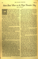
"St. Louis' Place..." (1927)
"Saint Louis' Place on the Type-Founders' Map." The Inland Printer. Vol. 79, No. 5 (August 1927): 764-766.
While some of the material in this article also appeared in his later "Addresss" "Address" (1931) (aka "St. Louis in Type-Founding History"; see below), other pieces of information in it appear nowhere else. For example, it is the only reference I've discovered so far to a pantograph engraving machine made for Schroeder and Werner.
[something in the "Open Forum"] (1929)
[Something in the "Open Forum" section.] The Inland Printer Vol. 84, No. 1 (Oct. 1929): 97.
[NOTE: In its infinite wisdom, Google Books will not allow Vol. 85 of The Inland Printer to be searched.]
"History of the Type Case..." (1930)
"The History of the Type Case, and Efforts Made to Improve It." The Inland Printer Vol. 86, No. 1 (Oct. 1930): 86.
[NOTE: The only result shown in a Google Books search of Vol. 87 of The Inland Printer is a reference to Werner in a discussion of Oz Cooper's typefaces.]
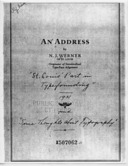
An Address. (St. Louis, 1931)
Werner, N. J. An Address by N. J. Werner of St. Louis. St. Louis: [St. Louis Club of Printing House Craftsmen, 1931. The bibliographic information concerning this item is problematic. It is a small booklet containing the text of an address by Werner "At a meeting of the St. Louis Club of Printing House Craftsmen" and presumably published by them. However, it bears no printed indication of publisher, location, or date. The copy reproduced here, from the St. Louis Public Library, carries annotations in an unknown hand on the cover indicating a date of 1931 and names for the two sections of the address ("St. Louis' Part in Typefounding" and "Some Thoughts about Typography.") The copy bears a stamp from the library indicating an acquisition date of January 13, 1934.
My thanks to Robert A. Mullen of Xanadu Press (author of Recasting a Craft) for kindly giving me a copy of his photocopy of this work.
This "Address" was reprinted under the title "St. Louis in Type-Founding History" (see below) in 1941 in Share Your Knowledge Review.
"St. Louis in Type-Founding History." (1931/1941)
This is a reprint, under the title "St. Louis in Type-Founding History," of "An Address" (see above) delivered probably in 1931 at a meeting of the St. Louis Club of Printing House Craftsmen. In Share Your Knowledge Review, Vol. 22, No. 3 (January 1941): 21-26.
Scanned by me from my copy of the original. 600dpi RGB JPGs wrapped in a PDF. (46 Megabytes)
This 1931 address by Werner is an important source for several items of typefounding history which are not well discussed elsewhere. It is worth enumerating them:
He speaks highly of Schroeder and Wiebking, but less so of Goudy ("of whose designs I would give case-room to but two") and is strongly prejudiced against "modernistic" type and typography ("By modernistic I mean, of course, the disreputable meaning the word has gained in late years because of the labors of freakish artists" ... "as if the present-day artists amounted to a hill of beans." pp. 23-24)
He also discusses his role in the origin of the American point system and the development of lining standards.
Gress. American Printer (1932)
Gress, Edmund G. "N. J. Werner and the Designers of Typefaces" in The American Printer, Vol. 94, No.5 (May, 1932): 52-53. I have not yet tracked this article down, and know it from only the Google Books "snippet" view. It would appear to consist primarily of a letter from Werner to Gres.
Here are extracts of it from various Google snippets:
"...J. Werner and the Desgners of Typefaces I had occasion recently to write to Nicholas Joseph Werner, of St. Louis, ... 'The DeVinne face was designed or drawn by Gustav Schroder about 1888, and it was engraved by machine, I being the ..." (probably p. 52)
"... drawn by Gustav Schroder about 1888, and it was engraved by machine, I being the operator. At that time, Mr. Schroder and I were in parthership in the type-engraving business. Previously he was house engraver for the Central Type Foundry, while I was its house printer. While so employed, Mr. Schroeder designed and cut the Central's [illegible] ..." (p. 52)
[this snippet from a combination of an image snippet and Google's OCR] "Mr Schroeder became a nature enthusiast from reading Thoreau, I think, and retired, get[t]ing himself a small home in California at the base of Mt. Tamal[pais] ... These were engraved intaglio direct into matrices by William A. Schraubstadter, one of the partners of the Central Type..." (p. 53)
"...pais. I then continued engraving by myself. I designed and cut the DeVinne Italic, DeVinne Condensed 9of which two faces, by the way, I am still proud), Mid-Gothic, Central Antique, Quentell (after a photograph of the originator's drawing). About this time the typefounders' combination was formed as the American Type Founders Company, after which I ..." (p. 53)
[this snippet from Google's OCR, not from an image] ... Geometric Gothic was made from Geometric Antique, the Studley from the Woodward ... He [Schroeder, I believe] originally came from Berlin, where Carl Schraubstadter, of the central Type Foundry, became acquainted with him and then engaged him to come to ..." (p. 53)
[this snippet from Google's OCR, not from an image] [note also that the reference to the Inland must be a slip of either Werner's memory or of the compositor; the Inland Type Foundry was not started up until after the Central was amalgamated into ATF in 1892, and Schroeder was never employed by it. Schroeder did, however, work on these faces for the Central] "While Mr. Schroeder was with the Inland, he made the patterns for the larger and smaller sizes of the Geometric (the middle ones coming from W. W. Jackson, a leading Philadelphia type designer and engraver), the Geometric Italic, Morning..." (p. 53)
[a snippet image, overlapping the above] "...Inland, he made the patterns for the larger and smaller sizes of the Geometric (the middle coming from W. W. Jackson, a leading Philadelphia type designer and engraver), the Geometric Italic, Morning Glory, and the very first typewriter face. These were engraved intaglio direct into matrices by William A. Schraubstadter, one of the partners of ..." (p. 53)
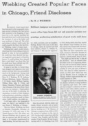
"Wiebking Created ..." (1932)
Werner, N. J. "Wiebking Created Popular Faces in Chicago, Friend Discloses." The Inland Printer. Vol. 90, No. 2 (November 1932): 71-73.
The icon here links to a presentation of this article in the Notebook on Robert Wiebking .
Note that the patent dates on some (e.g., Novelty Script on March 1893) don't quite line up with the dates of the Shroeder and Werner partnership (1888/9 - 1891).
Antique No. 6 (designed and cut by Werner for Central). [5]
Becker (either designed or engraved, or both, by Werner at Inland). [7]
Brandon (either designed or engraved, or both, by Werner at Inland). [7]
Bruce Title (either designed or engraved, or both, by Werner at Inland). [7] Saxe notes that Bruce Title was renamed Menu by BB&S.
Caxton Bold, four larger sizes (cut by Werner for Marder, Luse). [5]
Corbitt (either designed or engraved, or both, by Werner at Inland). [7]
DeVinne, first eight sizes (Schroeder & Werner, for Central). Remainder of series (Werner for Central). [5]
DeVinne Condensed (designed and cut by Werner for Central). [5]
DeVinne Italic (designed and cut by Werner for Central). [5]
Edwards (either designed or engraved, or both, by Werner at Inland). [7] Saxe notes that Edwards was renamed Bizarre Bold by BB&S.
Era (Schroeder & Werner, for BB&S) (renamed Pastel) Loy says that Schroeder & Werner cut it. McGrew attributes its design to both Werner and Schroeder, but Werner in 1931 attributed its design to Schroeder alone. He also notes that as Pastel it was much used in (silent) film cards. [5]
Façade Condensed (Schroeder & Werner, for Boston Type Foundry) (caps previously by Julius Herriet, Jr.) [5]
Flemish Extended (cut by Werner for Stephenson, Blake). [5]
Francis (either designed or engraved, or both, by Werner at Inland). [7]
Gothic No. 8 (designed and possibly engraved by Werner at Inland). [5]
Hermes (Schroeder & Werner, for Central) [5]
Inland (either designed or engraved, or both, by Werner at Inland). [7]
Jefferson (Schroeder & Werner, for Central) [5]
Johnston Gothic, lowercase (Schroeder & Werner, for Central) [5]
Midgothic (designed and cut by Werner for Central). [5]
Multiform (Schroeder & Werner, for Central) [5]
Novelty Script (Schroeder & Werner, for Central) [5]
Quentell (cut by Werner for Central from designs by W. P. Quentell). [5]
Skinner (designed and possibly engraved by Werner at Inland). [5] Saxe notes that Skinner was renamed Menu Roman by BB&S.
Victoria Italic, eight sizes of (Schroeder & Werner, for Central). Remainder of series (Werner for Central). [5] N.B., Schroeder later cut a lowercase from 6 to 24 point for Pacific States Type Foundry [6]
Condensed Woodward (designed and possibly engraved by Werner at Inland). [5]
Extended Woodward (designed and possibly engraved by Werner at Inland). [5]
[unidentified face "shortly to be put upon the market" in 1899] (designed and possibly engraved by Werner at Inland). [5]
[another unidentified face "shortly to be put upon the market" in 1899] (designed and possibly engraved by Werner at Inland). [5]
{Mullen 2005} Mullen, Robert. Recasting a Craft: St. Louis Typefounders Respond to Industrialization. Carbondale, IL: Univ. of Southern Illinois Press, 2005. ISBN: 0-8093-26361-1.
In his Note 16 to Chapter 3 (on p. 174), Mullen quotes some handwritten annotations by Bullen which appear on the cover of Werner's 1931 Address in St. Louis. These include the remark: "Werner is an able but narrow-minded man." Coming from someone with Bullen's ferocity of opinion, this is a bit much.
1. See also the Notebook on making matrices by pantograph Beyond (and Before) Benton.
2. Schroeder's purchase of the Central machine is mentioned by Werner in his 1932 obituary of Robert Wiebking . The "Schroeder-Boyer" machine is mentioned in Werner's 1927 "St. Louis' Place on the Type-Founders' Map".
3. In 1889, Benton, Waldo & Co. leased patrix (and punch) engraving pantographs to the Minneapolis Electro Matrix Company and the Electro Matrix Engraving Company (NY). At about this time, Robert Wiebking, in partnership with Henry Hardinge began commercial matrix engraving. There was more commercial typographical matrix making going on in the late 1880s and the 1890s than is generally acknowledged.
4. Loy. In Werner's own writing he merely suggests that he strongly influenced this foundry.
5. Loy, William E. "Designers and Engravers of Type," No. 19 - Nicholas J. Werner. The Inland Printer. Vol. 23, No. 5 (1899-08), p. 595.
6. Loy, William E. "Designers and Engravers of Type," No. 11 - Gustav F. Schroeder. The Inland Printer. Vol. 22, No. 3 (1898-12), p. 338.
7. Illustrated and identified in Saxe, Stephen O. and Alastair M. Johnston, eds., William E. Loy. Nineteenth-Century American Designers and Engravers of Type. (New Castle, DE: Oak Knoll Books, 2009), but not mentioned in Loy's original text.
All portions of this document not noted otherwise are Copyright © 2012, 2022 by David M. MacMillan.
Circuitous Root is a Registered Trademark of David M. MacMillan.
This work is licensed under the Creative Commons "Attribution - ShareAlike" license, version 4.0 International. See http://creativecommons.org/licenses/by-sa/4.0/ for its terms.
Presented originally by Circuitous Root®