Cut by William F. Capitain for Marder, Luse. Patent filed March, 1890. Advertised by Marder, Luse & Co. in 1890 and by ATF in 1893. Not shown in the 1897 ATF specimen book.
Adopted as the official typeface of the Oliver Typewriter Company
The attribution of this type to Capitain is also made in the biographical sketch of him in Loy's "Designers and Engravers of Type" ( No. 17, "William F. Capitaine," Inland Printer, Vol. 23, No 3 (June 1899): 336 ) This has been reprinted (with a brief showing of Ebony) in the Saxe/Johnston edition of Loy, Nineteenth-Century American Designers and Engravers of Type (New Castle, DE: Oak Knoll Press, 2009): 102, 104 . Note that the correct spelling is "Capitain," as confirmed in his patent for this type. Loy's original article is in error in this regard; Saxe and Johnston have corrected this.
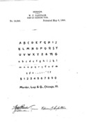
US Design Patent 19,800 (1890)
US design patent 19,800, "Design for a Font of Printing-Type." Issued 1890-05-06 to William F. Capitain. Filed 1890-03-24 as a application serial number 345,166. Assigned to Marder, Luse & Co. Note that the patent specimen does not show the alternate 'e' and 's' characters (not extending below the baseline) which are shown in the later advertisements and in the typeface as adopted by Oliver. The form of the 'A' shown here is the same as that shown by Marder, Luse but it differs from the more conventional form shown by ATF (and adopted by Oliver).
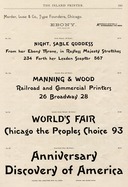
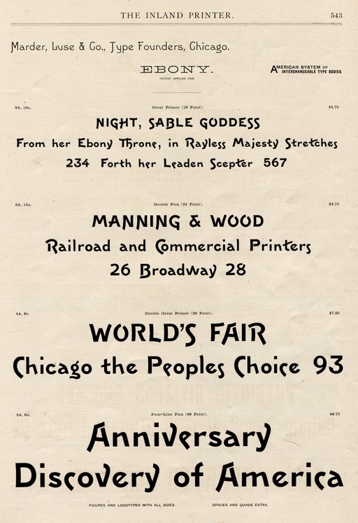
Inland Printer (1890, Marder, Luse)
The Inland Printer. Vol. 7, No. 6 (March, 1890): 543. Scanned from my copy of this issue.
The icon at left and the image below link to a slightly cropped image that has been scaled to 2048x pixels in width, converted lossily to a JPEG, and wrapped in a PDF. It is sufficient for ordinary viewing, and is 1.6 Megabytes in size. If you need a higher-resolution version, here is an unscaled 1200 dpi version of this same image (27 Megabytes): inland-printer-v007-n06-1890-03-1200rgb-0543-marder-luse-ebony-crop-8880x12960.jpg . For the true seeker after digital detail, here is the original, uncropped 1200dpi scan as a lossless PNG image (184 Megabytes): inland-printer-v007-n06-1890-03-1200rgb-0543-marder-luse-ebony.png . It is very difficult for the ordinary eye to distinguish any difference between the 27 Megabyte JPEG and the 184 Megabyte PNG. In either case, I would suggest that you do not try to view them online. Download them to your computing environment and view them offline.
This 1890 advertisement was also reprinted in Maurice Annenberg's A Typographical Journey through The Inland Printer: 1883-1900 (Baltimore, MD: Maran Prss, 1977), p. 326.

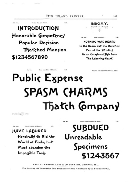
Inland Printer (1893, ATF)
The Inland Printer. Vol. 11, No. 5 (May, 1893): 167. This digital version is from the Hathi Trust presentation of the Google scan of the Universiyt of Michigan copy (Hathi ID: mdp.39015086781211). It is interesting to observe that it contains both versions of 'A'.
The icon at left and image below link to a PDF encapsulating a PNG version of the original page image from the Hathi Trust presentation. For convenience, here it is as a PNG image directly (1.3 Megabytes): inland-printer-v011-n05-1893-05-hathi-mdp-39015086781211-1200rgb-0167-pdf0215-atf-ebony.png. This 1893 advertisement was also reprinted in Maurice Annenberg's A Typographical Journey through The Inland Printer: 1883-1900 (Baltimore, MD: Maran Prss, 1977), p. 449. Annenberg's reprint is of course of higher resolution and quality than the Google/Hathi reprint reproduced here.
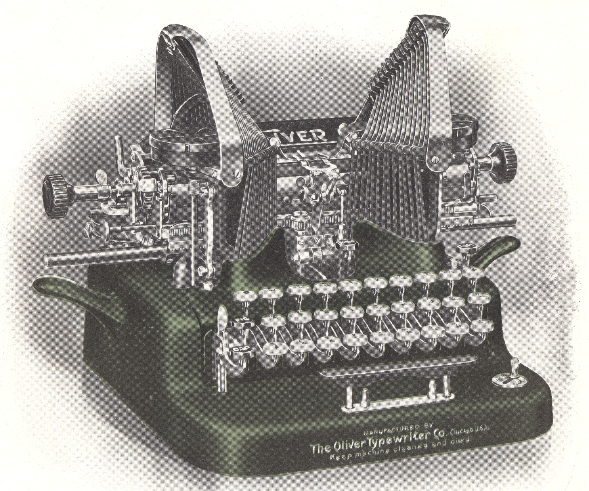
(See the Oliver Typewriter Notebook for more on the Oliver and the image above.)
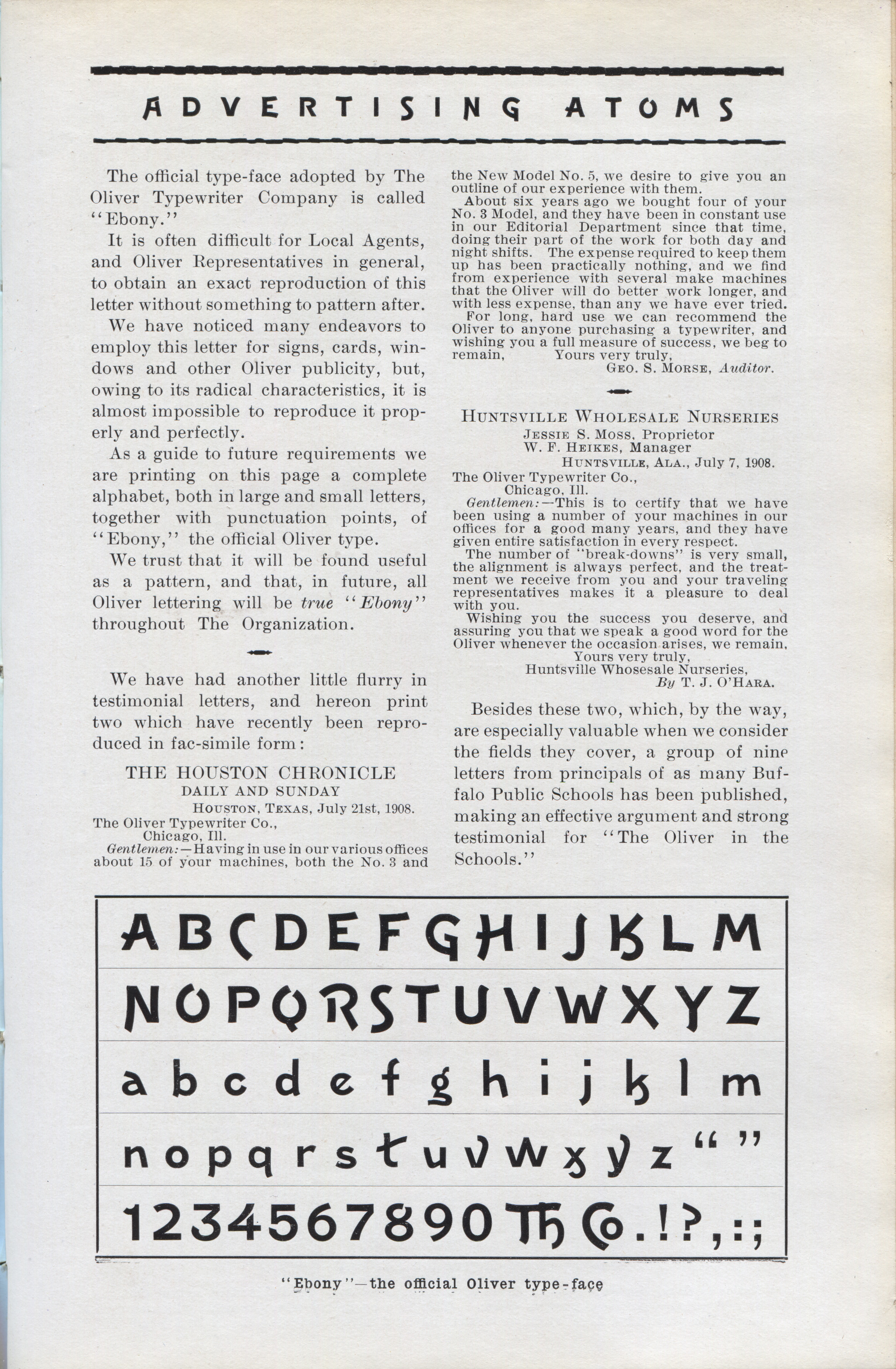
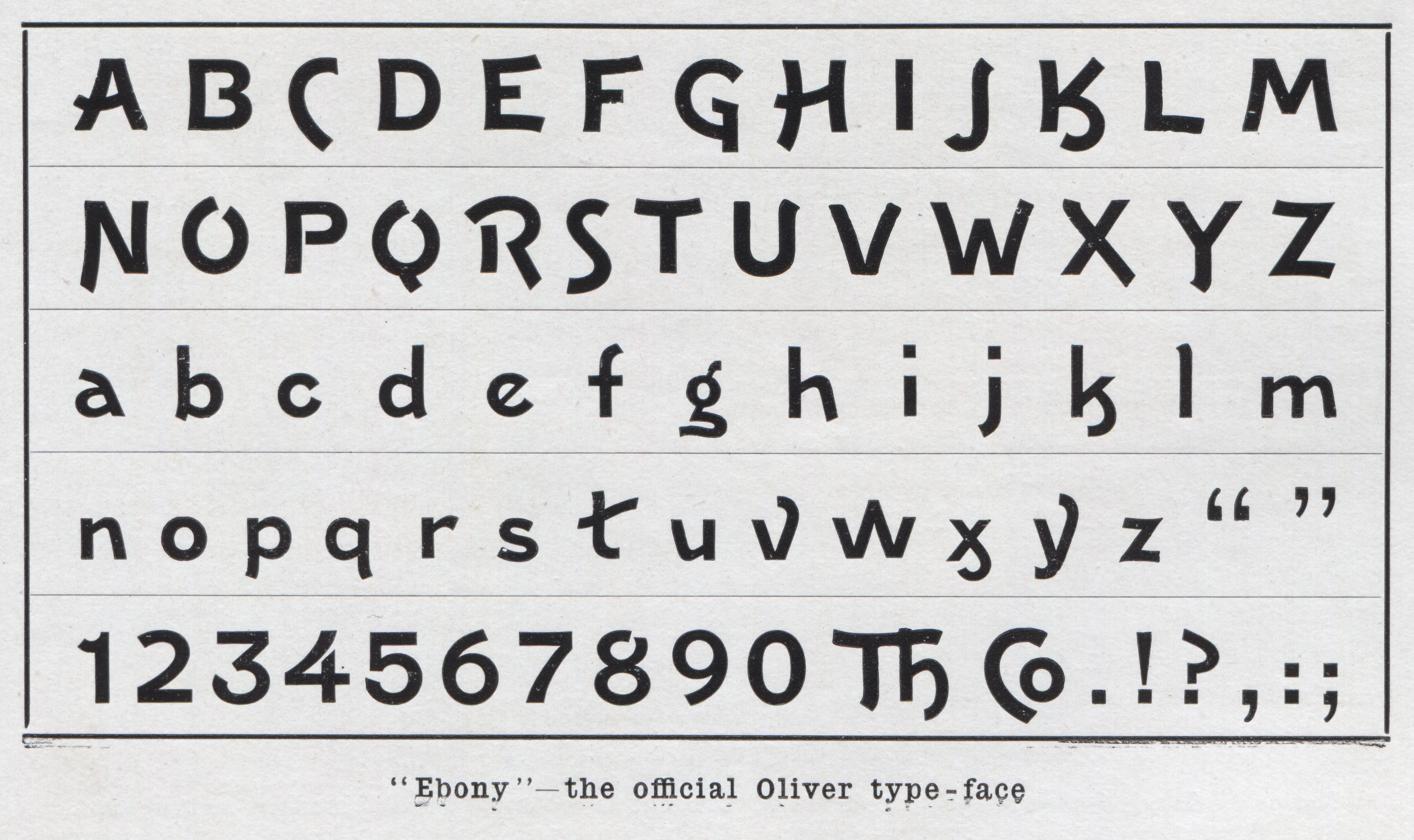
Oliver Typeface: Ebony
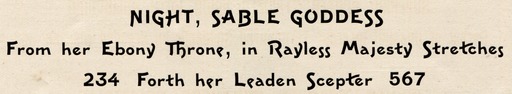
From The Oliver Bulletin, Vol. 7, Combined Nos 9 & 10 (September 10, 1908): 1275. The Oliver Typewriter Company had adopted Ebony as its official typeface, and used it for their logo, etc. (This was unusual at the time, as most logos were then lettered.) The "Advertising Atom" reproduced here from the Oliver house organ addresses the problem of the lack of showings of this face in contemporary specimen books (and the consequent lack of models for lettering in imitation of it when preparing non-typographic advertising material such as show cards).
The icon above left and the larger version of the showing below link to 2048 pixel wide versions of their respective images. Here is a full-resolution (1200 dpi) PNG of just the type showing (25 Megabytes, 5600 pixels wide): oliver-bulletin-v07n09and10-1908-09-10-1200rgb-1275-ebony-type-face-crop-showing-5600x3328.png
I have not yet found Ebony in any of the works of the 20th century antique revival era. That doesn't mean that it isn't there somewhere.
In the photolettering/phototypesetting era, Ebony was provided by Dan X. Solo. It is shown, for example, on p. 43 of The Solotype Catalog (NY: Dover Publications, 1992.)
The discussion of the Claude & "Character" 2011 font of digital lettering based on Ebony (see below) indicates that a specimen (of unknown provenance) was published by the San Francisco firm of Reardon & Krebs dba "Copies Unlimited."
This same discussion also indicates that a much more recent specimen by Dan X. Solo (of photolettering and phototypesetting fame) was published in his 100 Ornamental Alphabets (NY: Dover Publications, 2011). I haven't yet doublechecked this.
In the digital era, Ebony has been recreated as digital lettering by Claude Serieux and "Character" (pseudonym) and was posted to the alt.binaries.fonts newsgroup on June 13, 2011. It may be found and downloaded from the alt.binaries.fonts archive site http://abfonts.freehostia.com/ Here is a version of the ZIP file (containing OpenType and TrueType versions) which was labeled 1.2 on the site (but which is in fact 1.1 if you look at its internals: ebony.zip You should probably instead get the current version from the abfonts site.
Claude and "Character" have extended Ebony to include more sorts than were present in the metal and photographic versions. Here is a rendering of the Basic Latin portion of its character set, done using the FontMatrix program under Linux:
All of the documents reproduced or extracted from here are in the public domain due to the expiration of all possible copyright. The reproductions of/from them here remain in the public domain.
I believe that the font of digital lettering of Ebony by Claude and "Character" has been placed by them in the public domain. The specimen image of it as rendered here is placed by me in the public domain.
All portions of this document not noted otherwise are Copyright © 2012-2013 by David M. MacMillan and Rollande Krandall.
Circuitous Root is a Registered Trademark of David M. MacMillan and Rollande Krandall.
This work is licensed under the Creative Commons "Attribution - ShareAlike" license. See http://creativecommons.org/licenses/by-sa/3.0/ for its terms.
Presented originally by Circuitous Root®
Select Resolution: 0 [other resolutions temporarily disabled due to lack of disk space]


