[See also the Notebook From the Optical Scale to Optical Scaling in the CircuitousRoot Matrix Miscellany, which concentrates on the way in which we today misunderstand the concept of the optical scale, introduced by Harry Carter in 1937. At some point I should probably rewrite both that essay and this one and merge them.]
[This present Notebook, while a part of the "book" Making Matrices , may also be considered as an installment in the Heretic's Guide to Type. ]
Here's a quick summary of the concept of a "typeface" and "optical scaling" within a typeface, as these ideas might be held by a relatively sophisticated typographical professional today:
1. A "typeface" is the essential design unifying a coherent set of variations in type (one style, done bold, condensed, italic, etc.) Thus, Helvetica is the same typeface, no matter what weight or variation it's offered in or what foundry is offering it. Because it is the essence or core of the type design, the term typeface really encompasses what used to be called "type family" although (as in all families), certain members may be seen as black sheep.
1a. Only the vulgar conflate "typeface" and "font" - a font is a particular instance of a typeface as made by some type foundry.
1b. Particularly when speaking of metal type (which requires a separate physical set of matrices to produce each size), the range of sizes of type within a single variation of a typeface is a typefounder's "series." Thus, Lanston's Cheltenham Bold in all its sizes is their Series No. 86. In metal type, a series includes only one variation (Cheltenham Bold and Cheltenham Bold Italic are different series).
2. Good type design recognizes the fact that within the various members of a typeface the various sizes do not scale linearly. 12 point type doubled in size does not have the same outline as 24 point type. Good type design and implementation therefore employs "optical scaling" to provide well-formed type at each size. Today this is done with sophisticated mathematics. In the days of metal type, it was only possible to do this with one machine, the Benton pantograph.
I caution you that you would be wise to accept without question the position articulated above. It is held to be true today. With this perspective on type and optical scaling people will understand what you're talking about, and you'll pass muster at any cocktail party in the typographical univers.
The argument that I will be making here requires that you accept the idea that two things may appear to be quite similar but may in fact be completely different, and that you accept the idea that this difference matters. In particular, I wish to differentiate between "clubs" and "cults."
Consider a group of people with a single strong mutual interest (gardening, say, or old motorcycles or making working model steam engines). They might naturally form a club. They'll tend to share a lot more than just their nominal interest, of course; they may share similar social outlooks, or economic/class backgrounds. Still, they'll each be different from one another.
Consider by way of contrast a group of people who have been entirely shaped by a mutual belief system (usually it's a religion, but there are other belief systems just as strong). Such a group is more than just a collection of similar people; to whatever degree their shared belief matters to them, they are the same. This is a cult.
At a quick glance from the outside, it isn't always easy to distinguish a club from a cult. Each might have people with the same range of external features (height, gender, ethnicity, age, dress, etc.) But I will assume here that there is a fundamental difference between the two: that a club is a gathering of similar interests, while a cult is a manifestation of an underlying principle. This means, also, that a club is not simply an immature stage of a cult. It is a different kind of a thing, sufficient and valid in its own right. You can turn a club into a cult, but in doing so you lose the club.
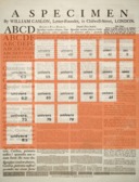
As applied to type, here, I'll be arguing that our modern conception of a "typeface" makes it something very much like a cult. Univers, to take an example, is a typeface and a cult. By way of contrast, the types shown by William Caslon in his famous broadside, types which we now conventionally think of as the "Caslon typeface," are really just a club. Univers is a typeface; Caslon is not. The process of understanding why this is so was, to me, a very revealing study in the nature of what type is.
A historical narrative can be taken in (at least) two ways: from old to new, or new to old. Here I'll start with the present, because in current practice the idea of a typeface as cult works, and go back in time to see how it breaks down.
So what is a "typeface," as the term is understood today? Let's take a particularly clear example: Univers, designed by Adrian Frutiger for Deberny & Peignot in the 1950s. Here's the cover of the showing of it as resold by American Type Founders in 1968:
The type foundry is marketing a wide array of related types, each of which varies in some way, but each of which has as its essence the design "univers." Frutiger regularized this into a numbered system which fit into a two-dimensional grid: go up or down on the grid and you vary the weight of the face; go left or right and you vary the characteristics (extended, normal, oblique, condensed, etc.)
Although Frutiger's numbering scheme was not quite as successful in practice as he might have hoped, the underlying idea of a "typeface" subject to regular variations is a powerful and flexible one. It gives you an ability analagous to the periodic table in physics; you can predict accurately types which do not yet exist. So, for example, the table above shows no Univers 78, but it is easy to see that it would be weight 7 (bold) and variation 8 (condensed oblique).
The idea also fits well into a related idea which developed at about the same time in history - that of a "family" of typefaces. It would be easy to take the design of Univers and extend it by creating, for example "back-slanted" variations, or drop-shadow variations, or "tooled"/"inline" variations. Indeed, although we speak of families of typefaces, the concept of a typeface as a core design with variations really contains the idea of the family. Each member of a typeface family is really just another variation of the typeface.
It's no surprise that this concept of what a "typeface" is has been successful to the point that it is not questioned. It has great descriptive and prescriptive power. It also fits well with the two characteristic which have defined type design over the last hundred years: the mechanization of type creation (whether by pantograph or computer) and the elevation of the type designer to superstar status. Creating a Univers 78 from the data in the image above is easy given a pantograph or a computer. But in part because it is so easy, creating Univers 78 if it did not previously exist would gain you little credit. Being the designer of Univers, on the other hand, confers a very special status within the design community. Type enthusiasts and professionals since Morris and Morison have argued that type is the core of civilization and that type design is the highest calling within it. Today we no longer have to argue this case; it is simply accepted as true.
Univers is also a good example for introducing the concept of "optical scaling" as it is understood today.
(NOTE: The issue of "optical scaling" (as now understood) and "the optical scale in typefounding" (as Harry Carter understood it, and as it was practiced for the first 450 years of type-making) is discussed as a subject in its own right in the essay "From the Optical Scale to Optical Scaling" in the CircuitousRoot Matrix Miscellany.)
Below is a scan (from the ATF specimen the cover of which was shown earlier) of the 48 point 'f' from univers 73 (colored yellow). On top of it is a scan from the same showing of the 12 point 'f', digitally enlarged 4x to an effective 48 point size (colored blue). The area where they intersect comes out grey.
Clearly, the 12 point 'f' is not only shorter but "stockier" than its 48 point sibling. Still, they are both univers 73. They merely differ in a regular, but nonlinear, way. It would be a straightforward matter to construct 'f's in several sizes, connect their outlines with curves, and generate a mathematical formula for converting one size to another (and even interpolating new sizes). This could be done in computer software for digital type, or on a pantograph engraving machine for metal type. (American Type Founders did a very nice animated sequence illustrating this kind of scaling for Warren Chappell's typeface Lydian, in their 1948 film Type Speaks!)
This isn't linear scaling (just making the 12 point 'f' four times as big to get 48 point). Rather, it is "optical" scaling in the sense that it takes into account the eye of the reader. A modern typeface such as univers can be "optically scaled" in this way with perfect success. (Of course, this reasoning is a bit circular, since there's a good chance that it was actually generated by this process, too.)
As we'll see later, this meaning of "optical scaling" is actually the opposite - the antithesis, even - of what Harry Carter meant when he introduced "the optical scale in typefounding" in 1937, but it is what it means today.
There is no doubt something sublime about the subtle variation in types through their scaling range, when scaled well. There is something ridiculous about a novelty type designed to look like tree branches. Yet it is with such a type that I hope to show the first "crack" in the concept of "typeface" as a unifying system.
"Rustic" is an ornamented novelty type which dates to at least 1845 (as Rustic No. 2, cut in the two-line English size (about 28 point) by the Figgins foundry. It was copied in America in the 19th century (by at least Bruce) and a new copy was done in 1962 by John S. Carroll. This latter version was popularized by Typefounders, Inc. of Phoenix, and the matrices for it have passed from them through two other foundries (LATF, Barco) and now reside with Skyline Type Foundry. Skyline has cast the 12 and 24 point sizes and as of this writing (2013) presently stock it for sale.
Here is the showing of the Carroll/Phoenix cutting of Rustic
(This is an extract from the complete showing card. That card is reprinted in the CircuitousRoot Notebook on Typefounders, Inc. (of Phoenix).)
Ignore the obvious difference that the three sizes have three different kinds of shadow (none, solid, open), even though it is likely that the designer chose the kind of shadow based on what would work best at a given size (a solid shadow at 12 point would be very difficult to distinguish from the letterform without smooth paper and perfect inking). Concentrate instead on the letterforms. For an example, consider 'M'. Here it is, in all three sizes:
Note the twig projecting on the right of the 12-point 'M' (not present in the other sizes). Note that the branches in the middle of the v-section of the 'M' in 36 point do not meet (but do in the other sizes). Note the differences in number and location of the knotholes. Note, in general, that each size differs in basic form and features. No amount of scaling, optical or otherwise, is ever going to get you from one size of this typeface to another. As 20th century American printer Daniel Berkeley Updike would have said, each size is law unto itself (though of course Updike would have scorned Rustic!) Yet the various sizes of Rustic have been accepted as a single typeface for nearly 170 years, and continue to be sold as a single typeface today. The modern conception of a "typeface" and of type design is logically incapable of accomodating this.
Rustic may indeed be a silly typeface, but this is a very important point. If a theory won't fit a fact, then the theory, not the fact, breaks. Only a cultist would think otherwise.
(As an aside for type enthusiasts with well-stocked libraries... If you look up Rustic in Nicolete Gray, you will find that the situation appears even more complex. Her specimens show five different types split over two different specimen books, with apparently (to a modern reader) inconsistent numbering. Why a Rustic No. 2 of 1845 should be so different from a Rustic No. 2 of 1846 will become clear later in this present chapter.)
Our 21st century perspective on "optical scaling" sees it largely as a matter of mathematical and design sophistication in digital type which has its origins in the mechanical (and thus also mathematical) sophistication of pantograph engraving machines. (Moreover, this seems always to be simplified to "the Benton" pantograph, even though Benton designed no less than five disinct pantographs, and though well over two dozen different pantographs are known by name to have been used at various type and matrix making establishments (and a dozen more remain unidentified.))
But the idea of "optical scaling" as the pinnacle of refinement in type is a relatively modern view, uncontested only since the middle of the 20th century. It only seems inevitable now because it was the victor in an early 20th century battle with a completely different meaning of "optical scaling" - a meaning in which it represented the destruction of the moral and aesthetic value of type.
Considering here only the making of matrices for metal type in America [1], the period from the first pantographic matrix engraving (Central Type Foundry, 1882) through the turn of the 20th century was one of the rapid adoption of the pantograph. Economics, not aesthetics, surely must have been the driving force here.
Roughly simultaneously, this was also the start of the Arts and Crafts movement, and a general re-valuing of hand techniques in response to what had by that time become an overwhelming pace of industrialization.
It is no surprise, then, that in the early 20th century this led first to a nostalgia for and then to a revival of hand punchcutting techniques.
The anti-pantograph position was put most succinctly by one of the finest printers of the era, Daniel Berkeley Updike. Writing in his two-volume Printing Types: Their History, Forms and Use (1922), he says:
"But a design for a type alphabet that may be entirely successful for the size for which it is drawn [his italics], cannot be successfully applied to all other sizes of the same series. Each size is law unto itself [my italics] ..." (Vol. 1, p. 11)
Updike was writing as an advocate of an older technology, but if one takes his statement not as rhetoric but as a statement of fact about the way type was before the pantograph, it is, simply, true. Before the advent of the pantograph, each size of type cut was, due to the technology of hand punch and patrix cutting, in the mechanics of its production independent of all other sizes.
Updike wrote as a printer lamenting the loss of the old ways. Koch wrote as a partisan fighting to revive them. Goudy wrote as an artist convinced he could command the new technologies to his will. In 1937, a different sort of person entered the fray: possibly the finest scholar of type and type-making of the entire 20th century, Harry Carter. In doing so, he introduced the phrase "optical scale," but he did not mean by this what we now think it means.
His article, "The Optical Scale in Typefounding," appeared in the journal Typography published by the Shenval Press (No. 4 (Autumn, 1937). This article is quite jarring to the 21st century reader in search of the origins of modern optical scaling, because by "optical scale" Carter meant not the scaling of types by any pantograph, however sophisticated, but rather the non-scaling adaption by eye of the hand punchcutter of the design of each size of type to that particular size.
He begins his argument forthrightly, dividing types into three broad size-groupings (small, medium large) and asserting that types should not even be cut throughout all of these ranges: "But there are no type-faces that excel in all three groups - hardly any in two of them." (2)
He soon goes beyond this, noting this about William Caslon: "[he] went so far as to buy an existing type, cut 50 years before his time, for his Canon size; moreover, by modern standards, we should hardly judge his 14-point and his 18-point to be members of one family." (2-3)
This is no oversight by Caslon-the-shoddy-punchcutter (Caslon was acknowledged one of the finest punchcutters in history). He says that "It is clear to anyone who can examine enlargements of hand-cut types that the good punchcutters varied the design [italics mine], or at any rate the functional features of it, to suit the scale on which they worked. They did so instinctively because they corrected their work by eye, and they had the wisdom not to let mathematical rules override their judgment." (3)
Carter continues with a long discussion of what makes type visually appropriate at each scale. There is a sophisticated logic at work here. He isn't simply longing for a return to simple hand methods. Rather, he is arguing that by designing and cutting their types specifically for each size the hand punchcutter achieved something that has been lost in the mechanized scaling of a single pattern over many sizes. His "optical scale in typefounding" is an argument that types should only be cut at the scale in which they work optically; if they do not work, they should not be cut at that scale at all. This is the exact opposite of our current understanding of "optical scaling," which is an attempt to find mathematical/mechanical rules to make a single typeface at every scale.
Perhaps it is best to let him have the last word:
"There has been too much of a tendency to design the face for setting the pages of a book, and then to make larger and smaller sizes by mechanical enlargement and diminution. The design must have beauty enough for the large sizes and legibility enough for the small ones; and these qualities must be stressed in the appropriate degree for each size. Types which lack either good quality should only be cut in the sizes for which they are suitable." (6)
It is perhaps well, then, to consider the size of types.
Of all the various incindiary points I hope to make here, this one certainly will be the most annoying. I wish to argue that the most basic aspect of type is not its design, but simply its size. This is, I think, presently blasphemy punishable by excommunication (which doesn't matter to me, since I'm not a member of the church of graphic design). Type is supposed to emobdy the ideals and genius of its designer, and together they are supposed to be the intellectual and artistic core which keeps our civilization together. To suggest that all of this is secondary to the size of the letters smacks of the troglodytic. After all, point size is simply something that one selects from a menu after one has selected the typeface (though this is precisely what Harry Carter warned us against in "The Optical Scale in Typefounding" over 75 years ago.
I start, though, with the argument (and realization, for me) that the primary function of a printer (or, today, a graphic designer) is to fill blank space. This is true regardless of the medium of that space or the material used to fill it - metal type, wood type, photographic type, or digital. A printer could, of course, do something akin to John Cage's musical composition 4' 33" (which consists of a pianist sitting at a piano and not playing, for that duration of time); he or she could run blank sheets through a press without type or ink. It would be a fine piece of performance art, but not printing. A lifetime devoted to it would be a heroic artistic statement, indeed, but not printing. A modern graphic designer attempting the same thing would soon be introduced to the art of filling in blank spaces on unemployment paperwork.
That the job of a printer is to fill space is self-evident in letterpress printing, because if you aren't putting phsyical type down in the form, or illustrative cuts, you're putting in physical spacing material. Yet it's just as true in the digital world even though the computer makes the blank space for you.
Imagine that you're designing and setting (digitally) an ad, or a newspaper, or a poster, or anything which is going to require a big headline. You have a particular idea of the typeface you wish to use for this headline; its choice is integral to your design. But when you check the proofs, it turns out that the digital font of Fancypants Extra Bold you set your heart on, which looked great every time you used it at 36 point, looks absolutely awful at 84 point. It just isn't going to work. A curse upon digital letters and bad optical scaling. So what do you do? Do you redesign the ad so that you only need the biggest size it'll work in - say, 48 point? Or do you just pull down a different menu item and select Snafubar Condensed, which wasn't your first choice but which will, after all, work?
Or consider the other end of the size range. The various Copperplate Gothics are actually some of my favorite types, simple as they are. I like them for their elegant, tiny, details. I can still recall talking about this to a friend who is a fine contemporary graphic artist well versed in the world of digital letters. We were standing in my shop by my Ludlow Typograph Machine, and I was referring specifically to the various weights and sizes of Ludlow's version, Lining Plate Gothic. He looked at me funny and said something along the lines of "but Copperplate Gothic is the ugliest typeface ever made." So we took a look at it on his Macintosh, and, lo, it is the ugliest typeface ever made (when shown on a computer screen). The problem isn't with the digital font itself. At the level of its encoded curves, it's probably an excellent Copperplate Gothic. The problem is that the fine details of the Copperplate Gothics are smaller than the resolution of contemporary digital displays, especially in the smaller point sizes. [1]
Say, then, that you're setting something that's going to have a section of fine print (not Fine Printing, but fine print; legalese, warranties and disclaimers). You want to make it look nice, so you pick a digital Copperplate Gothic of some description. It looks awful. It'd going to continue to look awful until you either (a) distort your design so that the fine print is big enough so that the details come through, or (b) keep it small and go with some bland, but workable, plain vanilla sans.
In each case, size over design is the correct production decision. Size, not design, is the single most basic aspect of all type.
The point (so far) is not that you can't scale type over a wide range of sizes; of course you can, and we do it all the time. Nor is it that you can't use the concept of a "typeface" to mean the essential core of design retained through that scaling and also through any number of variations; of course you can. Rather, the point is that this concept of "typeface" is only one way of organizing type, and that it is not by any means the one right way. It's actually a very recent way, occupying (not without contest) only the last 120 to 140 years of the 560 year history of type.
The groupings from the past that we now think of as "typefaces" were more like clubs than cults. The point is that these were not early stages of a necessary conversion into a typeface/cult (that's the view from inside the cult) but rather that they were clubs with a validity, as clubs, on their own.
This is easiest to see in the evolution of the ways in which ornamented types were named and grouped by typefounders in the 19th century. It is impossible to comprehend the organization of a mid-19th century specimen book if you come at it with the modern concept of a "typeface."
The problem is that you might start by looking for a particular typeface in a very late 19th century specimen book. It might have a name, or just as likely a number ("Ornamented No. 1046" of the Bruce foundry, for example). But when you look at earlier specimens you find that this is Ornamented No. 7 in the Two-Line Brevier size (about 16 point, or Columbian), No. 19 as Two-Line Long Primer (about 20 point, better known as Paragon), No. 40 as Two-Line Pica (about 24 point), and No. 27 as Two-Line Great-Primer (about 36 point). It seems to make no sense at all.
The ideal source with which to investigate this would be a type specimen book from the 1840s to 1850s from a type foundry with an extensive offering of ornamented types. By this time ornamented types had become popular enough that some foundries began to number them (in the 1820s, you might find one or two ornamented types in any given size, by the 1850s it was not uncommon to find two dozen). Yet it was before the transition to regularized series of types began around the 1860s.
Unfortunately, specimens from this period are rare. Often only one or two copies exist of any given book, and many have been lost altogether. When they do become available, they easily command prices in the four-digit range. At least at the present time (2013), there are none available freely online from this period, in English, with a sufficient number of ornamented types for this study. There are, however, two which have been reprinted on paper which serve perfectly. I do not have permission to reprint from them, though, I'll just have to describe their contents. Both have been reprinted by David Peat and are still available from him (1225 Carroll White Drive, Indianapolis, IN 46219); both are well worth having.
The best of these ("best" simply for the purposes of this discussion) is an extract reprinted under the title The Cincinnati Type Foundry: Selected Specimens from 1857 It contains an extensive selection of pages from the offerings of ornamented types in the original.
These are organized very simply, and in a way which at once makes clear all of the apparent confusion of later Victorian type specimens. Each type is illustrated with a single short line. These are organized in groups by body size, starting with Pearl (about 5 point) and going up to 14 Line Pica (which would be about 168 point). Within each size, the types are simply numbered sequentially. So, for example, in the Two-Line Bourgeois Ornamented section, the types simply run No. 1, No. 2, No. 3, etc. Each is a different type. In Two-Line Long Primer Ornamented, the types run No. 1, No. 2, No. 4, etc. (sometimes numbers are skipped). Each is a different typeface, and each number is unrelated to the same number in any other size.
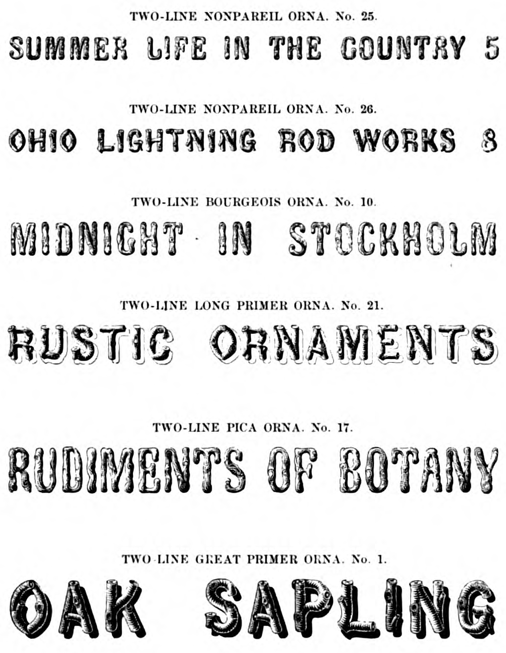
The group of related types that we now call "Rustic" may be traced through the various sizes:
(The Cincinnati foundry's names for sizes differed from those used elsewhere.)
The "Rustic" above is related to Gray II 136 and 137. Another "Rustic" (with not quite the same feeling; related to Gray II 148 appears as:
Although it may seem strange to modern eyes, this is actually a quite rational way to show type for sale and to manage a typefoundry.
Here are the three relevant pages from the 1857 Cincinnati specimen (in the reprint by David W. Peat, used here with his permission):
As discussed earlier, size, not design, is the primary attribute of type. The Cincinnati Foundry's customers were about to pay serious money for a relatively expensive product. They needed it because they had to fill certain kinds of space on the page. Organizing a type specimen by size simply organized it by customer requirements.
From the foundry's point of view, numbering sequentially within the size makes sense. The foundry had to make the matrices for each of these types in each of these sizes one at a time. Cutting a complete series at a single time would rarely make business sense. (Even in the hot metal era of the 20th century, new sizes frequently were added to existing series long after their initial release.) If the foundry's record books carried, say, ten different kinds of Pica Ornamented type, the next one cut would naturally be No. 11.
It isn't as if typefounders in 1850 couldn't see that the various sizes of what we now call Rustic were similar. Of course they could. It's just that they weren't making a typeface. They were making a looser grouping, a club not a cult, of types generally related to each other. They were making them over time as commercial needs required, and they were making them in each size as appropriate to the optical needs of that particular scale.
It is interesting that the actual grouping of these related types together as a single "club" began before the introduction of the pantograph. It would appear that the idea of "typeface" is powerfully attractive, and that the pantograph, when it came along, simply accelerated a trend that was already underway.
Continuing with the same Cincinnati types, the 1870 Specimen and Price List reveals a very interesting transitional stage. In the "Ornamental Letters" section (unpaginated, but p. 142 of the Google PDF of the NYPL copy) these "rustic" types are grouped together and organized in order of size (as they would be if they constituted a modern type series within a typeface), but there are three distinctly un-modern characteristics of this showing.
(From the Google Books scan of the NYPL copy, available via The Hathi Trust. Hathi ID: nyp.33433000823397 .)
This is not a showing of a typeface, but it's a nice group portrait of a club. This can be seen in three things:
First, types from what now would be called two distinct typefaces are included.
take common inspiration from the "Rustic" of 1845 from Figgins (Chart Nos. 136 & 137 in the second edition of Gray).
look to the "Rustic" of 1846 from Figgins (Chart No. 148 in the second edition of Gray).
Compare the 'T' in each set - they just aren't the same.
Second, the original numbers are retained: 25, 26, 10, 21, 17, 1.
Third, this proto-series does not yet have a name. Indeed, it is not even set off in the page from other proto-series.
So here we have a reorganization of the existing foundry stock, each identified by its size and number within that size as they would have been carried on the company's books. They're now grouped on the basis of stylistic similarity, and ordered by size within that grouping. But the concept of a typefounder's series, and the concept of a typeface, are not present.
Instead, the stylistic grouping reflects an older notion of the grouping of types - a notion which survives only in a secondary and relatively unimportant role today. If you look at 18th and early 19th century specimen books, they are generally ordered in terms of stylistic groups: Romans (sometimes called just "letters"), Italics (the italic then stood on its own and was not just a slanty or curvy Roman), Italians, Egyptians, Blacks (blackletter), Greeks, etc. These general stylistic groups continued through much of the 19th century, and were added to (e.g., Ionics, Dorics, Clarendons, etc.) But as the concepts first of series, then of typeface, and finally of typeface family became dominant in the 20th century, these more general stylistic groupings faded from use. Similar concepts survive today only in schemes to try to bring some order to the thousands of different types available - and no such scheme has achieved any lasting dominance (e.g., the "lineales" and "garaldes" of Maximelien Vox's system, which attempt the same more systematically).
So what we're looking at here is not a series in a typeface, but a stylistic collection (a club) of independent types each law unto itself. One might think of them as "Rustics" in the same way that one would have thought of "Italics," "Antiques," or "Gothics" and "Grecians" (like condensed gothics; both shown four pages earlier in this specimen), etc. The next types shown on the same page might also have been thought of as "Rustics"; they look as if they were made of picket fence posts.
Here's a sampling of a few pages from this 1870 Cincinnati specimen to illustrate their relatively late use of these stylistic groups.
(This images should show up as an animated sequence displaying each of 15 pages sequentially. Click on it to open a PDF to read these 15 pages.)
This seletion of pages includes:
In no case do any of these designations refer to a typeface or typeface family, nor do the types within them represent typefounders' series.
To continue tracing the emergence of the ideas of typefounders' series and typeface using this same set of "rustic" types requires switching type foundries. As late as their 1888 specimen, the Cincinnati Type Foundry was still showing the same types:
(P. 88 of their 1888 specimen. The last of these is what was previously called "Two-Line Great Primer Ornamented No. 1".)
By that time, Rustic was getting to be quite old-fashioned. It does not appear in any of the specimens (of those online, at least) put out by any of the foundries amalgamated into ATF in 1892. [3]
However, the specimens of MacKellar, Smiths & Jordan continue the story of this evolution nicely.
Armed with the realization that we are not looking at typefaces at all, but rather clubs of more or less related types, the type specimen books of the early 19th and late 18th centuries suddenly become clear.
When 16th through early 19th century typefounders cut types, each size was cut separately (which was a technological necessity) and (if it was good type) designed so as to be appropriate to the size at which it was cut. Even from the point of view of the design, physical size was the fundamental parameter. This is what Harry Carter meant in 1937 when he introduced the concept of "the optical scale in typefounding" and what D. B. Updike meant in 1922 when he wrote that every size was "law unto itself."
When these typefounders collected a set of types over a range of sizes, they were not thinking of them as a "typeface" in any sense where "typeface" means an essentially unified design which can be expressed over many sizes. As Carter said of Caslon's Roman, "we should hardly judge his 14-point and his 18-point to be members of one family." This is because they were not, in fact, members of a typeface or type family in any modern sense of the terms. We do not have a good technical term to describe what Caslon or any of the other pre-19th century typefounders meant when they performed such a loose grouping. I have suggested here that the nature of this grouping is more like that of a club, but "club" is not really a good term to use. In the interim, something along the nature of "style" might work. Thus, the range of different Roman types grouped together by Caslon in his famous broadsheet specimen are not "the Caslon typeface," but rather "types in the Roman style by Caslon."
The total number of types offered by any typefoundry through the 18th century was relatively small, and confined to a few of these stylistic groups (Roman, Italic, blackletter, and sometimes a few non-Latin types such as Greek). Under these circumstances, it was possible to cut or collect individual types in particular sizes which could represent these loose stylistic groups over a wide range of sizes. As the number of these "styles" increased in the early 19th century, typefounders responded to the increased work of cutting in so many styles by cutting them only at the sizes at which they worked. This was especially true of the ornamented types which became increasingly popular.
It is easy to look back from the 21st century and think that they did this because their hand methods were crude and they were unable to achieve the "standard of uniformity in design" (Carter, p. 2) that we expect today. But to do this is wrong for two reasons. First, it distorts the past and makes it difficult to understand what was in fact being done (and difficult to comprehend the early type specimens). Second, it shoehorns the much larger world of type as it in fact existed from the 16th through 19th centuries into a rigid modern mold.
What were the stages through which type-making passed to get from this rather open conception of type through the 18th century to our rigid notion of typeface today?
Through the early 19th century, typemaking continued as it had since the 15th or 16th, under the broader concept of type as made at particular sizes and grouped for convenience of presentation into broad categories. This can be seen as late as the 1812 specimen of Binny & Ronaldson (to take just one relatively small example).
This concept of type continued through the middle of the 19th century, but the number of these "styles" proliferated. Binny & Ronaldson had Roman type (which didn't need a name), Italic, Two-Line type (titling, in later terminology), German/Black, and a few Hebrew, Greek, and Ornamented types. Their greatest complexity was in offering two styles Romans and Italics (but in text sizes only). By mid-century this catalog of styles had expanded to include Egyptians, Italians, Clarendons, Dorics, Ionics, Grecians (not Greek), and any number of others.
Typefounders responded, both aesthetically and pragmatically, by cutting only those types in those sizes which worked visually and would sell. Since size is the basic parameter of type, it made sense to organize specimens by size. There might be an overall grouping by style (Ornamented, Script, Roman, etc.) but these were stylistic descriptions, not names of types. Within each size grouping, the successive types were simply presented as they came (probably in the order in which they were cut). Each type was cut separately, and types were cut in the order in which the foundry expected them to sell (it would be foolish to cut many sizes of one style when you knew that only one of them would sell; you were better off cutting a different type which would sell). This is particularly clear in the Ornamented types which proliferated by the middle of the 19th century. The Two-Line Long Primer Ornamented No. 1, the Pica Ornamented No. 1, and the Paragon Ornamented No. 1 of a single foundry would simply be the first types in that size cut by that foundry, with no design relationship to each other at all.
By the third quarter of the 19th century, it became common to group visually related type designs in various sizes together. These groupings were not typefaces in the modern sense. The types had been cut individually to suit each size; they were not recut when they were regrouped in the specimens. Typically the old designations for them were retained; only gradually did the idea emerge that these groupings might themselves be given a single name. Indeed, in many cases a single name would not yet have been appropriate, as these groupings still combined types of related but substantially different designs (sometimes duplicating sizes).
So firmly is the concept of "typeface" entrenched in modern thinking that it may simply be impossible to comprehend any other way to think. Analogies with other fields may help.
Consider a parallel situation in architecture. (Architecture is not type, to be sure, but certainly design spans genres.) Imagine two architects who are called upon each to design an entire series of houses, from the smallest to the largest: an artist's detached studio, a small bungalow, a modest suburban home, an immmodest suburban McMansion, a truly grand Newport "cottage," a palace - the whole range.
One of these architects may be taken to be any successful architect you might care to mention; anyone since the profession of "architect" separated from the trade of master builder. This person would design each of these houses separately, because each size has different requirements which demand different solutions. Still, it would almost certainly be possible to distinguish this series of houses as designed by one architect from a series designed by another - the work of, say, Frank Gehry can be distinguished from that of Frank Lloyd Wright. Each series might well have stylistic unit while necessarily preserving the individuality of each step along the scale.
But consider an entirely different architect - a slightly obsessive one. This architect takes a single design, and by the application of sophisticated and elegant proportioning rules scales this same design from the smallest studio to the largest palace. If this architect's design started out on the small end of the scale, one must pity the poor emperor sitting in a vast one-room palace scaled up from an artist's studio. If the design started out on the large end, the poor artist would need a miniature remote-controlled camera to navigate the tiny rooms of the palace scaled down to the size of a backyard shed. To attempt to do anything like this scaling in architecture is obviously ludicrous - it's dumb, and won't work. But it is exactly what the concept of "typeface" imposes on type. This is what D. B. Updike and Harry Carter were telling us all along.
Carter, Harry. "The Optical Scale in Typefounding." Typography. No. 4 (Autumn 1937): 2-6. London: Shenval Press, 1937.
[Cincinnati 1857] Peat, David W., ed. and the Cincinnati Type Foundry. The Cincinnati Type Foundry: Selected Specimens fromn 1857 Terra Alta, WV: The Pioneer Press of West Virginia for David W. Peat, 1998.
Cincinnati Type Foundry. Specimen and Price List. (1870) Google Books scan of the NYPL copy, available via The Hathi Trust. Hathi ID: nyp.33433000823397
Updike, Daniel Berkeley. Printing Types: Their History, Forms and Use. 2 vols. Cambridge: Harvard University Press, 1922.
1. Wood type had been made by direct pantographic routing of the type itself for several decades. Although the various early makers and users of pantographs for punch/patrix/matrix making must have been aware of this, I am aware of no evidence of any influence on them of wood type making.
There must also have been considerable activity in Europe at this time, as the first pantograph to cut matrices in America (for the Central Type Foundry, in 1882) had been manufactured in Germany prior to 1880. I know nothing of any of this presumed activity, however.
The three pages from the 1857 Cincinnati Type Foundry Specimens of Printing Type in the David W. Peat reprint are used here by the kind permission of David W. Peat.
All portions of this document not noted otherwise are Copyright © 2012-2013 by David M. MacMillan and Rollande Krandall.
Circuitous Root is a Registered Trademark of David M. MacMillan and Rollande Krandall.
This work is licensed under the Creative Commons "Attribution - ShareAlike" license. See http://creativecommons.org/licenses/by-sa/3.0/ for its terms.
Presented originally by Circuitous Root®