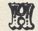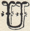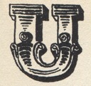
Garamont (Goudy)
Lanston Monotype Series No. 248/2481.
Monotype: A Journal of Composing Room Efficiency. Vol. 9, No. 6 (Jan.-Feb. 1923) was set in a trial casting of Garamont.
Geometric (Central)
Central Type Foundry, St. Louis. 1880/1882. The first type series the matrices of which were made by pantograph (the Central Type Foundry Pantograph).

German No. 5 (Central)
Central Type Foundry. Reviewed in The American Bookmaker Vol. 10, No. 2 (1890-02): 51.

Giraffe
MacKellar, Smiths & Jordanr. Reviewed in The American Bookmaker Vol. 12, No. 6 (1891-06): 169? - 170 [this digitization of this specimen is missing pp. 168-169, so most of the discussion of Giraffe, and a showing of it, are missing; it may be identified as MS&J from external sources (Saxe/Johnston/Loy)]

Gold Rush (ATF No. 588)
ATF recutting (1933, 1949; but not listed in the ATF Book of American types for 1934 or 1941) of a face cut "about 1865" by Bruce and called, then, either Antique Shaded or Ornamented no. 1514. (McGrew).
Electroform copy by John S. Carroll as Gold Rush.
Gold Rush (Carroll Copy; Phoenix, LATF, Skyline)
McGrew traces the history of this face to a face cut "about 1865" by Bruce and called, then, either Antique Shaded or Ornamented no. 1514. As originally cut it had both uppercase and lowercase. ATF (McGrew says) revived it in 1933 and 1949 as No. 588, Gold Rush (q.v.) (N.B., ATF No. 12 is their "Antique Shaded," and is an entirely unrelated design.) John S. Carroll [ Replica Type Foundry] electroformed a copy of it "in the 1950s", and his matrices went to Typefounders, Inc. [of Phoenix] and from there to Los Angeles Type Founders (again, information from McGrew). (LATF was acquired by Barco, and the Barco "antique" matrices were in turn acquired by Skyline Type Foundry. The Skyline matrix inventory does list Gold Rush.) No source that I have found indicates any size other than 24 point for this Carroll version.
McGrew gives Klondike as an alternative name for "Gold Rush"; I presume he means the Carroll copy of Gold Rush, not ATF's.
Shown in:

Gothic No. 20 (Central)
Central Type Foundry. Reviewed in The American Bookmaker Vol. 12, No. 1 (1891-01): 9-10.

Lining Gothic Extended (MSJ)
MacKellar, Smiths and Jordan. Reviewed in The American Bookmaker Vol. 10, No. 1 (1890-01): 21-22.

Gothic Italic Extra Condensed (Central)
Central Type Foundry. Reviewed in The American Bookmaker Vol. 12, No. 2 (1891-02): 36-37.

Lining Gothic (Keystone)
Keystone Type Foundry. Shown in The Inland Printer Vol. 8, No. 9 (1891-06): 819.

Lining Gothic (MSJ)
MacKellar, Smiths and Jordan. Reviewed in The American Bookmaker Vol. 10, No. 1 (1890-01): 21-22.

Goudy Modern
Derived by Frederic Goudy from his Goudy Open (by filling it in). Roman only. Cut by Robert Wiebking and cast at Goudy's Village Letter Foundery.
Recut for machine composition as Lanston Monotype Series No. 293 in 1924. {McGrew}

Goudy Modern Italic
1919. Derived by Frederic Goudy from his Goudy Modern. [I haven't verified the cutting and casting; was it Wiebking and Village Letter Foundery?]
Recut for machine composition as Lanston Monotype Series No. 2931 [when? 1924?] {McGrew}

Goudy Open
Frederic Goudy, 1918, Roman only. Cut by Robert Wiebking and cast at Goudy's Village Letter Foundery.
Recut for machine composition as Lanston Monotype Series No. 291 in 1924. {McGrew}

Goudy Open Italic
Lanston Monotype Series No. 2911. This is of course the companion to Goudy Open, but was not derived directly from it. According to McGrew, Goudy Open came first, cut by Robert Wiebking and cast at Goudy's Village Letter Foundery. Then Goudy filled in Goudy Open to produce Goudy Modern (again cut by Wiebking and cast at the Village Letter Foundery). From here he made Goudy Modern Italic, and then took that solid italic and opened it back up to produce Goudy Open Italic. All of these were done before Lanston Monotype licensed them and recut them for machine composition. (McGrew says Goudy Open and Goudy Modern were adapted by Lanston in 1924. Lanston showed Goudy Open Italic in 1924 (see below). I would gues that Goudy Modern Italic was probably adapted at the same time, but as yet I have no evidence.)
Goudy Open Italic is shown in Monotype: A Journal of Composing Room Efficiency. No. 70 (May 1924) .

Gray I, No. 109
Catalog No. 109 from Nicolette Gray's XIXth Century Ornamented Types and Title Pages . Shown on p. 181. A Two-line small pica by Stephenson, Blake from circa 1849.
This is the same face as Doric Ornamented (in wood) by Wells & Webb. See also Ornamented No. 847 (Bruce). Revived in the mid Twentieth Century in metal as Tuscan Ombree and in the late Twentieth Century digitally as Zebrawood[TM]. See the main entry for this design's history under Tuscan Ombree.

Gray I, No. 190
Catalog No. 190 from Nicolette Gray's XIXth Century Ornamented Types and Title Pages . A face by Caslon Caslon, circa 1865 (revived 1884).
Copied as Ornamented Nos. 7/19/40/27/1046 (Bruce) and Ornamented No. 22J (Cincinnati). Revived as Tuscan Graille (= Stellar (Weidemann)).

Gray I, No. 211
Catalog No. 211 from Nicolette Gray's XIXth Century Ornamented Types and Title Pages . A face by Figgins, circa 1870.
Revived in the Twentieth Century as Tuscan Ornate (Weidemann)

Gray 2nd Ed., No. 303
Catalog No. 303 from Nicolette Gray's Nineteenth Century Ornamented Typefaces . Second Edition. (Berkeley, CA: Univ. of Calif. Press, 1976) A type cast by Marr Typefounding Company, copying Bruce's Ornamented No. 1515 (20th century " Belgian")

Gremolata
2011/2012 (digital; metal version attempted but never completed). Designed by Russell Maret. Companion roman to Cancellaresca Milanese. Private typeface. The metal version of this was commissioned and patterns were cut by the Dale Guild. This project, unfortunately, was never completed. The kickstarter campaign for it was fulfilled using photopolymer plates from digital lettering.
Gray's 1938 XIXth Century Ornamented Types and Title Pages is in copyright both in the UK and the US. However, the brief snippets extracted here for the purpose of identifying types in her catalog are, I believe, within the limits of Fair Use. As such they is not licensed here under the Creative Commons license governing the rest of this page.
All of the type specimen documents reproduced or extracted from here, except Gray's XIXth Century Ornamented Types and Title Pages as noted above, are in the public domain due to their publication without copyright notice when such notice was required, or the failure to renew copyright as was then required, or the expiration of all possible copyright. The reproductions of/from them here remain in the public domain.
All portions of this document not noted otherwise are Copyright © 2011 by David M. MacMillan and Rollande Krandall.
Circuitous Root is a Registered Trademark of David M. MacMillan and Rollande Krandall.
This work is licensed under the Creative Commons "Attribution - ShareAlike" license. See http://creativecommons.org/licenses/by-sa/3.0/ for its terms.
Presented originally by Circuitous Root®
Select Resolution: 0 [other resolutions temporarily disabled due to lack of disk space]