I try not to be a disagreeable person, yet if confronted with the many books which are being written today on the subject of type, I find that I disagree with important (and commonly accepted) points in most of them. I believe, moreover, that I can provide sound evidence for my objections in both the history and technological practices of making and using type. Here's an index to those places in the CircuitousRoot Notebooks where these issues come up.
Theoretical/Historical/Metahistorical:

Reading Metal Type Specimens
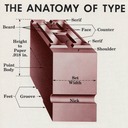
[TO DO: Revise and improve the illustrations - the present version is a hasty rough draft.]
The specimen books for metal type, and especially those for the industrial era of metal type-making from the 1840s through the 1980s, constitute the core set of documents for understanding the history of type and for continuing type into the future. They are essential references. Yet they will be confusing to the 21st century maker of type who does not have a background in metal type. Not only are there matters in them which require an understanding of the mechanics of metal type and type-composing machinery, but there are subtleties in them which we have (needlessly) lost in our digital era.
This Notebook is a quick and incomplete attempt to identify some of the issues faced by the 21st century type enthusiast in confronting these specimens. If you are confused by something such as a single Linotype font which is both Russian Condensed No. 3 and Antique Black No. 3 at the same time, or if you can't quite figure out what it means when a showing is set "one point leaded" in type which is clearly larger than one point, then you might find it to be of use.
All portions of this document not noted otherwise are Copyright © 2011-2014 by David M. MacMillan and Rollande Krandall.
Circuitous Root is a Registered Trademark of David M. MacMillan and Rollande Krandall.
This work is licensed under the Creative Commons "Attribution - ShareAlike" license. See http://creativecommons.org/licenses/by-sa/3.0/ for its terms.
Presented originally by Circuitous Root®