[UNFINISHED: This is pretty obviously an unfinished draft, both in its arguments and in its exploration of source materials. Still, I don't think that what it says so far is wrong. I've put it online in this preliminary state because it reprints materials that I'm already starting to refer to elsewhere.]
(This essay, while filed under Type & Type-Making History and Design, is also a part of the loose collection which constitutes A Heretic's Guide to Type.)
It is easy enough to go out and find contemporary books on famous "type designers" and the typefaces they created. They are inspiring catalogues of genius, no doubt. The books coming out today are all well removed from the people and events they describe, and they all seem somehow suspiciously close to hagiography. How do we know what we think we know, really? More particularly, since I argue elsewhere that the modern concept of a "type designer" does not fit with the reality of the creation of metal type , how do we know who accomplished which particular aspects of the creation of the metal types which account for the first 500 years of printing? The answer is simple: for the most part, we don't.
There are four ways in which our knowledge of the attribution of type-making tends to be uncertain.
First, we simply don't know enough about the technical details of the processes themselves.
On the positive side, certain parts of the many processes of typemaking have been well documented and/or constitute skills that continue to this day. Punchcutting, for example, has been the topic of several very good studies in the history of type, and in any event has never been a "lost art." It is a metalworking skill that was developed in antiquity and has been practiced continuously to the present day. For any particular type produced by traditional punchcutting, we may or may not know the name of the punchcutter, but we do know the stages of the type-making process of which punchcutting is one part. Similarly, various kinds of pantograph engraving machine operation have been practiced continually from at least the 18th century to the present.
But to take a single example by way of contrast, the way in which American Type Founders Company produced the working patterns for its patrix and matrix engraving in the late 1890s has been described only very briefly, and these descriptions are incomplete and inconsistent. We don't even know what they were doing, much less who was doing it.
Second, until the middle of the 20th century the making of printing types was simply another industrial process. Like all such processes, it was practiced largely in anonymity. We know only a few of the names associated with it, typically either because they were for one reason or another well known within the field (e.g., William Caslon I) or because they wrote about it themselves (e.g., Moxon, Fournier). The few relatively early studies tend to treat of it in terms of business history rather than personal history (i.e., Talbot Baines Reed wrote a History of the Old English Letter Foundries (London, 1887) rather than biographical sketches of the English punchcutters, matrix justifiers, castermen, etc.) He wrote well, and much of what we do know of the people involved comes from him, but he wrote of them only incidentally.
Third, we now have a tendency to attribute too much to single individual. A few pre-industrial typemakers no doubt performed all of the activities of making type. (Fournier certainly did, for example. Moxon did, as well, although his types are not fondly remembered). But many did not. From an early period there was an active trade in punches, and even in unjustified matrix strikes. (Even a well-struck matrix is at best half-finished.) To whom should we attribute the type which has been made by so many hands?
Moreover, type-making in this period (1450-1880, roughly) was not held to the same set of arbitrary requirements that it was in the 20th century. As Updike (who thought this was a good thing) said, each type in each body size was law unto itself. These people may have been "complete typographers" (as Moxon uses the word), but they were not making typefaces in any sense that we would now understand the term "typeface." It was only in the late 19th century that type-making began to be seen in terms of typefaces, and by that time the process of making type at a commercial scale had become far too large an undertaking for any one person. Ironically, it was no long after this that the marketing concept of the "type designer" emerged as a means of promoting paticular types as the product of genius.
Fourth, there has been far too much repetition without questioning. If you consult any modern list of "who designed which typeface" (a question you will now no doubt realize I find to be a bit meaningless), you'll discover that they're simply repetitions of older lists, and those are often repetitions of older lists still. The compilers of the original lists were at pains to note their own limitations and to present their lists as tentative. With repetition, their caution has been forgotten and their tentative lists have become authoritative sources.
I do not wish to sound completely bleak; we do have some very good histories. Generally, when you find a detailed biography of a letterform designer (e.g., Paul Renner), punchcutter (e.g. Philip Prince), or the like it will be well-researched enough to present reliable information. Also, after the emergence in the 20th century of a class of white-collar artists who were called "type designers," we increasingly find direct documentation of their work in letterform design. Thus we know for certain that Warren Chappell drew Lydian, because we can see him doing part of it in an ATF film ( Type Speaks! (1947)). Unfortunately, concurrent with this we find the people who did everything else in making type (besides letterform design) pushed even further into obscurity. That same ATF film never names the people who actually drew Lydian as type (not as lettering), or who lined it, fitted it, proofed it, and revised it. Yet without them, Lydian would not look like Lydian.
Finally, of course, Goudy remains the grand exception: he did it all (almost), and wrote about it (mostly).
There are a number of general categories of sources for information on who did what for which type. The following sections will explore each.
First, in a very few cases, we have the words of the people themselves. When these accounts exist, they are of great value. They need to be seen in context, however.
Most of them are accounts by letterform designers, and as such reflect only one part of the type-making process. William Addison Dwiggins' WAD to RR (1940) is notable because of the degree to which it acknowledges the partnership between Dwiggins as letterform designer and the type-making department headed by Mergenthaler's head of type design, Chauncey H. Griffiths.
A few accounts are by individuals committed to revivals of traditional techniques in the face of industrial methods (e.g., Paul Koch, Victor Hammer). These are important accounts, and some of the types they produced are exceptional (Victor Hammer's in particular). But to the (varying) extent that they tended to bring the entire process under their own hand they are (deliberately) uncharacteristic of their era.
The same charge (a compliment, really) of exceptionalism may be laid against the comprehensive works of Moxon, Fournier, and (in specimens only) Bodoni.
Goudy of course stands out in this category, but one must always keep in mind the context of each of his types. At his Village Letter Foundery, Goudy was able to bring the entire process in-house as no one else did during the era of industrial metal type production. Yet this very comprehensiveness - combined with a personality of great force - allowed him to cut corners in ways that would not have worked in a more commercial setting. He lined and fitted his types "hot" at the caster, and did not fold this information back into the process. This was not possible for his types when released commercially. To make a Goudy type work in production required many months of additional labor beyond his letterform design. In the case of Lanston Monotype's Californian, we happen (by chance) to know that we are seeing not only Goudy's work but Claire van Vliet's. In most cases, the labor of those who made Goudy's types workable remains anonymous.
Typophile Monograph VIII (1944)
The Type Designs Made for Private and Commercial use, 1896 to 1943, by Frederic W. Goudy . (NY: The Typophiles, 1944). This cover chapbook bears the title "A Keepsake for Friends of Fred W. Goudy, Produced for His Seventy-Ninth Birthday." It was "issued ... on the occasion of Goudy's 79th birthday party at La Salle du Bois, New York, on March 8th, 1944." It contains an apology to Goudy by its printers for setting it on a Linotype rather than in handset type, a two-page "Author's Prologue" by Goudy (an early version of the "Prologue" of A Half-Century (see below), and a four-page list of "The Type Designs of Frederic W. Goudy from Camelot (1896) to Goudy Thirty (1942).
The image here links to a presentation of this chapbook at The Internet Archive, where it may be read online. Here is a local copy of the PDF (57 Megabytes): typophiles-monograph-VIII-goudy-75th-birthday-keepsake-0600rgbjpg.pdf
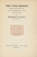
Goudy. A Half-Century. (1946, v. 1)
Goudy, Frederic W. A Half-Century of Type Design and Typography: 1895-1945. Volume 1. (NY: The Typophiles, 1946.) Typophile Chap Books: XIII.
Goudy's Half Century (in two volumes; see below) contains not only Goudy's own list of his type, but (more importantly) his comments upon them. It's one of the more important (and interesting) firsthand accounts of type-making of the 20th century.
The icon here links to a presentation of this work in the Notebook of General Literature on Making Printing Matrices and Types
Goudy. A Half-Century. (1946, v. 2)
Goudy, Frederic W. A Half-Century of Type Design and Typography: 1895-1945. Volume 2. (NY: The Typophiles, 1946.) Typophile Chap Books: XIII.
The icon here links to a presentation of this work in the Notebook of General Literature on Making Printing Matrices and Types
Bullen. It is one of the great misfortunes of the history of type that while Henry Lewis Bullen was an active participant in it and while he wrote extensively about it, he cannot be trusted as a source without external verification (and is therefore of no use as a source). Enough of what he wrote is demonstrably fabricated that it calls into suspicion everything else.
(The real reason I put this present Notebook together was to give me a place to reprint Rollins' list.)
Inland Printer (1927)
"The Types of a Quarter Century." Inland Printer, Vol. 79, No. 5 (August, 1927): 811-817 My thanks to John Horn for the loan of this number of The Inland Printer.
This list is cited by Carl Purington Rollins in "American Type Designers and Their Work" (1947, see below). It isn't really an article on type designers, however. It was just a survey done by the editor of The Inland Printer on types through the previous quarter century. Moreover, the survey is very incomplete. It includes only current ATF faces, a relatively complete list from Barnhart Brothers & Spindler (then owned in secret by ATF), and a very few faces from Inland, Farmer, Bruce, and Keystone. It does not even acknowledge the existence of types from composing machine manufactures such as Mergenthaler Linotype and Lanston Monotype, which by this time completely dominated printing. Within these limits, only the information returned by BB&S indicates a designer.
The icon above links to a 300dpi PDF of this article. Here is a 600dpi version: inland-printer-v079-n5-1927-the-types-of-a-quarter-century-0600rgbjpg.pdf
Rollins (1947)
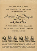
In 1947, R. R. Donnelley & Sons Company (founded in 1864 and still a major printing company today) held an exibition on the subject of "American Type Designers and Their Work" at the offices of their prestige imprint, The Lakeside Press, in Chicago. For this exhibition, Carl Purington Rollins wrote an essay (of the same title) and prepared a list of "American Type Designers and their Type Faces." The set of documents reprinted here comprises the four-page advertising flyer for the exhibition, together with Rollins' article and list (which were printed together). This particular copy was sent originally to the Indian typefounder Arvind Patel a decade after the exhibition (postmarked July 5, 1957). I have included a scan of the envelope for this, as it is a part of the history of this document. (Note: the name on this envelope is typed as "Ervind," but I believe that the correct spelling was "Arvind.")
The image above left links to these documents as hosted at The Internet Archive, where they may be read online. For a local copy of, see the CircuitousRoot Page on Rollins
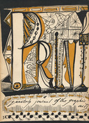
"American Type Designers..." (1948)
Rollins, Carl Purington. "American Type Designers and Their Work." Print. Vol. 5, No. 4 (1948): 1-20. This is a reprint of much of the material in Rollins' 1947 literature for the Lakeside/Donnelley exhibition (see above) .
Note that this article by Rollins is at the present time often being mis-cited as either " Print, No. 4" or " Print, Vol. 4, #1". Both of these citations are incorrect.
The image above left links to these documents as hosted at The Internet Archive, where they may be read online. For a local copy of, see the CircuitousRoot Page on Rollins
As near as I can figure, Rollins' list is the master list for the 20th century from which most subsequent lists have simply been copied. It's a good list and a good source, but given its central status it is well to note certain issues with it.
First, Rollins himself notes the following warning: "In compiling the following information we have had the enthusiastic co-operation of typographic authorities and amateurs all over the land. It is no more than just to them, and to ourselves, however, to say that there has been only a limited time for the task. Inaccuracies may have crept in, and we are under no illusion that the lists are complete beyond question. The compilation should be regarded as a pioneer effort in a field that awaits scholarly and thoroughgoing exploration."
Beyond issues in the list, Rollins' introductory essay has been a source of a number of often-repeated errors (errors which have come to define the textbook history of typefounding).
After describing punchcutting, Rollins says "It was not until the invention of the Benton pantograph punch-cutting machine in 1885 that any other method was known. All type made before 1885 was therefore dependent on hand punch cutting ..." Parts of this are still quoted today, sometimes verbatim. Yet ever single part of it is wrong.
Rollins continues that "the designer of the type was almost always the same man who cut the punches." Even pre-1885 this was by no means true, as the biographical sketches of "American Designers and Engravers of Type" by Loy in The Inland Printer from 1898 to 1900 made clear.
In a more specific error, Rollins also makes a number of mistakes in describing the type DeVinne (which he cites as an important and distinctively American face): "About 1894 or 1895 the Central Type Foundry of St. Louis introduced a face which became widely used, called (for no better reason than attends the christening of most type faces) 'De Vinne.' It is of unknown parentage." In fact its parentage and birth was well documented even at this time. In 1907, DeVinne himself (or at least his firm) noted that "the name given to this face ... is purely complimentary," and identified it as a collaboration between Nicholas J. Werner (compositor and printer at the Central Type Foundry and later an independent matrix engraver) and J. A. St. John (co-owner of the Central). DeVinne does not date it directly, but notes that it came out of correspondence in the 1888-1890 period. [DeVinne 1907] Loy, in his 1899 biographical sketch of Werner ( The Inland Printer. Vol. 23, No. 5 (1899-08), p. 595 In his 1931 "Address" to the St. Louis Club of Printing House Craftsmen" (reprinted in 1941 as "St. Louis in Type-Founding History, Werner is at pains to credit the design of DeVinne to
There are a few very well-researched biographies of makers of type. It is perhaps remarkable that several of them are devoted to people who did things other than letterform design. However most biographical sketches of "type designers" are simply rehashes of unverified secondhand information. As a quick and necessary check, see if the biography in question has footnots/end-notes which identify primary sources.
The equivalent of McGrew for European types is Jaspert, Berry and Johnson's Encyclopedia of Typefaces. It is not nearly as thorough, however.
Is there a "McGrew for 19th century types"? There is not. But because of its extensive type specimens from the Saxe collection, the Johnston/Saxe edition of Loy, published as Nineteenth Century Designers and Engravers of Type (New Castle, DE: Oak Knoll Books, 2009) is a good substitute until we have a Victorian McGrew.
[Benton 1883]. The notion that Benton's first machine engraving was of patrices for electroforming matrices is speculation, but it is extremely well-informed speculation (by William Gregan, a matrix engraver at American Type Founders, who spoke with Morris Fuller Benton about this). It also fits extremely well with the way in which much (probably most) type was being made at that time (by hand-engraving patrices). See the discussion of Benton's first pantograph elsewhere in CircutiousRoot.
[Benton 1884]. Benton, Waldo & Co. advertised this capability in The Inland Printer, Vol. 1, No. 10 (July, 1884): 21. See the discussion of Benton's punch-engraving pantograph elsewhere in CircutiousRoot. There is a frequently repeated story by Henry Lewis Bullen that P. T. Dodge of the Linotype company was responsible for inducing Benton to modify his machine to cut punches. This story is demonstrably false.
[Central 1882]. See the discussion of the Central Type Foundry pantograph elsewhere in CircuitousRoot.
[DeVinne 1907]. In Types of the De Vinne Press, (NY: Theodore L. De Vinne & Co., 1907). p. 273.
[Electro]. I haven't yet devoted a Notebook at CircuitousRoot specifically to this matter, though I should. Here, then, are some preliminary observations:
The making of matrices by electroforming from hand-cut or machine-cut patrices has been omitted from all standard histories of type-making in America. There are, I think, two reasons for this. First, the method was associated with the piracy of types, and thus not discussed by typefounders (it is just as easy to electroform a matrix from someone else's type as from a patrix you made yourself). Second, in the highbrow backlash against pantographic techniques in the first three decades of the 20th century (by the Rudolf and Paul Koch, Victor Hammer, and others) punchcutting emerged as the One True Way to make type in opposition to the machine. A technique as machine-based as matrix electroforming (using electricity, even!) inevitably became "collateral damage" in this fight. Interestingly, German texts from this period simply present it as one of the three basic methods of making matrices.
The evidence for the importance of patrix engraving is therefore scattered throughout the literature, and frequently allusive (and elusive). Yet it is clear that this method was used extensively. In 1887, Carl Scharubstadter, Jr. (then of the Central Type Foundry, owned by his father, and later the co-founder of the Inland Type Foundry) wrote:
"In later years, a new school of engravers, headed by Mr. Ruthven, of Philadelphia, has sprung up, cutting exclusively on [type]metal, and producing ornamentation and finish that punch cutters never dared to attempt.
"In perfection of finish, such faces as the Raphael, Raskin, Steelplate Gothic, etc., silence all attempts to bring the process into disrepute, and lately Mr. Benton has cut Roman type on [type]metal with his engraving machine, having such a high finish that it is safe to say that even in this field, until this time wholly given up to the punch cutter, the electrotype matrix will also drive out its copper rival." The Inland Printer, Vol. 4, No. 6 (March, 1887): 382.
Regrettably, this account does not date the origin of electroforming from patrices (if, indeed, he is correct in assigning it to Ruthven). Edwin C. Ruthven, though, first worked in Philadelphia in 1846 (the year after Thomas W. Starr, also of Philadelphia, patented the electroformed matrix ( US patent 4,130). Loy, in his biographical sketch of Ruthven (No. 15 in the series, in Inland Printer Vol. 23, No. 1 (April 1899): 64) says "It was in 1846 that he came to America, and from that time forward he gave his time entirely to designing and engraving type faces, first on steel and later on [type]metal for electrotyping the matrices. At the time Mr. Ruthven began his connection with the Johnson foundry [in 1846] he was probably the only cutter in steel in America then actively engaged. Shortly afterward he conceived the idea of electrotyping matrices, and he was probably the originator of this method of making matrices. After he began cutting type on soft metal he employed as many as twelve apprentices at one time ..."
Finally, here is a hypothesis that I have not yet verified by experiment: David Bruce, Jr., inventor of the typecasting machine, noted the importance of the higher pressures of machine typecasting in enabling the production of the fancier types which became common after the 1830s (in his History of Typefounding in the United States, which has been edited in an edition by Dr. James Eckman (NY: The Typophiles, 1981)). I will posit that there was another aspect to this. The cutting of the increasingly elaborate ornamental types of the 19th century would have been exceedingly difficult as steel punches, but significantly easier as typemetal patrices. Perhaps more importantly, the driving of steel punches for these often very delicate faces would present great difficulties, but their electroforming would have been trivial. It seems clear to me, although I do not yet have evidence to prove it, that patrix cutting and matrix electroforming was an enabling technology which allowed ornamented types to flourish in the 19th century.
This technology remained dominant in the 20th century. Nearly all Lanston Monotype display matrices in the pre-WWII period are electroformed, and these matrices remain the core of the display typefounding industry even today.
[Loy]. Loy, William E. "American Designers and Engravers of Type," a series in The Inland Printer from 1898 to 1900. For some of the original essays, and for a bibliographic citation of the outstanding modern reprint by Saxe and Johnston, see the section on Loy in "General Literature on Making Printing Matrices and Types".
All portions of this document not noted otherwise are Copyright © 2013, 2022 by David M. MacMillan.
Circuitous Root is a Registered Trademark of David M. MacMillan.
This work is licensed under the Creative Commons "Attribution - ShareAlike" license, version 4.0 International. See http://creativecommons.org/licenses/by-sa/4.0/ for its terms.
Presented originally by Circuitous Root®