[UNFINISHED: This is pretty obviously an unfinished draft, both in its arguments and in its exploration of source materials. Still, I don't think that what it says so far is wrong.]
(This essay, while filed under Type & Type-Making History and Design, is also a part of the loose collection which constitutes A Heretic's Guide to Type.)
The standard paradigm which is accepted universally today is that type is created by type designers. More specifically:
Obviously, I agree with the first of these assumptions, as I'm rather a type nut. But the other two are true only in the tautological sense that if you define Typefaces as objects of unified design and Type Designers as the creators of these things, then necessarily you will end up with unified Typefaces and Type Designers will create them for us. The preconception creates both the product and its maker. But however universal these preconceptions are today, they actually define only one rather limited way of thinking about type and its making. Moreover, they are a rather recent way of thinking which has been with us for only about a century or so and dominant only for the last 50 or 60 years. They are wholly inadequate for understanding how type was made during its first 500 years.
The subject (most would call it a heresy) of the inability of the concept of "Typeface" to explain type before about 1870 is discussed elsewhere on CircuitousRoot. [1] Here I wish to address the inability of the concept of "Type Designer" to explain anything at all about the making of type before about 1920 and its failure to explain the reality of the making of metal type up to the end of its commercial production at the advent of the computer. [2]
The Type Designer (as understood today) is a celebrity. Type Designers change the world (like William Morris did), they're grand characters (like Frederic Goudy), lone rebels (like Victor Hammer), multi-talented artist (like William Dwiggins), ... I'm sure you get the picture. I've cited only dead people involved in metal type here, but in our digital era the Type Designer has emerged as someone with the status of a rock star and the inspired cool of a Beat Generation poet.
It wasn't always so. Type began as an industrial enterprise and has remained so until this day. Until the early 20th century, the makers of types were simply participants - usually anonymous - in this industry. The industry had few historians, and when writers such as Talbot Baines Reed wrote about it, [3] they wrote primarily about the industry and secondarily about its people. When at the turn of the 20th century William Loy wrote the first comprehensive study of (American, at least) "designers and engravers of type," he had to argue for a place for it in the public eye, as a new subject worth noticing:
"The active development of the type founding industry has produced a large number of ingenious designers and engravers of type, about whom the public knows very little. ... It is hoped that the publication [of his biographical sketches] ... may awaken an interest in the subject." [4]
Loy, writing in the 1898-1900 timeframe, had to convince an audience of professional printers that the design of type existed as an independent professional category. The first comprehensive list of persons called "type designers" didn't appear until 1947. [5] A 1942 technical/biographical article on Goudy intended for a wide public audience noted that he was "the dean of twentieth-century designers" and yet had to confess that "Chances are you never heard of Goudy." [6] The Type Designer as celebrity was a creation of the first half of the 20th century. Goudy himself had a lot to do with it; in large part he created the concept of the Type Designer as a brand identity. But there was more to it than that.
The Type Designer as cultural hero was a natural outcome of the calculated valorization of printing type as the carrier of civilization. This emerged out of two simultaneous (and interrelated) events: the revival of (so called) "fine" printing with William Morris and the Arts and Crafts movement of the late 19th century, on the one hand, and the need of typefoundries to find some way to convince printers to buy new type after the ornamental types of the late 19th century "Artistic Printing" movement had run their course in the marketplace. Our current view of type isn't a natural part of type, it is the product of specific ideologies and sometimes intense corporate marketing campaigns. That it has become accepted as true to the point that it is difficult even to think in other terms would suggest it as an excellent topic of study in effective marketing at a business school. [For a more comprehensive discussion of this, see Digital Typography and Computer-Aided Lettering [IN PROCESS] in Making Matrices .
Type displaced lettering in the mass-production of words almost immediately upon its invention. (The number of books printed before 1500 is astonishing. [7]) It retained a near-monopoly on this until the middle of the 19th century, when something very threatening happened: lithography. People raised in the last part of the 20th century might think of lithography as just another form of printing. But in the 19th century lithography was a distinct field, practiced by people and companies who were not invested in conventional letterpress printing technology. Starting gradually, from roughly the 1830s [8], lithography became a serious competitor to printing with type. For the first time in the history of the word, a technology allowed the mass-production of hand-drawn lettering. [9]
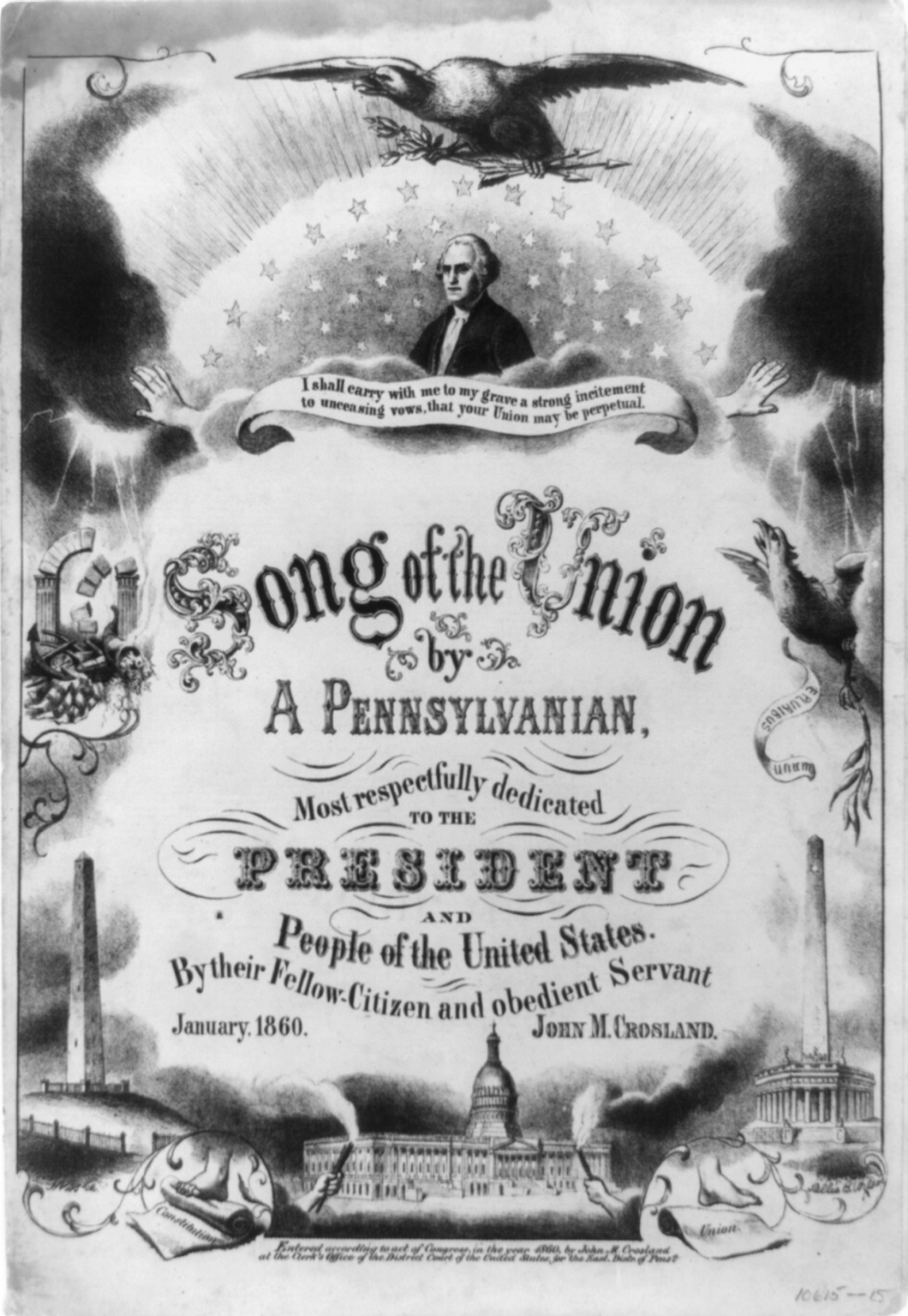
This was a great threat to printing and to the typefoundries making printing type. Lettering, it turns out, is a pretty amazing field. Especially in the area of its greatest strength - display advertising - lithographically reproduced lettering permitted a degree of graphical sophistication (or at least graphical complexity, if the results are not to your taste) heretofore unknown in printing. To illustrate this, consider two examples from the same year, 1860. At left below is an example of an advertisement (for printing services, as it happens) done in much the same way that printed advertising had been done throughout the century. It is neither a particularly good nor bad example from the period; it is a typical example. At right below is a lithograph from the same year which makes the printed example look crude and antiquated. It is important to realize that in the lithographed example there is no type used at all. It is entirely hand-lettered. [10]
Lithography must have given foreward-thinking typefounders of this period nightmares. It allowed both a complexity of letterform and an integration of words with images that had never been seen in printing with type. The problem of the integration of words and images remained until the demise of industrial-scale letterpress printing in the 1970s (and remains today in hobby and art letterpress printing; it is inherent in the medium). But the matter of the complexity of letterforms was something that typefounders could address, and did.
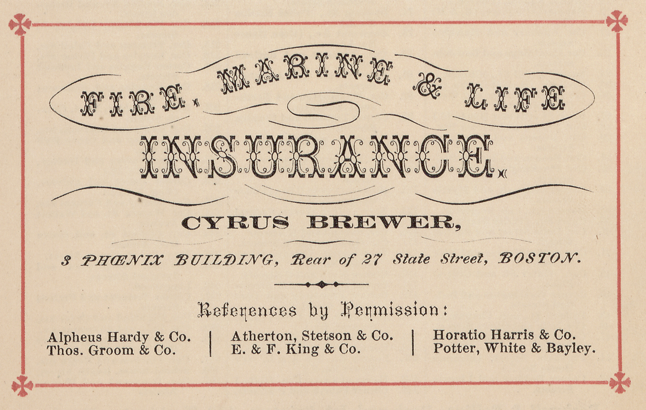
Here is another example of advertising printing, done in Boston in 1860 (the same city and year as the example above left). It makes an interesting comparison with the lithographed example above right. It is done entirely in type, type ornaments, and printers' rule - all traditional items of letterpress printing. No hand lettering is involved at all.
(Source: [13].)
[Harpel. Pr. Int. Spec. Exch. combination ornaments of the 1890s.]
If you listen to broadcasts of classic jazz - serious broadcasts, that is, hosted by enthusiasts - you soon come to realize that somehow they know the name of every single musician present in every obscure studio recording session of every forgotten band from 1927. And they identify every single one of them, every time. Much as I love this music, and admire their scholarship, it is wearying. So perhaps it is best that we don't actually know (or feel the need to name) all of the personnel involved in every episode of type-making. It is a sufficient shorthand to ascribe each type to one or two people. But actually to understand type it is necessary to remember, always, that this is nothing more than shorthand. The commercial making of metal type always required several - sometimes many - minds and hands.
1. In the chapter "Clubs and Cults: Revisiting the Concept of 'Typeface' and the Optical Scale in Typefounding, in the "book" Making Matrices . The subject is also a part of the Notebook "From the Optical Scale to Optical Scaling", which argues that the modern (post-1980s) concept of "optical scaling" in type is exactly what Harry Carter was arguing against in his 1937 article "The Optical Scale in Typefounding."
2. Yes, I am aware of the brief era of photolettering and phototypesetting. But these did not kill metal type; the computer killed them both.
3. Reed, Talbot Baines. A History of the Old English Letter Foundries. (London: Elliot Stock, 1887).
4. Loy, William E. "Designers and Engravers of Type." The Inland Printer, Vol. 20, No. 5 (February 1898) through Vol. 25, No. 3 (June 1906). This series has been reprinted in a beautiful modern edition edited by Alastair M. Johnston and Stephen O. Saxe (with extensive illustrations from the type specimen book collection of Saxe) as Nineteenth-Century American Designers and Engravers of Type. (New Castle, DE: Oak Knoll Books, 2009). The quotation here from Loy's introduction appeared originally in The Inland Printer. Vol. 20, No. 5 (February 1898).
5. Rollins, Carl Purington. "American Type Designers and their Work." This was a list prepared in 1947 to accompany an exhibition by the R. R. Donnelley & Sons company (one of the largest printing firms in America at the time) at the offices of their prestige imprint, The Lakeside Press, in Chicago. It was reprinted in 1948 in Print: A Quarterly Journal of the Graphic Arts, Vol. 5, No. 4 (1948): 1-20.
6. Boone, Andrew R. "Type by Goudy." Popular Science. Vol. 140, No. 4 (April 1942): 114-119. This is online on the Modern Mechanix blog ( http://blog.modernmechanix.com/), and also online via Google Books. It's worth finding an original copy, though.
7. Various sources, including the Encyclopædia Britannica, estimate about twenty million copies by about 1500.
8. Although it cannot be proved, I do not believe that it is coincidental that the origins of commercial lithography in the 1830s and 1840s coincided with the first flourishing of ornamented printing types. (Much of what we think of today as "Gay '90s" American type is in fact French type from this period.)
9. It had of course long been possible to reproduce hand-drawn lettering in two other technologies: relief woodcuts or wood engravings, and intaglio engravings of various kinds. However, these are both multi-stage processes (first drawing, then engraving or etching) which separated the lettering artist from the final product. They were slower and more costly to make, and did not have the same mass impact that lithography did.
10. Should any confusion remain regarding this distinction, here is an illustration of the process of lettering upon a lithographic stone. The image itself is probably from the early 20th century, but the process shown is that which was used throughout the 19th. If you think that this is "type" or "typography," then you need to think again.
(From Hackleman, Charles W. Commercial Engraving and Printing. Second Edition. (Indianapolis, IA: Commercial Engraving and Publishing Company, 1924.) Fig. 1126 on p. 486. For those who relish the many levels of mechanical reproduction: Here we have a man who is lettering by hand on a lithographic stone to be used in direct (not offset) lithography, who has been photographed (by an unknown but physical photographic process) This photograph was retouched by hand in a darkroom and vignetted. It was then converted into a black and white halftone (133 line screen; Hackleman is very careful to note such particulars) and printed on a relief ("letterpress") printing press. This in turn was scanned (by me) as a 1200 dpi RGB digital image and saved losslessly as a PNG. This in turn was processed digitally into the (lossy) JPEG image you see above; the image linked from it is the "original" (but what is original?) PNG.)
11. From "[6 advertisements of Boston printing, 1860]", a subset within the collection "An American Time Capsule: Three Centuries of Broadsides and Other Printed Ephemera" of the United States Library of Congress. Digital ID: http://hdl.loc.gov/loc.rbc/rbpe.06603900
12. This is a sheet music cover printed/published by Beck & Lawton in Philadelphia in 1860, digitized from a copy in the U.S. Library of Congress' Prints & Photographs Division. Call numberr: LOT 10615-15 [P&P]. Online at: http://www.loc.gov/pictures/item/2008661600/.
13. This item is also from "[6 advertisements of Boston printing, 1860]", a subset within the collection "An American Time Capsule: Three Centuries of Broadsides and Other Printed Ephemera" of the United States Library of Congress. Digital ID: http://hdl.loc.gov/loc.rbc/rbpe.06603900 The type in which "FIRE, MARINE & LIFE INSURANCE" is set has been traced in English sources by Nicolete Gray to "Corinthian" by Reed & Fox, 1869 (and as "Englisch" by an unidentified German type foundry in the same year). It is No. 273 in the the catalog in the 1976 reprint of her work. (Gray, Nicolete, Nineteenth Century Ornamented Typefaces (Berkeley, CA: University of California Press, 1976). In my own collection of 19th century specimens (all digital and/or reprints, alas), I have been able to trace it in America only back to 1888, when it appeared in the James Conner's Sons catalog in five sizes from long primer to two-line pica. ( Abridged Specimens of Printing Types (NY: The United States Type Foundry, 1888. Partially reprinted in facsimile by David W. Peat.) It is possible, therefore, that the date of this item is later than 1860. However, the exact date is immaterial here; this type bears features characteristic of any number of "fancy" ornamented types of the 1860s.
The images from the Library of Congress used here are all in the public domain due to the expiration of all possible copyright. Their reprints here remain in the public domain.
All portions of this document not noted otherwise are Copyright © 2013 by David M. MacMillan and Rollande Krandall.
Circuitous Root is a Registered Trademark of David M. MacMillan and Rollande Krandall.
This work is licensed under the Creative Commons "Attribution - ShareAlike" license. See http://creativecommons.org/licenses/by-sa/3.0/ for its terms.
Presented originally by Circuitous Root®
Select Resolution: 0 [other resolutions temporarily disabled due to lack of disk space]