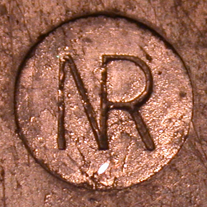
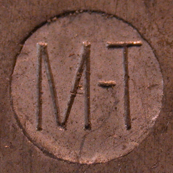
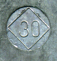
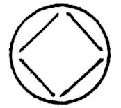
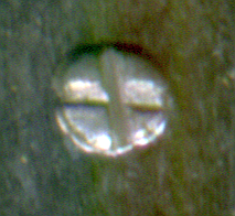
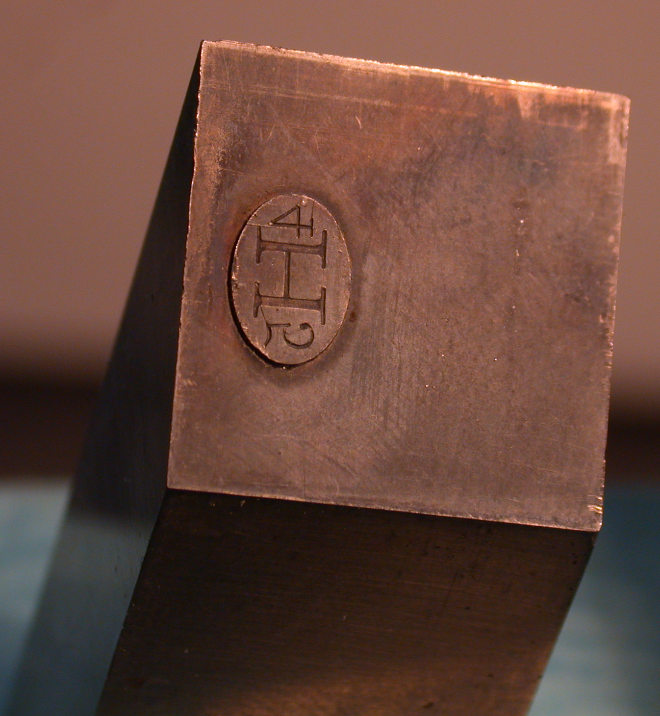
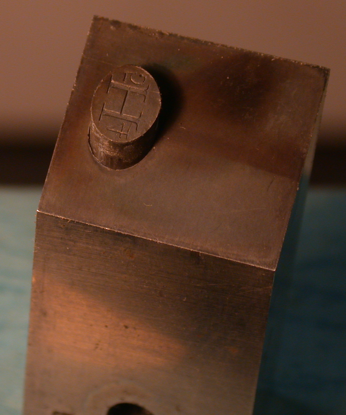
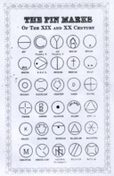
A "pin mark" is a distinctive, usually circular, depression which appears on the side of some (but not all) metal printing types. It may be relatively simple, as shown below left, or quite elaborate, as shown below right. It is only one of many features which may assist in the identification of type . Note in particular that it is characteristic of the earliest style of type casting machine (the pivotal type caster, introduced in the 1840s). It was not produced in types cast by most 20th century machinery.
(Both photographs by Richard L. Hopkins, Hill & Dale Private Typefoundry & Press.)
In greater detail: The confusingly named "discharging pin" (perhaps better called a "drag pin," as was done by John Carroll) is a stationary component of the mold of most versions of the pivotal type caster. [CAVEAT: I'm in the process of rewriting the pivotal caster Notebooks, so it is best not to follow this link right now, as it may lead to incorrect information.] When casting, it creates very shallow, usually circular, depression in the side of the type. It threfore provides a convenient place for the typefounder to engrave a trade or identifying mark which would therefore be cast into the type - the pin mark. The drag pin is not used on any other style of type casting machine, although in several cases typefounders have modified other machines to produce a mark on the type which is visually indistinguishable from a pin mark (but not a necessary by-product of the operation of the type casting machine). Typefounders, Inc. of Phoenix and Baltotype did this, for example.
While you can use a pin mark as nothing more than a graphic device to help identify type, it is best to understand what it really is. If you don't know, in detail, how a pin mark in a type is made and when it would or would not exist, and in particular if you belive that it is somehow produced by a moving pin as Henry Lewis Bullen wrongly claimed, you should first read ... [TO DO: add a section below briefly, graphically illustrating how a pin mark is made]
This page collects only pin marks. For the decorative markings on the tops of spaces and quads, see ../ Quads and Spaces -> Their Ornaments & Trade Marks.
The organization here, after the presentation of published sources, is first by country (type is heavy, and hard to ship) and then alphabetical by type foundry name. For the purposes of inclusion here, I pay no regard to casting equipment used. If you cast metal type, you are a typefounder.
I'll keep it all on one web page. This makes for a very long page, but the advantage is that it is easy to scan and search if you don't quite know what you're looking for.
This present Notebook is nothing more than a compilation and collation of the work of others.
Thanks are due to the following people for permission to use their photographs of pin marks in this compilation, for making photography of pins and pin marks possible, or for further information on and identification of particular pin marks (in alphabetical order):
Posthumous thanks are due to John S. Carroll and Herb Harnish for their pioneering work on the subject.
Most of the information about corporate names, dates, and locations of type foundries is from Maurice Annenberg's Type Foundries of America and their Catalogs, Second Edition, edited by Stephen O. Saxe (New Castle, DE: Oak Knoll Press, 1994). This is the standard reference work on the subject and should be in every typographer's library.
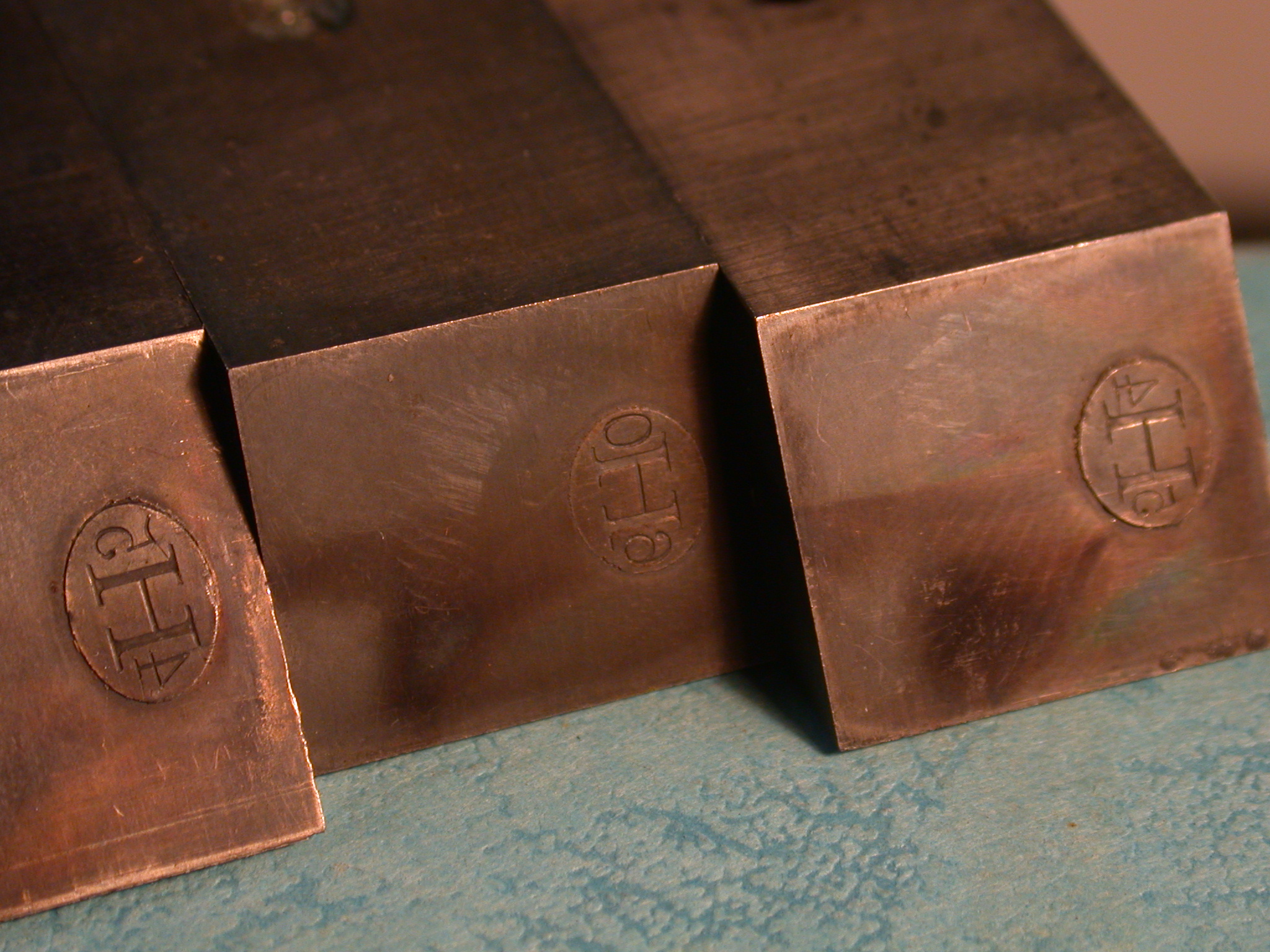
The photographs and drawings here are not to scale in relation to each other. I have cropped photographs so that just the pin mark shows, but so long as the original was more or less horizontal in most cases I have not rotated them for perfect horizontal alignment. I've left color photographs in color rather than converting them to monochrome as it is sometimes easier to see details in color, but I have not color-balanced (white-balanced) anything. When multiple examples occur for a particular foundry, their order here is random.
Despite the optical effects in some of the photographs, a pin mark is always a depression in the type's side; it is not raised. (The identifying marks cast on the tops of spaces and quads, which are not shown on this page, were sometimes raised.)
The dates given are approximate dates for the foundries as businesses. They do not necessarily identify the date of any particular pin mark. The pivotal type caster was not introduced until the 1840s, so of course before that date pin marks did not exist.
Unless noted otherwise, marks are (or are believed to be) shown with the type standing on its feet.
Especially for foundries in non-anglophone countries, the alphabetical order here is open to question. Often the descriptive part of the company name comes before the substantive part, but I'll file it under the latter Yet sometimes there are exceptions and I'll file it under the former. Thus "Schriftgießerei Benjamin Krebs Nachfolger" is filed under 'K' for Krebs. But "Aktiengesellschaft für Schriftgießerei und Maschinenbau" is filed under 'A' for Aktiengesellschaft (even though this means simply "Corporation") because it figured most prominently as the first word of their name in their literature.
In translating terms such as "nachfolger" (which indicates that the company was a successor to an earlier firm), I have adopted the English convention of putting such terms (in parentheses) after the main name. Thus: "Benjamin Krebs Typefoundry (Successors)"
Web note: If "Schriftgießerei" doesn't show up with an eszett ('ß'), or "Skriftstøberi" with a lower-case slashed 'o' ('ø'), make sure that the page encoding of your web browser is set to "UTF-8".
If (well, not if but when) I have made errors in translation, I would greatly appreciate a proper, idiomatic correction.
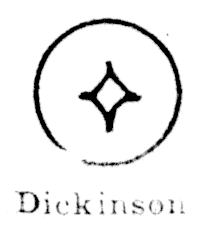
Note that especially in English and American practice there are often two names associated with a foundry: a usually more durable foundry name (e.g., the the Franklin Type Foundry or the Dickinson Type Foundry) and a business name which might change more frequently (e.g., Allison & Smith or Phelps, Dalton & Co.) Sometimes a foundry is now better known by its foundry name, sometimes by its business name.
Brief Glossary, German to English:
Brief Glossary, Danish to English:
My thanks to Jens Jørgen Hansen, Bogtrykker, for his glossary of Danish and German terms in his Briar Press posting at: http://www.briarpress.org/13362 (it contains more terms than those few cited here).
At present (2015) one of the best online collections of pin marks is the "pinmark" group on flickr.
I am aware of only four (and a half) published studies of pin marks. Two and a half of them (Carroll, Harnish, and "probably Harnish") are in the public domain and may be reprinted here; the other two (Lasko, Rehak) are in copyright and cannot.
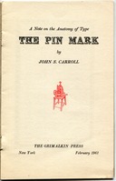
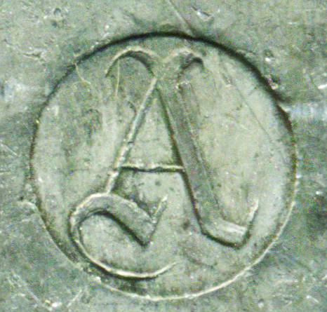
Carroll (1961)
Carroll, John S. The Pin Mark: A Note on the Anatomy of Type. (NY: The Grimalkin Press, 1961.)
Carroll was a practising typefounder who was involved with the revival of several 19th century type faces.
This was printed in an edition of 250 copies, 50 of which were privately distributed and 200 of which were incorporated into The Second Uncommonplace Book of the New York Chappel. The icon at left links to a PDF of this booklet from a scan of the copy owned by the late Paul Hayden Duensing. Thanks are due to Richard L. Hopkins for preserving it and making it available.
Here is a PDF of a photocopy of this booklet as incorporated into the New York Chappell's Uncommonplace Book. Thanks are due to Robert A. Mullen for making this available: carroll-the-pin-mark-1961-from-photocopy-0300rgbjpg.pdf
Note that while Carroll's description of the pivotal caster is correct (he was a practicing typefounder), the "squirt pot" that he attributes to Binny in 1811 is so far unattested anywhere else in the literature and is probably an error.
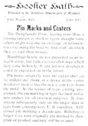
Harnish (1977)
Harnish, Herb. Hoosier Hash (June 1977) [entire issue]. (Fort Wayne, IN: Pumphandle Press, 1977)
Harnish was a noted collector of 19th century type.
In the discussions and extracts below, I will refer to this source as "Harnish".
The version reprinted here is from an older scan done by Richard L. Hopkins, to whom thanks are due for preserving it and making it available.
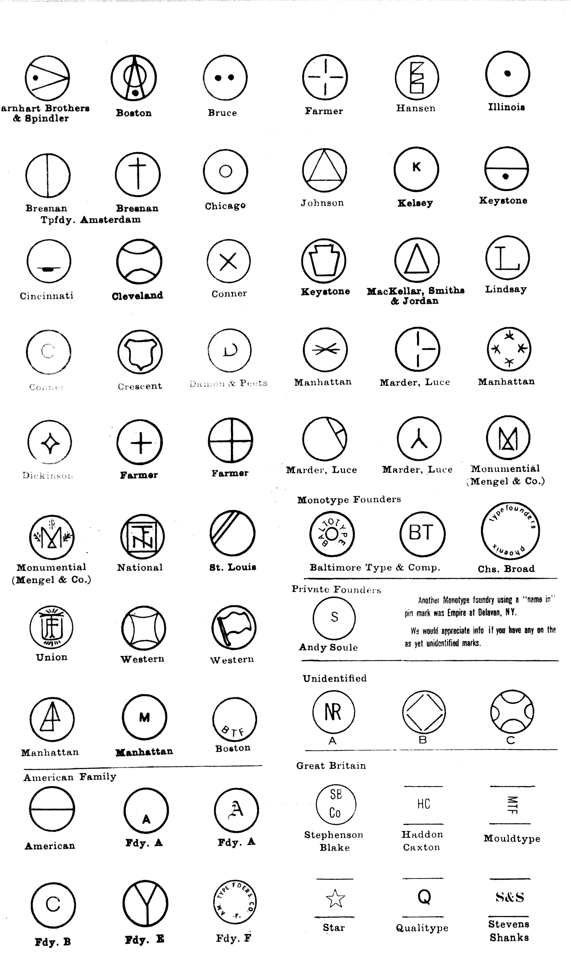
Chart, Probably by Harnish
This is a scan of a photocopy of a chart of pin marks from the files of Stephen O. Saxe. The origin of the chart itself is uncertain, but to me it looks to be the work of Herb Harnish. Every entry which is also in Harnish's "Pin Marks and Casters" essay in Hoosier Hash (see above) is an identical image in this chart. All of the other entries are in the same style and many of them are labeled using the same typewriter. I will therefore assume here that it was drawn and compiled by Harnish shortly after his "Pin Marks and Casters" article.
Most of the marks in it are shown elsewhere - but not all of them. It is also particularly useful because it gives a partial attribution for the 'L' mark of one of the two separate Lindsay foundries.
In the discussions and extracts below, I will refer to this source as "the chart probably by Harnish". While this usage is awkward, it is accurate.

Lasko. "Pin Marks, Nicks & Grooves." (1980)
Lasko, David. "Pin Marks, Nicks, & Grooves: Some Notes on the History of American Typefounding." Festina Lente: The Journal of the Melbert B. Cary, Jr. Graphic Arts Collection. Vol. 1, No. 1 (February 1980): 3-20.
This is the most comprehensive study to day, but it is still in copyright and I cannot reprint it. Unfortunately, copies of this short-lived journal are becoming increasingly difficult to find.
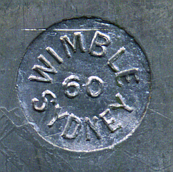
Wimble. Sydney, Australia. [At the moment I know nothing at all about this foundry.]
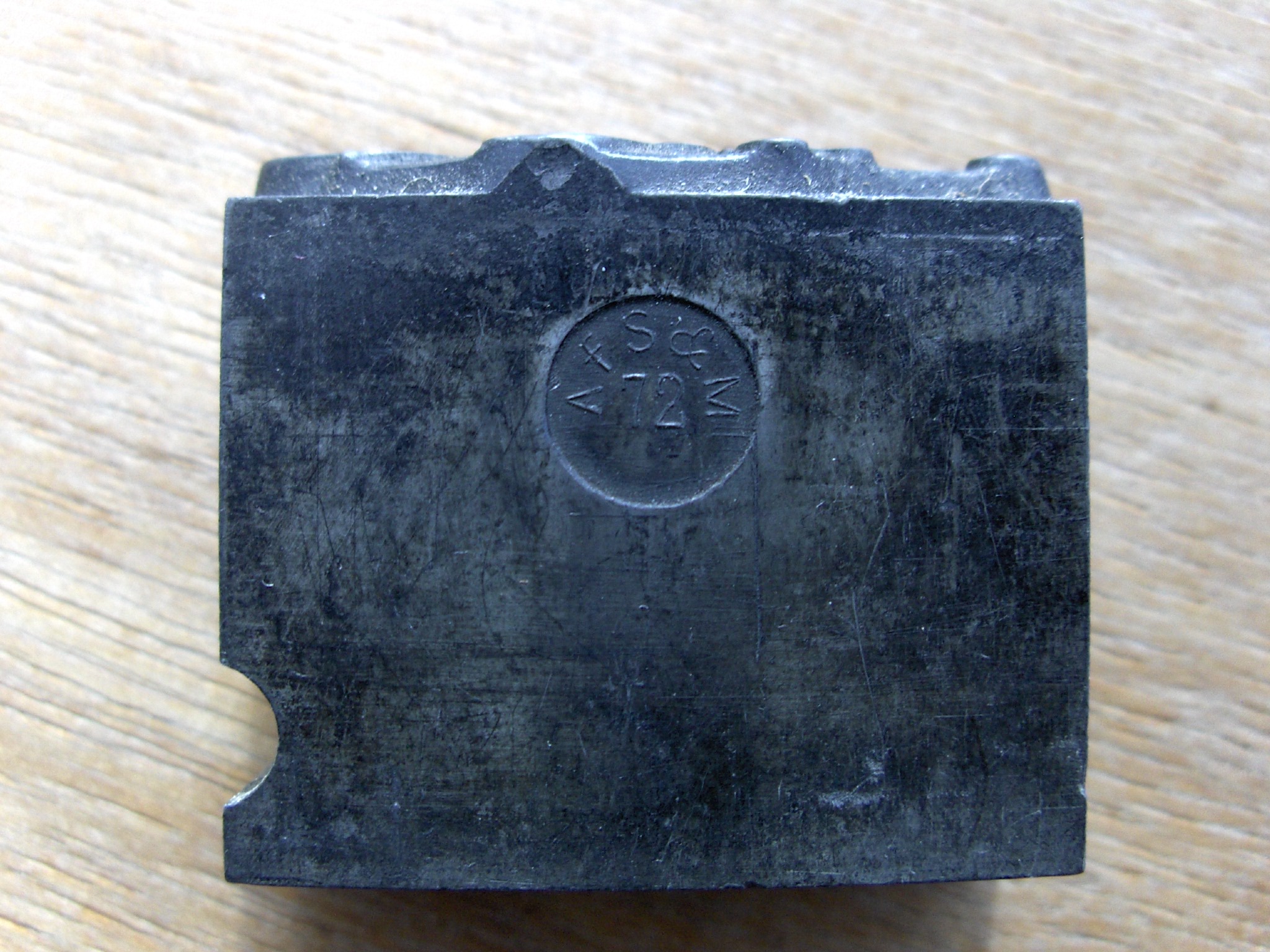
Aktiengesellschaft für Schriftgießerei und Maschinenbau. ("Corporation for Typefounding and Machine-Building [Mechanical Engineering]") Offenbach am Main, Germany. 1888 - 1922 (with final dissolution of the foundry ca. 1932-1936). Formerly J. M. Huch & Co. (since 1840). Acquired by Berthold AG in 1922.
(Photograph by Jens Jørgen Hansen, Bogtrykker, from his flickr posting at: https://www.flickr.com/photos/bogtrykkeren/4622391620/in/pool-pinmarks/ Clicking on the image above will show his un-cropped, full-size original photograph. Used by permission.)
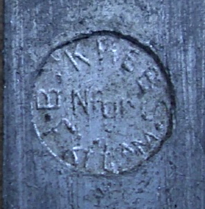
Schriftgießerei Benjamin Krebs Nachfolger. Frankfurt am Main, Germany. ("Benjamin Krebs Typefoundry (Successors)")
(Photograph by Jens Jørgen Hansen, Bogtrykker, from his flickr posting at: https://www.flickr.com/photos/bogtrykkeren/3518269083/in/pool-pinmarks/ Clicking on the image above will show his un-cropped, full-size original photograph. Used by permission.)
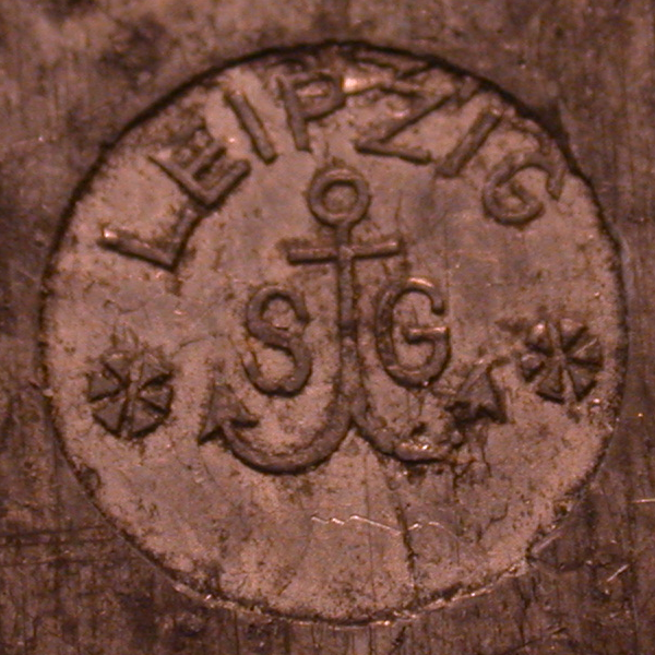
Schelter & Giesecke, Leipzig, Germany.
(Photograph by Richard L. Hopkins, Hill & Dale Private Typefoundry & Press.)
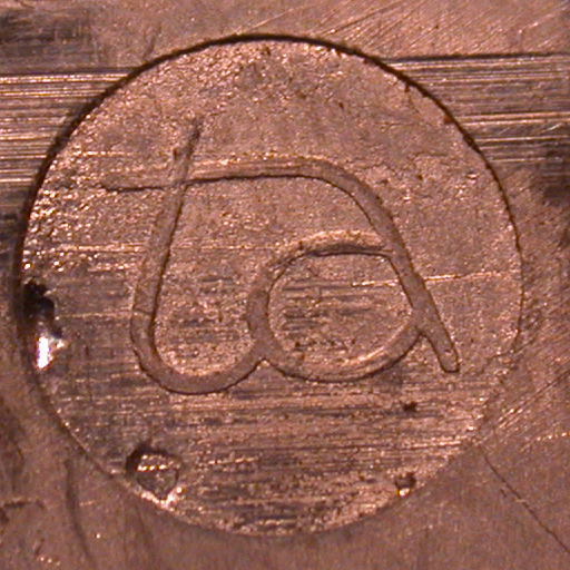
Lettergieterij Amsterdam / Typefoundry Amsterdam, Amsterdam, Netherlands. 1851-1984.
Note: In the 20th century, Typefoundry Amsterdam types were imported into the United States by, inter alia, Amsterdam Continental Types, Inc. (an American firm; an importer but not a type foundry) and sold by various American firms, including Castcraft / Typefounders of Chicago. Amsterdam Continental Types, Inc. should not be confused with the earlier American import firm Continental Typefounders Assn., Inc.
In the mark below, "ta" does not stand for "Typefoundry Amsterdam" (which is just the English translation of their 20th century business name, Lettergieterij Amsterdam). Instead, it stand for "Tetterode Amsterdam". Nicolas Tetterode (1816-1894) had been the owner of the foundry in the 19th century [ note: lommen], and in the 20th century they did business under the full firm name "Lettergieterij 'Amsterdam' voorheen N. Tetterode". My thanks to Jens Jørgen Hansen for clarifying this.
(Photograph by Richard L. Hopkins, Hill & Dale Private Typefoundry & Press.)
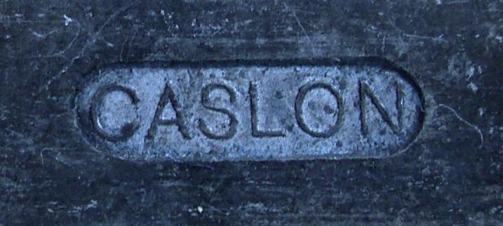
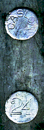
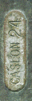
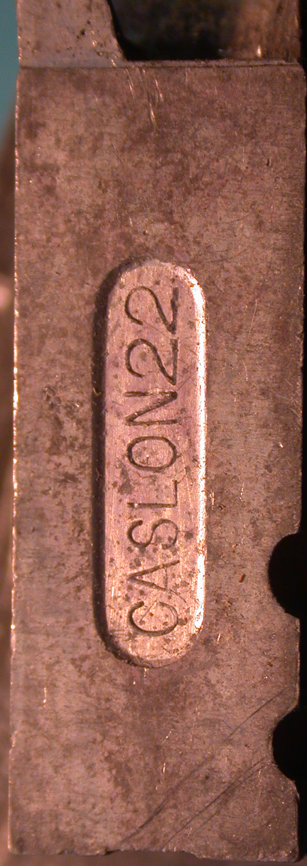
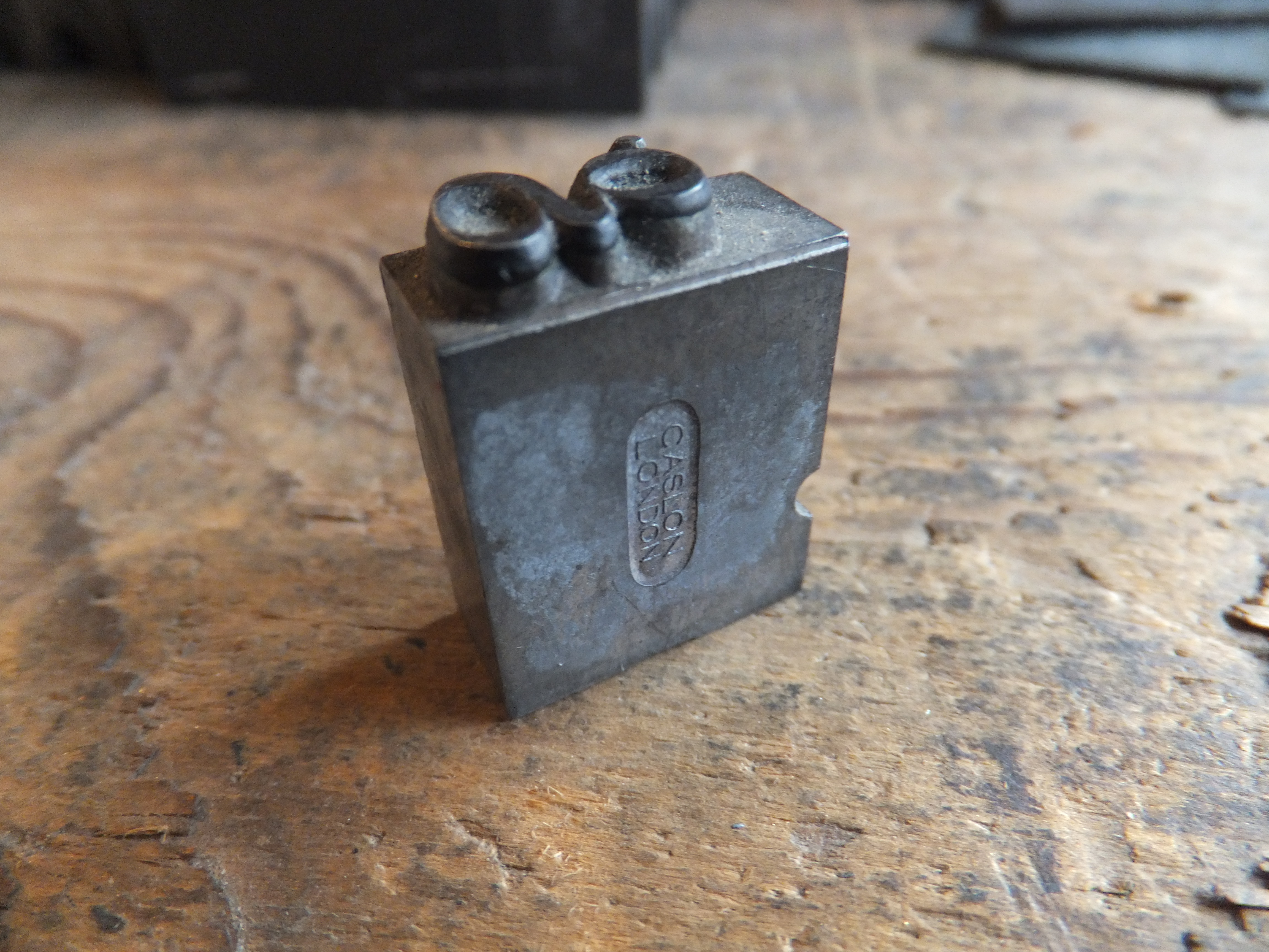
Caslon, London, UK. 1720-1937. This firm had a long corporate history (and a relatively complex one; at one point in the 18th century it split into two competing firms) with many corporate names. Even after its acquisition by Stephenson, Blake in 1937 the Caslon name continued as a foundry name.
Hansen identified the mark below as from a type by "H.V.Caslon." This should probably be "H. W." Henry William Caslon was admitted to partnership in the firm at by 1839, and at some point after that the firm name changed to "H. W. Caslon & Co." Henry William Caslon died in 1874, but the firm contined as "H. W. Caslon & Co." From 1900 to 1937 it was "H. W. Caslon & Co., Ltd." I do not know the orientation of this mark on the type.
(Photograph by Jens Jørgen Hansen, Bogtrykker, from his flickr posting at: https://www.flickr.com/photos/bogtrykkeren/3519078298/in/pool-pinmarks/ Clicking on the image above will show his un-cropped, full-size original photograph. Used by permission.)
The mark on the type at right below is oriented vertically along the type.
(Photograph by Richard L. Hopkins, Hill & Dale Private Typefoundry & Press.)
The type on which the pin mark shown below appears is further interesting because, while cast by a London foundry, it bears a nick on the "top" side of the type as more commonly seen on the Continent.
(Photographs by Jens Jørgen Hansen, Bogtrykker, from his flickr posting at: https://www.flickr.com/photos/bogtrykkeren/8450548655/in/pool-pinmarks/ Clicking on either image above will show his un-cropped, full-size original photograph. Used by permission.)
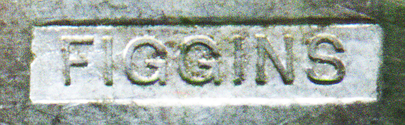
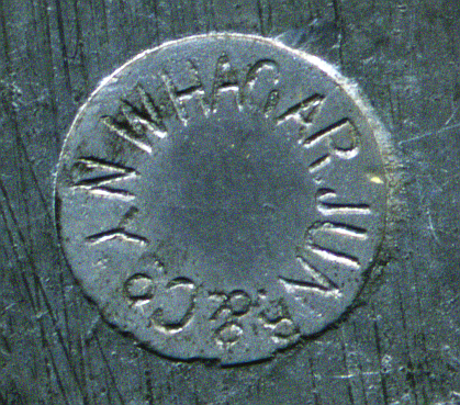
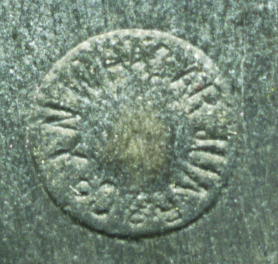
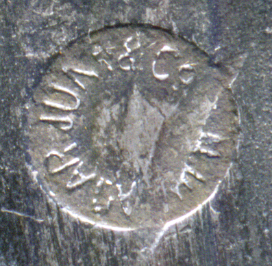
Figgins London. 1792 - 20th century.
The mark on the type below is oriented vertically along the type.
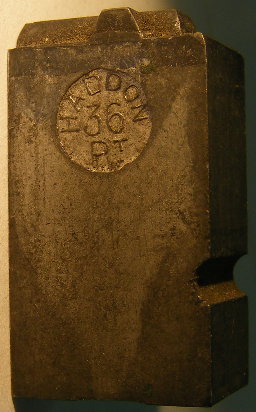
The Caxton Type Foundry, Haddon & Co. [by 1895] - 1939? London. Walter Haddon. John Haddon & Co. An early adopter in England of the American Point System (when, for example James Figgins, head of V. & J. Figgins, was still objecting to it).
(From the chart probably by Harnish.)
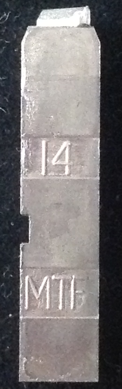
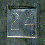
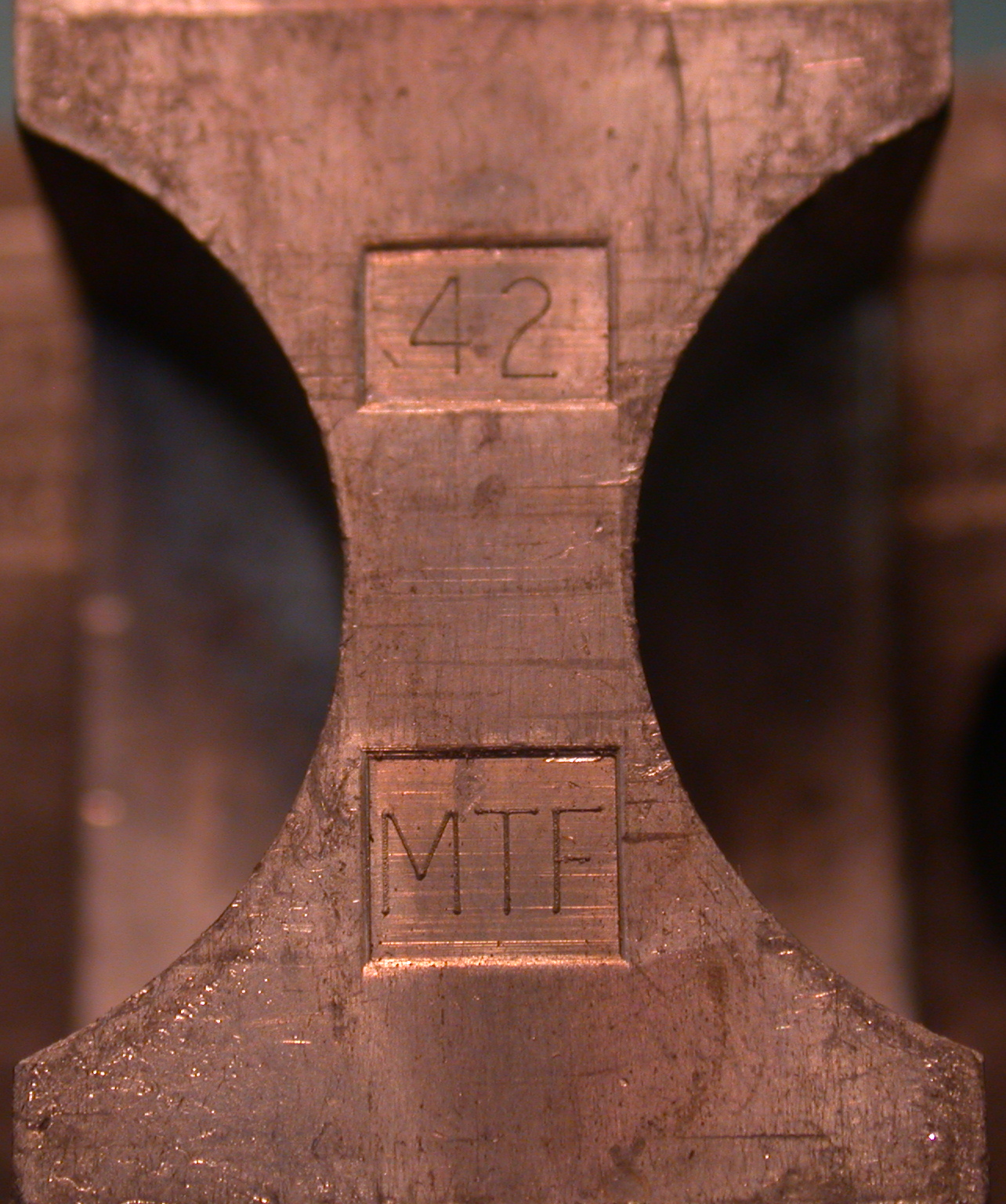
Mouldtype. ? - ca. 1992. Dunkirk Lane, Preston, Lancashire. Type imported into the United States by Amsterdam Continental Types, Inc.. My understanding is that when they closed, their machines went to a museum in Japan.
Here is a type from a font of 14 point Bembo cast on a Super Caster by Mouldtype. In addition to the pin mark, it shows the flat bottom and square/rectangular Nick characteristic of the Super Caster, as well as a beveled or sloped Shoulder.
(Photograph by David Bolton, Alembic Press.)
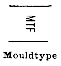
My thanks to David Bolton (Alembic Press), for identifying as Mouldtype the square mark (usually with point size) and the "MTF".
(Photograph by Richard L. Hopkins, Hill & Dale Private Typefoundry & Press.)
(From the chart probably by Harnish.)
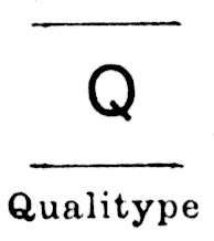
Qualitype. England. At present I know of this foundry only through the pin mark shown in the chart probably by Harnish.
(From the chart probably by Harnish.)
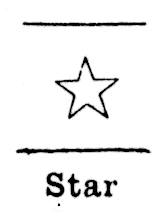
Startype. By 1950 - late 1980s. Birstall, West Yorkshire, Great Britain. HOrsfall & Sons (Startype) Ltd. Some machines to Supertype (Brian Horsfall).
(From the chart probably by Harnish.)
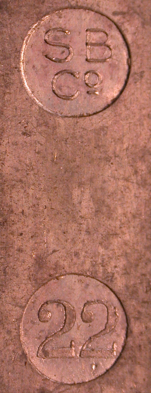
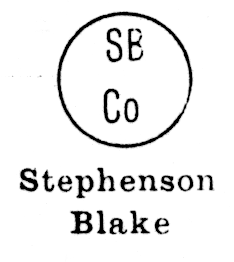
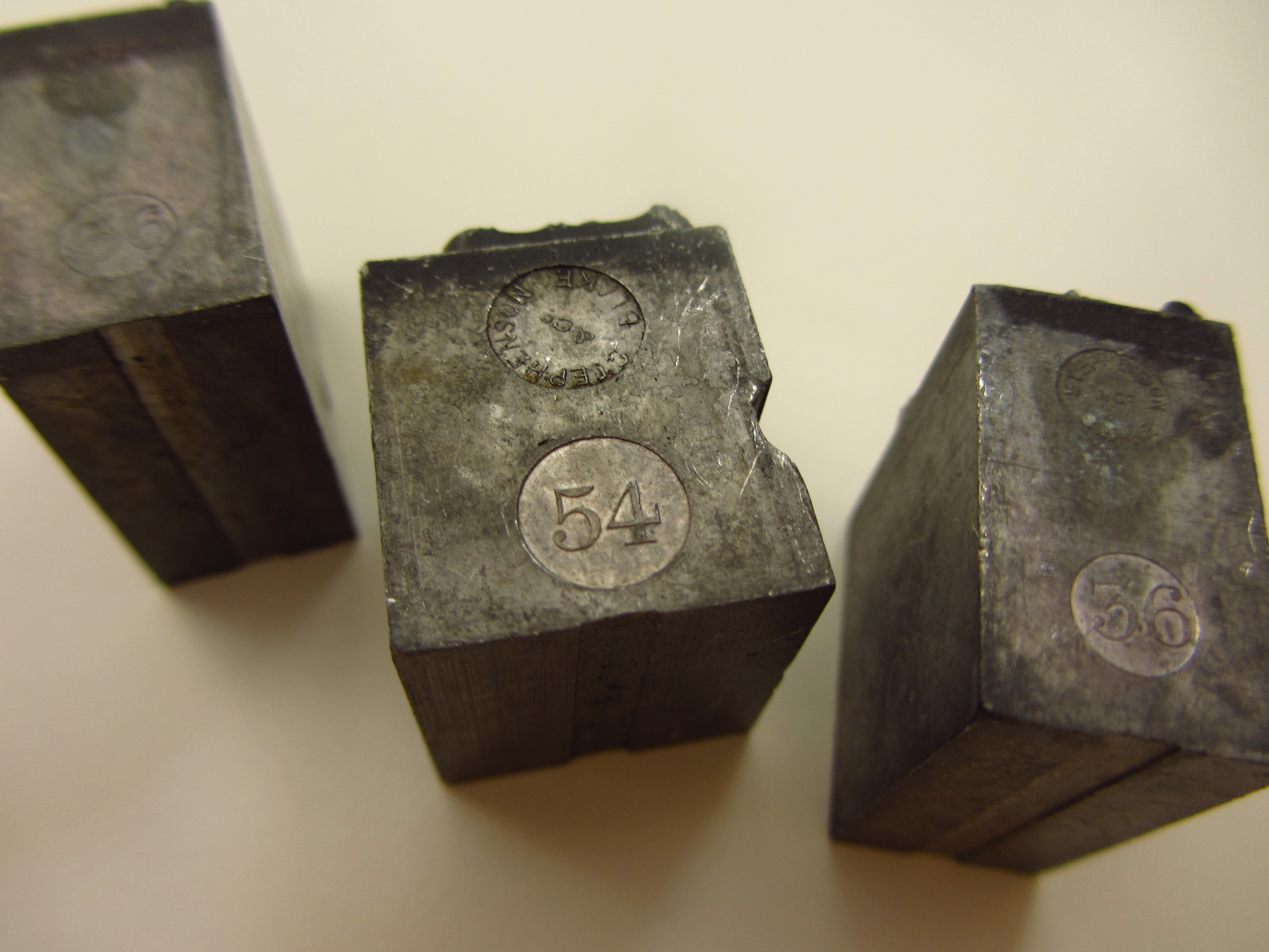
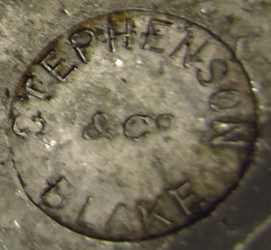
Stephenson, Blake, Sheffield and London, UK. 1818-1996.
Roy Millington has written an excellent book on the long history of this foundry, Stephenson Blake: The Last of the Old English Typefounders. (New Castle, DE and London: Oak Knoll Books and The British Library, 2002.)
(Photograph above left by Richard L. Hopkins, Hill & Dale Private Typefoundry & Press. Image above right from the chart probably by Harnish.)
(Both images are by Lars Schwarz, from the pinmarks flickr group at: https://www.flickr.com/photos/bitrocker/6963077384/in/pool-pinmarks/ License: Creative Commons Attribution-NonCommercial-ShareAlike 2.0 The image above left is simply cropped from Lars' original photograph. The one above right has been substantially (albeit rather crudely) processed by me.)
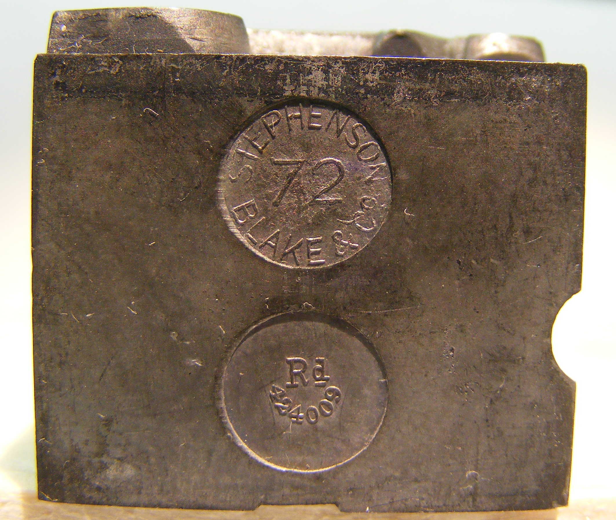
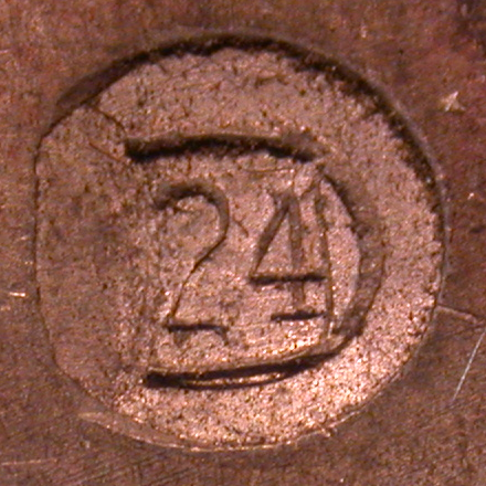
Finally, here is a small collection of Stephenson, Blake types each of which bears a "Rd" pin mark indicating their design registration with the (English) Board of Trade. See the section on similar "Rd" marks by MacKellar, Smiths and Jordan, below for information on them and procedures for researching them. (The American firm MSJ also registered some of their type designs in England.) Thanks are due to Gregory Jackson Walters for solving the puzzle of these "Rd" marks.
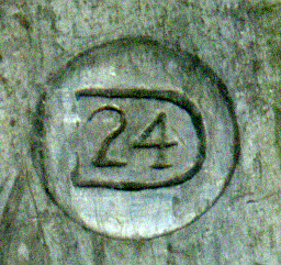
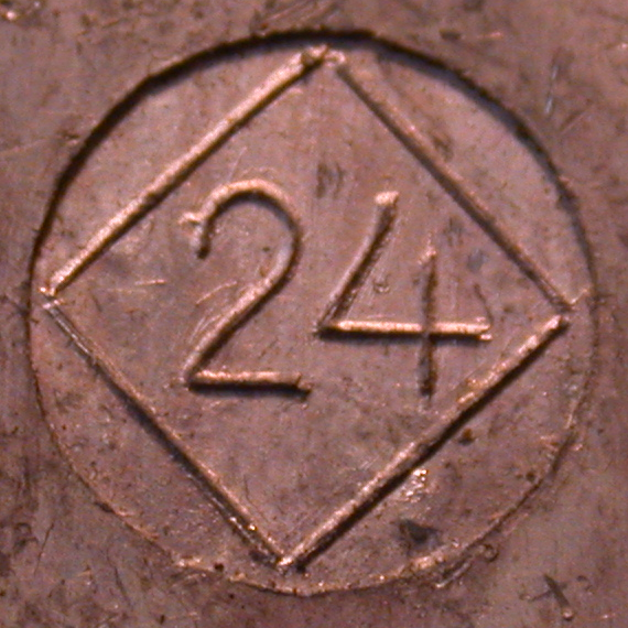
All of the types in the top row of the photograph below (72pt two-color, 42 [not 48] pt two-color, 24 pt individual [I may simply be missing its counterpart], 24 pt matched pair, and 18 pt matched pair) bear pin marks with "Rd 424009". Curiously, the 36 pt matched pair in the bottom row have the number 479817, even though they are identical in design to the 18 pt size of 424009.
(Photographs by DMM, CircuitousRoot.)
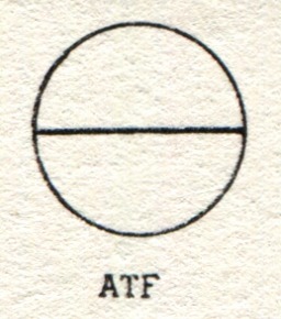
ATF, various locations. 1892-1993.
Several pin marks were used by ATF. Initially I would guess that the surviving constituent foundries continued to use their own pin marks until they were consolidated, although I have no evidence of this one way or the other. ATF first consolidated the surviving operations into a smaller number of manufacturing foundries in the period 1892-1903. (This process began before Nelson took charge.) These manufacturing foundries were associated with cities. Internally, they were assigned letter codes (A through H, and then J for the Bruce foundry when acquired). These were used within the company only (for example, in designating molds), not externally in published literature. It would appear that we know of them today primarily through the research of Stevens L. Watts, who passed this knowledge on to Paul Hayden Duensing and others, and the work of Theo Rehak. See the Notebook on ATF Early History through 1906 for details on this. After the consolidation into a single plant in New Jersy from 1902 to 1906, ATF introduced additional pin marks (most notably that for the "American Line" of re-aligned faces first shown comprehensively in the 1906 specimen book).
The letter codes for the manufacturing foundries in the 1890s were:
Several of the smaller foundries of the original 23 may simply have been closed, without contributing material to the surviving manufacturing foundry in their city; these are noted below by city. Two of the original foundries were not in any of the cities where foundries survived, and may not have contributed materials to any of them:
ATF acquired four other foundries between 1892 and its consolidation into a single plant in 1903/1904. Bruce's New York Type Foundry (purchased 1900) received its own letter designation and was operated independently until the full consolidation into a single plant in 1906. The other three did not receive letter designations, and the manner of the consolidation of their materials into ATF, if any, is unknown:
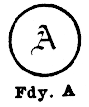
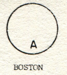
ATF Foundry A (Boston). Consolidating (in 1894) the Dickinson Type Foundery (Phelps, Dalton) and the Boston Type Foundry.
(Left image by Stephen O. Saxe. Right drawing from the chart probably by Harnish.)
(Left from Carroll, who identifies it only as "Boston", right from Harnish.)
The chart probably by Harnish shows the same image as that of Harnish shown above right.
Drawn in Lasko in a form similar to that of Carroll.
Drawn in Rehak in a form similar to that of Carroll, and identified as "BOSTON (EARLY)".
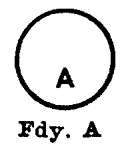
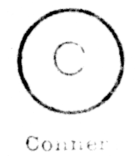
ATF Foundry B (New York). Consolidating the United States Type Foundry of James Conner's Sons with (in 1895) North-Western Type Foundry of Benton, Waldo & Co. (formerly of Milwaukee).
The P. H. Heinrich / Manhattan foundry and the A. W. Lindsay foundry, both of which were part of the original ATF amalgamation, were not mentioned explicitly by name in the ATF annual reports from 1893 on, and may or may not have contributed materials to Foundry B. The 1894 ATF Annual Report says that "The departments of the company in New York, including ... the Conner Type Foundry, ... have been collected in the Rhinelander Building..."
This ATF manufacturing foundry never included the Lindsay Type Foundry (a separate concern) or Bruce's New York Type Foundry (which remained independent until acquired separately circa 1900 and given its own letter designation, J (see below)).
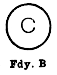
The dominance of the former Conner foundry explains the somewhat confusing situation where the pin mark from Foundry B is 'C'):
(Left from Carroll, right from Harnish)
(From the chart probably by Harnish. He shows this mark twice, once as "Conner" and once as ATF Foundry B. I presume that both are ATF Foundry B. The size of the 'C' in this "Fdy. B' drawing is one of the few cases in the chart where the image differs (slightly, to no import) from that in Harnish (though the typewriter used remains the same).
See also Unidentified Nos. 17a, 17b, & 17c at the end of this Notebook.
Drawn in Lasko in a form similar to that of Carroll.
Drawn in Rehak in a form similar to that of Carroll.
ATF Foundry C (Philadelphia). Consisting of the MacKellar, Smiths & Jordan Type Foundry.
The Collins & M'Leester [aka McLeester] foundry, which was in Philadelphia at the time of the ATF amalgamation, was consolidated in 1895 with either the Baltimore Type Foundry or the ATF Baltimore operations (which were consolidated primarily out of the Ryan foundry). See the section on ATF Foundry H (Baltimore) for a more detailed look at ATF's consolidations in Baltimore.
The Philadelphia Type Foundry of Pelouse & Co., which was a part of the original ATF amalgamation, was not mentioned in the ATF annual reports from 1893 on, and may or may not have contributed materials to Foundry C.
(Aside: MacKellar, Smiths and Jordan, which could lay claim to being the oldest continually operating type foundry in the United States, seems to have attempted to keep their independence as long as possible. The smaller Philadelphia foundry, Collins & M'Leester, was moved to Baltimore rather than being merged into them. As late as 1896 MSJ managed to publish a corporate history celebrating their centennial without ever mentioning the ATF or its other foundries in the text itself - while at the same time illustrating Barth Type Casters developed at the Cincinnati Type Foundry).
ATF Foundry D (Cincinnati). Consolidating the Cincinnati Type Foundry and the Franklin Type Foundry of Allison & Smith. This consolidation began in 1894 and was complete by 1895 (according to the ATF Annual Reports of those years).
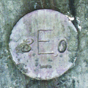
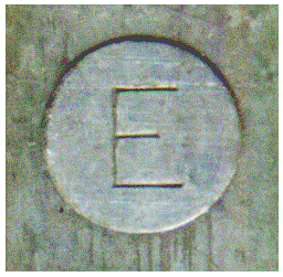
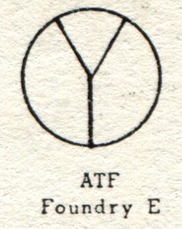
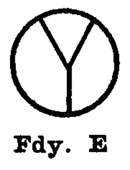
ATF Foundry E (Chicago). Consolidating The Chicago Type Foundry of Marder, Luse & Co. with (in 1895) The Cleveland Type Foundry of H. H. Thorp Mfg. Co.
The Union Type Foundry (Chicago), which was a part of the original ATF amalgamation, was not mentioned in the ATF annual reports from 1893 on, and may or may not have contributed materials to Foundry E.
(Left from Carroll, right from Harnish)
The chart probably by Harnish shows the same image as that of Harnish shown above right.
Drawn in Lasko in a form similar to that in Carroll.
Drawn in Rehak in a form similar to that in Carroll.
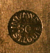
ATF Foundry F (St. Louis). The two St. Louis type foundries of the original amalgamation, the Central Type Foundry and the St. Louis Type Foundry consolidated into one operation at some point after 1895 but before 1897. The Central, in particular, was notable as one of the most successful foundries of its era and for having produced the first matrices made by pantographic methods (in 1882, before Benton).
(From the chart probably by Harnish.)
ATF Foundry G (San Francisco). This consisted of the sole ATF house in San Franciso, Palmer & Rey
This manufacturing foundry did not include the other two foundries in San Francisco at the time, the California Type Foundry and the Pacific States Type Foundry. However, the "molds and machinery" (but not the business) of the California Type Foundry were acquired by ATF at the demise of that foundry circa 1898-1904.
ATF Foundry H (Baltimore). This consisted primarily of the former John RyanType Foundry. The details of the consolidation of the other Baltimore type foundries are complex and poorly documented.
In the 1895 ATF Annual Report, the Collins & McLeester [sic] foundry is noted as having been "... consolidated ... with the Baltimore ..." This might mean that the Collins & M'Leester foundry (of Philadelphia) was consolidated with the Baltimore Type Foundry (Charles J. Cary & Co.), but it might simply mean that it was consolidated into the ATF Baltimore operation.
Further, at the time of the ATF amalgamation in 1892, the Baltimore Type Foundry / Charles J. Cary & Co. included the Washington Type Foundry (Washington, DC). I have discovered no information on the consolidation of the materials of the Washiongton Type Foundry into ATF, if indeed their materials were preserved.
I have found no indication of when the Baltimore Type Foundry was consolidated into the ATF Foundry H, if indeed its materials were used and not scrapped.
Finally, there were two other Baltimore type foundries in the original ATF amalgamation:
It is not clear that the materials of these foundries were consolidated in the ATF Baltimore operation. Indeed, Annenberg was unable to discover any information at all about Hooper, Wilson & Co.
The left photograph below is of a pin mark of ATF Foundry H (Baltimore). My thanks to Bob Mullen (Xanadu Press) for confirming this. For comparison, the photograph below right is of a pin mark of the former John Ryan Type Foundry (Baltimore). Note the similarity.
(Photographs by Richard L. Hopkins, Hill & Dale Private Typefoundry & Press.)
ATF Foundry J. Bruce's New York Type Foundry. This was purchased in 1900 and it received its own letter designation. It was operated independently until the full consolidation of ATF into a single plant in 1906.
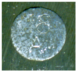
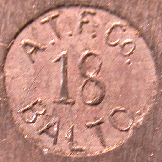
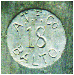
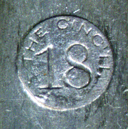
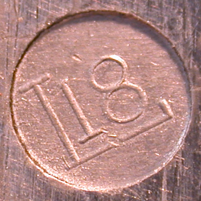
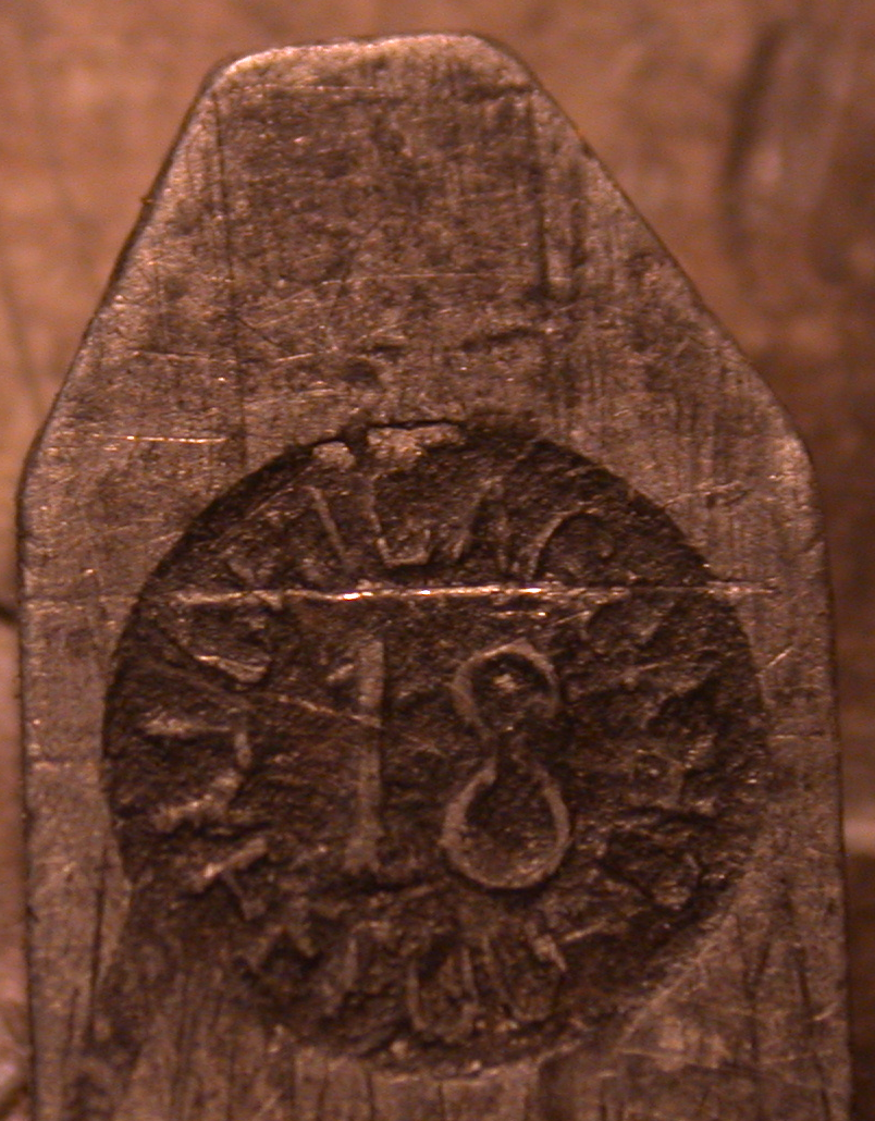
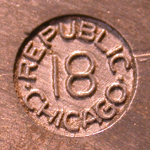
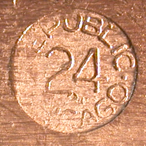
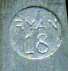
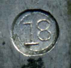
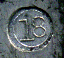
ATF "American Line" (circa 1905 on):
(Left photograph by Richard L. Hopkins, Hill & Dale Private Typefoundry & Press. The line is horizontal (with the type standing on its feet) in the original photograph from which this is cropped. Right photograph by DMM. This is of a sort from a font of 14 point ATF Wedding Text.)
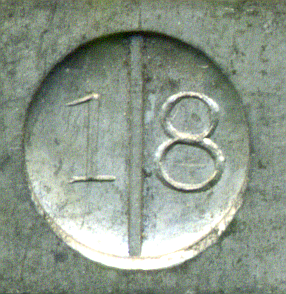
In the image below, the line is in fact horizontal as the type stands on its feet. It is shown here vertically to make the "18" easier to read.
The chart probably by Harnish shows a mark effectively the same as that shown by Carroll.
Drawn in Lasko in a form similar to that in Carroll.
Drawn in Rehak in a form similar to that in Carroll.
Harnish shows an identical horizontal-line pin mark, calling it simply "AMERICAN".
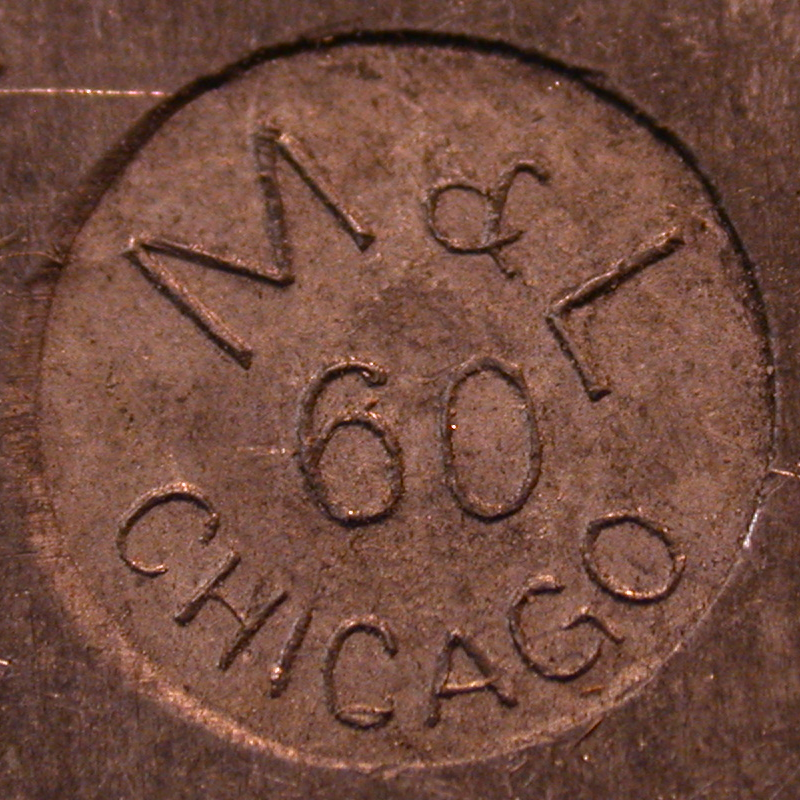
In a discussion thread on "BriarPress" in January 2015, Barbara Hauser presented an image of an ATF pin mark which carried the text "AMERICAN" in a semicircle with the body size "60" just below center in the middle. This pin mark was used in the types for the ATF "Holiday Decorators" four-color ornament, Nos. 813, 814, 815, and 816. These were shown in the ATF special Christmas cut catalog in the 1930s.
Here is a link to the BriarPress thread showing this pin mark: http://www.briarpress.org/41251
In this discussion thread, David Greer, proprietor of the T. J. Lyons Memorial Type Collection, posted a link to a photograph of this ATF holiday specimen page on his web site: https://www.flickr.com/photos/39182740@N04/6653507857/sizes/o/in/set-72157628761783663/
At present this foundry is attested only by a drawing of its pin mark in Rehak (p. 196). The mark he draws consists of the point size, centered, plus the text "THE ATLANTIC TYPE FOUNDRY" in an arc around the outside of the pin's circle.
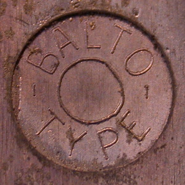
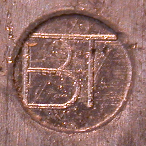
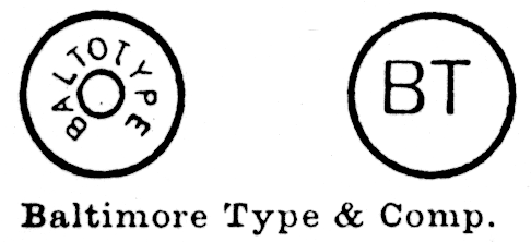
Baltotype, Baltimore, MD. ? - 1978.
Note: Baltotype pin marks were not necessarily produced by a pivotal type caster.
(Photograph by Richard L. Hopkins, Hill & Dale Private Typefoundry & Press.)
(From the chart probably by Harnish.)
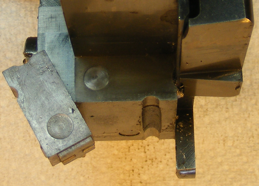
The two photographs below show a "pin" as installed on a Thompson Type Caster "Type Body Piece" (sometimes informally called the "point blade") at Baltotype. As noted earlier, the Thompson does not require a drag pin, and this pin plays no functional part in its casting operation. It is a non-standard addition used solely to provide what appears to be a pin mark on the type.
Rich Hopkins, who was involved with the winding-down of Baltotype and who acquired some of its materials, notes that the pin mark alterations for Baltotype's Thompsons and Giant Casters were done by the Hartzell Machine Works, a major supplier of third-party and remanufactured Lanston Monotype parts.
(Photograph by Richard L. Hopkins, Hill & Dale Private Typefoundry & Press.)
Drawn in Lasko with a large "BT" as distinct letters, much as it appears in the second version in the chart probably by Harnish.
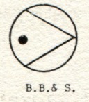
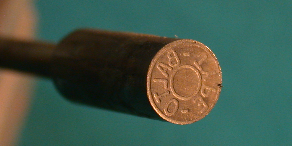
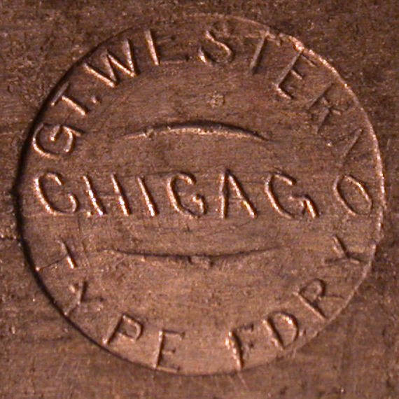
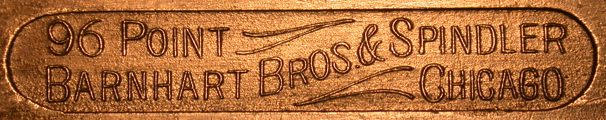
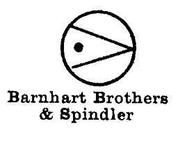
The Great Western Type Foundry of Barnhart Brothers & Spindler, Chicago, IL. 1873-1911. Purchased covertly by ATF and run under its own name 1911-1929.
(Photograph by Richard L. Hopkins, Hill & Dale Private Typefoundry & Press.)
(Photograph above left by Richard L. Hopkins, Hill & Dale Private Typefoundry & Press. Photograph above right by DMM, CircuitousRoot.)
The one below is so lovely I'll show both the pinmark and a view of the complete type.
(Both photographs by Richard L. Hopkins, Hill & Dale Private Typefoundry & Press.)
(Photograph by Richard L. Hopkins, Hill & Dale Private Typefoundry & Press.)
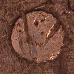
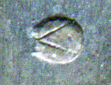
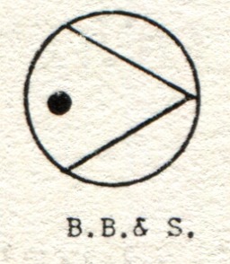
I believe that the image below left is a damaged BB&S pin mark rotated 90 degrees from its conventional orientation. The image below right (shown here at full resolution; you can't click on it) is clearly a BB&S mark.
(Left photograph by Richard L. Hopkins, Hill & Dale Private Typefoundry & Press. Right image by Stephen O. Saxe.)
(Left from Carroll, right from Harnish)
The chart probably by Harnish shows the same image as that of Harnish shown above right.
Drawn in Lasko in a form similar to that of Harnish, but with the small dot as an open circle.
Drawn in Rehak in three forms:
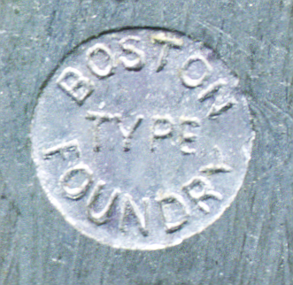
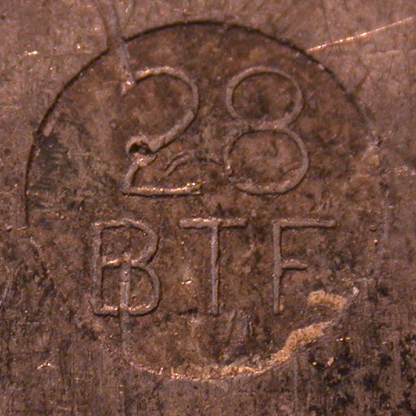
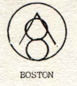
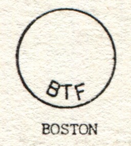
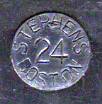
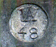
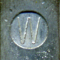
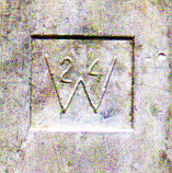
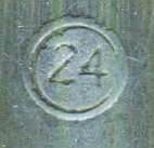
Boston Type Foundry, Boston, MA. 1817-1892.
In the early 1840s, the Boston Type Foundry was the first commercial user of the second, more successful, version of Bruce's pivotal type caster.
(Photograph by Richard L. Hopkins, Hill & Dale Private Typefoundry & Press.)
(Photographs by Richard L. Hopkins, Hill & Dale Private Typefoundry & Press.)
The chart probably by Harnish shows the same image as that of Harnish shown above and a mark very similar to the "BTF" mark shown by Carroll.
Drawn in Lasko forms the same as Carroll's second example (a small "BTF" along the bottom) and Harnish (but with small dot as an open circle).
Drawn in Rehak in two forms. The first is a form similar to that of Carroll's second drawing (that is, "BTF" in an arc at the bottom), but with a large centrally placed point size. The second is a form similar to that of Carroll's first drawing (inverted 'V' with an '8') except that the '8' in Rehak does not touch the edge of the circle.
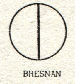
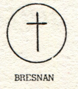
See Walker/Pelouze/Bresnan. A complex history. 1856-1882 Walker & Pelouze (NY). [1856 founded Richmond, VA branch; this became the Richmond Type Foundry] 1882-1890 Walker & Bresnan (NY). 1890-1895 P. H. Bresnan (NY). Disssolved; did not join ATF.
Harnish shows these same two pin marks (vertical line, cross) for "Bresnan".
The chart probably by Harnish shows the same two images as Harnish.
Both forms also drawn in Lasko.
Drawn in Rehak in two forms, each similar to Carroll's drawings (a single vertical line, and a Latin cross).
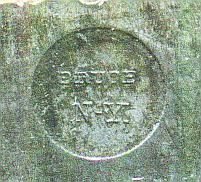
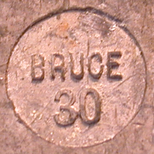
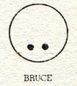
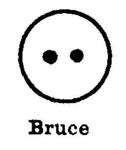
Bruce's New York Type Foundry. NY. 1813-1900/1901.
(Photograph by Richard L. Hopkins, Hill & Dale Private Typefoundry & Press.)
(Left from Carroll, right from Harnish)
The chart probably by Harnish shows the same image as that of Harnish shown above right.
Also drawn in Lasko in the form shown by Carroll.
Rehak draws a mark similar to the one shown by Carroll (two dots near the bottom), but in Rehaks' drawing the dots are more widely spaced and the point size appears centered on the mark.
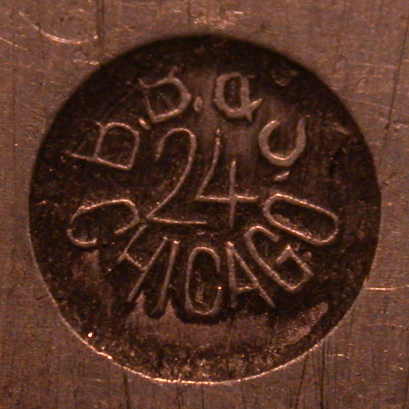
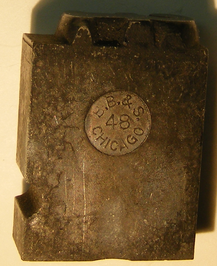
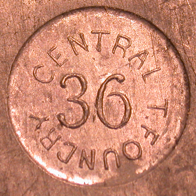
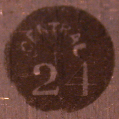
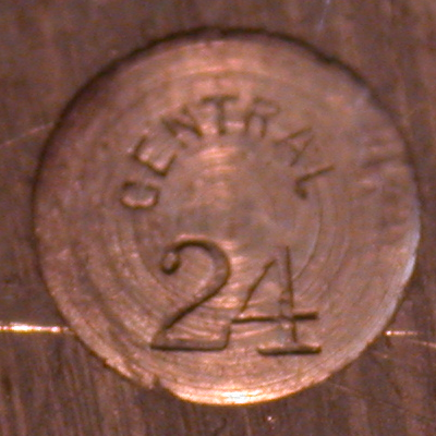
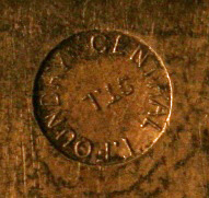
Central Type Foundry, St. Louis, MO. 1870/2 - 1892. James A. St. John and Carl Schraubstadter, Sr.
(Photographs by Richard L. Hopkins, Hill & Dale Private Typefoundry & Press.)
(Photograph by Richard L. Hopkins, Hill & Dale Private Typefoundry & Press.)
(Photograph by Robert A. Mullen, Xanadu Press.)
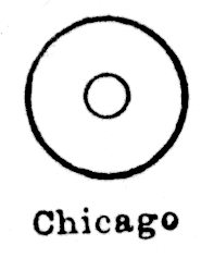
Chicago. 1855 - ca. 1860/1863. Chicago Type Foundry. Became Marder, Luse (q.v., below).
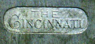
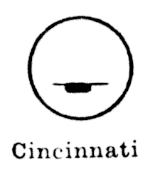
Cincinnati Type Foundry, Cincinnati, OH. 1817-1892.
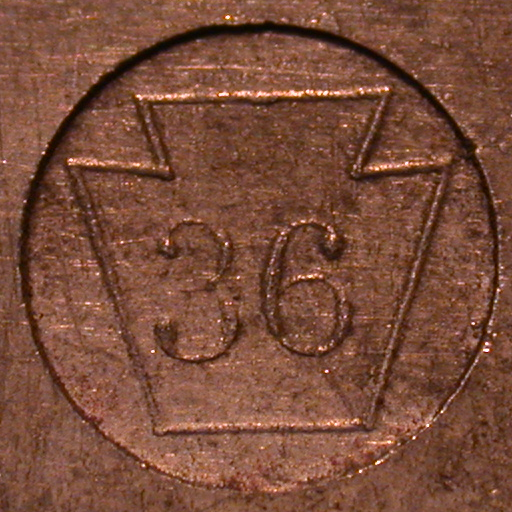
The pin mark on the type shown below is oriented horizontally on the type as it sits on its feet (it is a 36 point ornament).
(Photographs by Richard L. Hopkins, Hill & Dale Private Typefoundry & Press.)
(From the chart probably by Harnish; not shown in Harnish.)
Lasko notes several text pin marks, and draws one which is equivalent to the one shown inthe chart probably by Harnish, above (looking exactly like the musical notation for a whole rest).
Rehak draws a mark which is generally similar to the first photograph by Hopkins, but with "FOUNDRY" in full rather than "F'DRY". (Of course, the mark shown by Rehak is for 32 point type, so there's more room on it.)
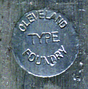
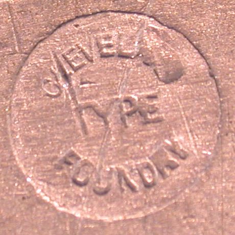
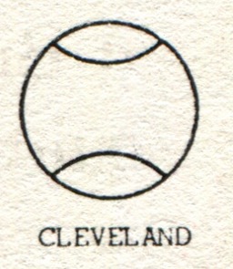
Cleveland Type Foundry, the H. H. Thorp Mfg. Co. Cleveland, OH. 1875-1892.
(Note: After the 1892 amalgamation of ATF, the Cleveland foundry was consolidated in 1895 into ATF Foundry E in Chicago.)
(Photograph by Richard L. Hopkins, Hill & Dale Private Typefoundry & Press.)
Harnish shows a mark essentially identical to that shown by Carroll.
The chart probably by Harnish shows the same images as in Harnish.
Drawn by Lasko in a form similar to that of Carroll.
Drawn by Rehak in a form similar to that of Carroll.
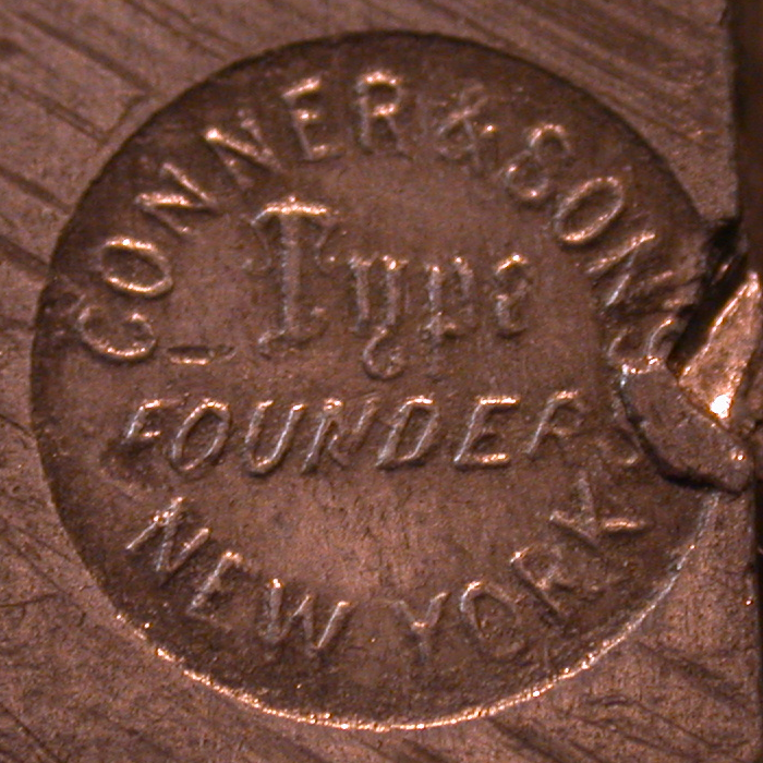
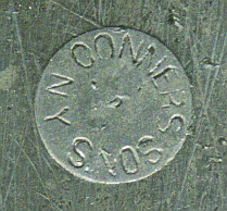
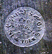
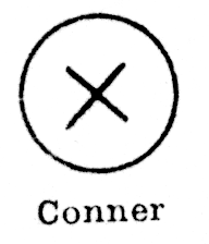
The United States Type Foundry [Connner's]. NY. From 1829 Conner & Cooke Type & Stereotype Foundry. From ca. 1841 James Conner & Son. After 1861 James Conner's Sons.
(Photograph by Richard L. Hopkins, Hill & Dale Private Typefoundry & Press.)
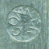
(From the chart probably by Harnish.)
The chart probably by Harnish also shows a mark for Conner which is a large letter 'C'. I have presumed that this is really ATF Foundry B and have placed it there. (And, indeed, lower down on the same chart (which looks itself to be a composite photocopy of several charts) it is identified as "Fdy. B".)
Lasko draws as well a mark which consists of a simple X, as in the example from the chart probably by Harnish, above (he notes that in some examples he's seen this 'X' also includes the word "CONNER").
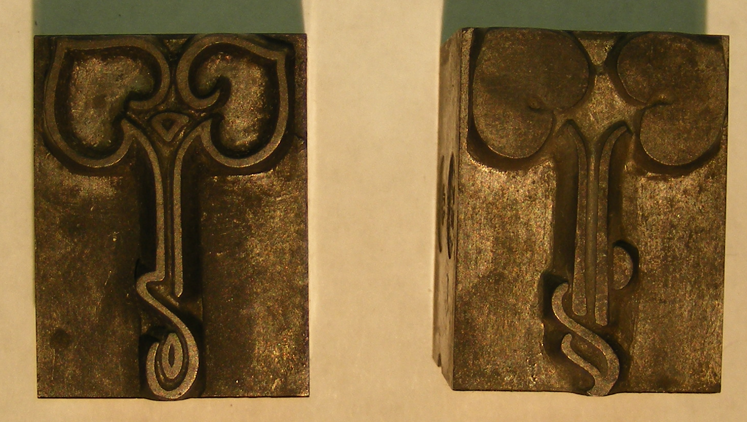
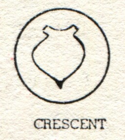
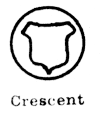
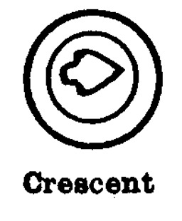
Crescent Type Foundry. Chicago, IL. 1895 - ca. 1900. The history of this foundry is still obscure, but the account of it in Annenberg seems to have been overly simplified. The Crescent Type Foundry acquired the materials of the earlier National Type Foundry (Chicago), which had originated Shepard Script, Alfereta, and Iroquois.
It is interesting to compare the "shield" pin mark of the Crescent Type Foundry with the shield in the National Type Foundry (Chicago) logo. Here, first, is the National Type Foundry logo, from an 1894 advertisement:
(From The Inland Printer, Vol. 13, No. 5 (August 1894): insert after p. 456. Image from the Google digitization of the University of Michigan copy. Available via The Hathi Trust, Hathi ID: mdp.39015086781518.)
Here are several representations of the Crescent pin mark:
(From the chart probably by Harnish.)
Also drawn by Lasko in a form similar to that of Carroll.
Also drawn by Rehak in a form similar to that of Carroll.
Rehak draws a mark for the Dale Guild Type Foundry which consists of the letters "DG", with the 'D' reversed right-to-left.
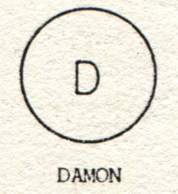
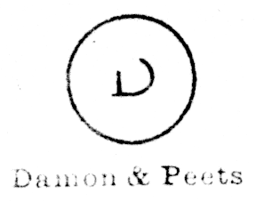
Damon & Peets. NY. 1868 - ca. 1929.
(From the chart probably by Harnish.)
Lasko draws a mark consisting of a capital 'D' with double lines.
A top-of-quad mark also survives for this foundry .
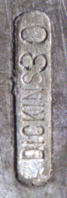
Dickinson Type Foundery. Boston, MA. 1839-1892. From 1839 as Dickinson Type Foundery [sic]. From 1848 as the Dickinson Type Foundery, Phelps & Dalton, Successors. From 1863 as the Dickinson Type Foundery of Phelps, Dalton & Co.
The mark on the type below right is oriented vertically along the type.
(Photograph above left by Richard L. Hopkins, Hill & Dale Private Typefoundry & Press. Image above right by Stephen O. Saxe.)
(Drawing from the chart probably by Harnish.)
Lasko says that "Some of their fonts show a lozenge-shaped pin mark with the legend "DICKINSON" or "DICKINS (PT. SIZE)" (these are presumably similar to the examples by Hopkins and by Saxe shown above). He also draws a mark effectively the same as the one shown in the chart probably by Harnish, above.
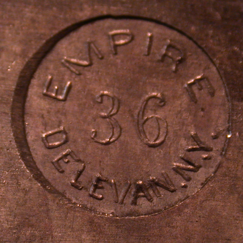
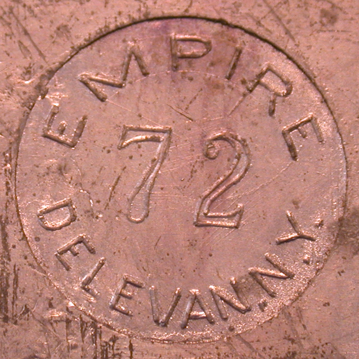
Empire Type Foundry, Delevan, NY. 1893 - 1970. Claude and Wilbur Persons.
Distinct from (and larger and longer-lived than) the Empire State Type Foundry (circa 1888 - 1892, but not amalgamated into ATF).
(Photographs by Richard L. Hopkins, Hill & Dale Private Typefoundry & Press.)
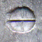
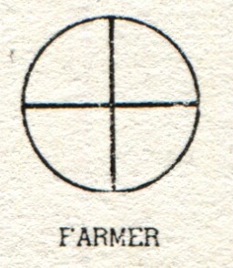
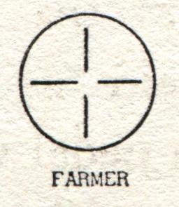
Farmer, Little. Emerged ca. 1861 out of Elihu White's Type Foundry; through at least 1867 as Farmer, Little & Co. dba White's New York Type Foundry. From 1892 traded as A. D. Farmer & Son Type Founding Co. Acquired by ATF.
At first glace the example below looks a bit like ATF's "American Line," but the vertical bar gives it away as Farmer, Little.
These same two pin marks (crossed lines, four line segments at right angles) are shown for "Farmer" in Harnish.
The chart probably by Harnish shows the same images as in Harnish.
Lasko draws three marks, all of which are variations on a Greek cross (that is, a horizontal cross all of the arms of which are of the same length). One is a cross with arms which do not touch the circle, the other is a form like the first one shown by Carroll, and the third a form like the second one shown by Carroll.
Rehak draws the same two marks as Carroll (crossed lines, four line segments at right angles).
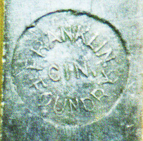
Cincinnati, OH. 1856-1892. Franklin Type Foundry, Allison & Smith. From 1856 as a branch of L. Johnson & Co. of Philadelphia (which later became MacKellar, Smiths & Jordan) . Then the Franklin Type & Stereotype Foundry, Allison & Smith. Later (by 1889) "Franklin Type Foundry, Allison & Smith". Amalgamated into American Type Founders at its inception in 1892; Robert Allison became the first president of ATF.
Lasko draws a mark similar to that shown in Saxe's photograph above, save that in Lasko's drawing the 'FOUNDRY" reads upside-down, right-to-left (that is, it continues the text of "FRANKLIN..."
An interesting top-of-quad mark also survives for this foundry .
Hagar Type Foundry, New York. 1826 - 1887. The history of this foundry is comples; it is best to refer to Annenberg's account.
The Hagar type and its pin mark are rare. Annenberg indicates that the firm was sold by William Hagar "to his brother and his sons William and John" in 1852. Annenberg's specimen references demonstrate that by at least 1858 the firm was known as "Wm Hagar, Jr. & Co.", but that by 1863 or 1866 it had changed to "Hagar & Co."
Lasko mentions a mark similar to that shown in Saxe's images, above. He also draws a mark which consists of "HAGAR" in large letters horizontally across the mark, with "NY" in smaller lettering below.
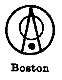
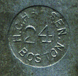
H. C. Hansen Type Foundry. Boston. 1872 - 1892.
(Image from the chart probably by Harnish.)
Lasko mentions a mark which reads "H. C. HANSEN BOSTON" (presumably like the one shown in Saxe's image above) and draws a mark similar to that shown by Carroll (but in Lasko the top quadrilateral of Carroll's figure is a triangle with a point to the right - more like the image from the probably-Harnish chart).
Rehak draws two marks. The first resembles that shown by Carroll (except that the bottom rectangle is a bit thinner). The second consists of this text in a full circle, starting and ending with a centered dot: "· BOSTON · TYPE F. C. H. T. HANSEN" [sic].
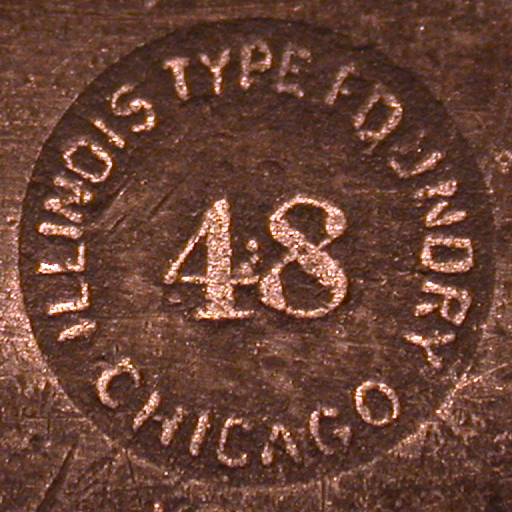
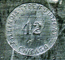
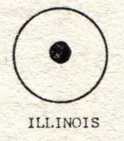
Illinois Type Founding Co., Chicago, IL. 1872-1892. Reorganized into the Standard Type Foundry, not amalgamated into ATF.
(Photograph above left by Richard L. Hopkins, Hill & Dale Private Typefoundry & Press. Image above right by Stephen O. Saxe.)
This same solid circle pin mark is shown in Harnish.
The chart probably by Harnish shows the same image as that of Harnish.
Lasko draws a mark resembling that of the Saxe photo above and Carroll's drawing, save that in Lasko the small dot is an open circle.
Rehak draws a mark resembling that of Carroll, but with a smaller solid dot. He labels it "ILLINOIS".
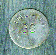
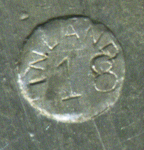
Inland Type Foundry. St. Louis.
(Left photograph by Robert A. Mullen, Xanadu Press, right image by Stephen O. Saxe.)
(Left drawing from Carroll, right image by Stephen O. Saxe.)
Rehak draws a mark for the Inland which is similar to that of Carroll, but with the point size in the center as well.
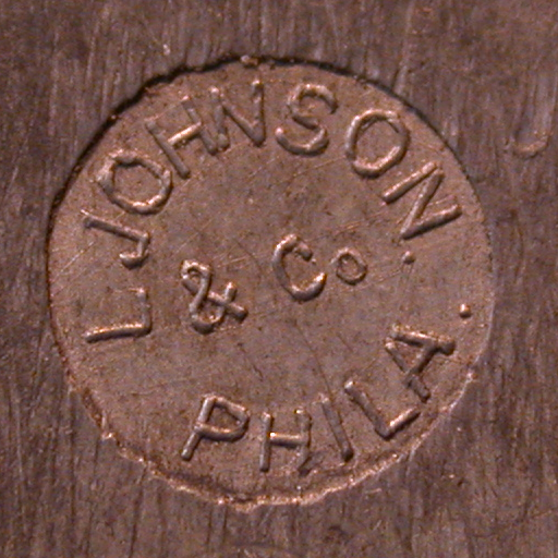
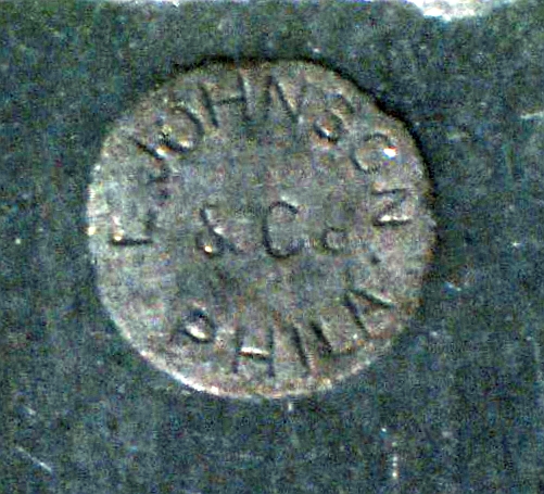
L. Johnson & Co., Philadelphia, PA. 1843 - ca. 1860. Preceeded by Johnson & Smith (1833-1843). Succeeded by MacKellar, Smiths & Jordan (ca. 1867-1892).
(Photograph by Richard L. Hopkins, Hill & Dale Private Typefoundry & Press.)
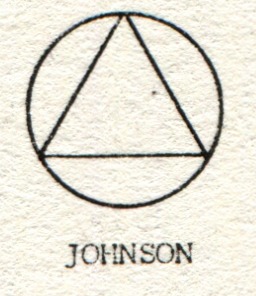
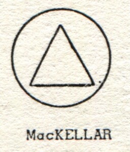
Some care must be taken in the distinction between variations of the "triangle in circle" mark apparently used by L. Johnson & Co. and certainly used by their successors, MacKellar, Smiths, and Jordan. Lasko distinguishes the two marks, saying that L. Johnson & Co. "had a familiar triangle pin mark where the apexes of the triangle touched the circle enclosing it" while MSJ, the "successors to L. Johnson & Co. used a variation of their pin mark, a triangle with apexes that did not touch the circle border." {Lasko, pp. 10-11}
(Photograph by Richard L. Hopkins, Hill & Dale Private Typefoundry & Press.)
The chart probably by Harnish shows a mark equivalent to that of Carroll shown above left.
Lasko draws the triangle-touching-edges mark of the Johnson foundry. Later, he draws the triangle-not-touching-edges mark of MSJ.
Rehak draws the triangle-touching-edges mark, in a form identical to that of Carroll's "JOHNSON" drawing. He labels it "PHILADELPHIA".
Rehak also draws a Johnson pin mark which has a small triangle not touching the circle, with the point size inside, surrounded (inside the circle) with "JOHNSON T. F." in an arc above and "PHILA." in an arc below. This is intereseting because it seems to contradict the idea that the Johnson fouundry used the triangle-touching-edges mark and that MSJ used the triangle-not-touching-edges mark.
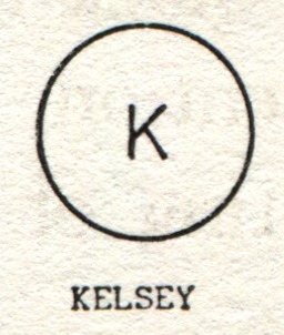
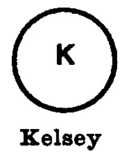
Kelsey. Meriden, CT. 1898 - 1920 (as a foundry).
(Left from Carroll, right from Harnish)
The chart probably by Harnish shows the same image as that of Harnish.
Lasko draws a mark resembling that shown by Carroll, but with doubled lines.
Rehak draws a centered 'K' similar to that of Harnish (both bars of the 'K' extend from the same point), but with the text "KELSEY" in an arc around the outside of the pin's circle.
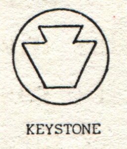
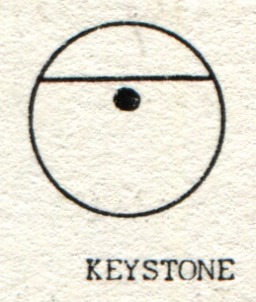
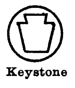
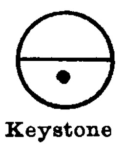
Keystone Type Foundry, Philadelphia, PA. 1888 - 1917.
(Photograph by Richard L. Hopkins, Hill & Dale Private Typefoundry & Press.)
The chart probably by Harnish shows the same images as Harnish.
Lasko draws two marks. The first resembles Carroll's first drawing (an outline of a keystone); the second resembles Harnish's second drawing (a horizontal line at mid-circle with a dot below it). In Lasko's second mark, the small dot is an open circle.
Rehak draws two marks for the Keystone. The first is similar to Carroll's second mark (horizontal line above, dot below), except that in Rehak the dot is centered on the mark. The second is the stylized keystone similar to that shown by Carroll and Harnish.
St. Louis, 1919-1923. Laclede Type Foundry. This foundry is unjustly forgotten. It was the last foundry of Charles Schokmiller. At least two faces were cut for it by Wiebking, including Munder Venezian. Yet Annenberg has no entry for it, and writes unkindly of Schokmiller's earlier foundry, the Western.
(As to its name - the French fur trader Pieree Laclède founded St. Louis in 1764.)
There is some confusion between the marks for this foundry and the earlier Manhattan Type Foundry (1886-1892; amalgamated into ATF). Lasko shows a drawing of a pin mark, said by him to be of the Manhattan Type Foundry, "showing four modified sextiles" (that is, six-pointed stars with one point cut off). He gives no source for this, save that he also shows a pin mark for the Manhattan Type Foundry which consists of a single large un-modified sextile.
In keeping with Lasko's attribution, Richard L. Hopkins has identified the pin mark shown below as that of the Manhattan Type Foundry:
(Photograph by Richard L. Hopkins, Hill & Dale Private Typefoundry & Press.)
However, Robert A. Mullen, who wrote the definitive book on St. Louis typefounding, has a font of Laclede Old Style, cast by the Laclede Type Foundry at least 27 years after the Manhattan Type Foundry was amalgamated into ATF. It bears the pin mark shown below.
(Photograph by Robert A. Mullen, Xanadu Press.)
This is compelling evidence that the attribution of this "four modified sextile" mark in Lasko is in error and that it is, instead, the mark of the Laclede Type Foundry.
There were two mutually independent Lindsay foundries, both in New York City. This is the one founded by Alexander W. Lindsay by 1870, after leaving the Lindsay Type Foundry of his brothers. It was a part of the 1892 amalgamation of ATF, while the other, older, firm was not.
Annenberg notes that the father of the Lindsay brothers was "superintendent of the Alexander Wilson type foundry in Edinburgh," and that another brother, James (1826-1879) was with the Bruce foundry in New York.
So far, one pin mark is attested in the form of a large 'L' with an extended lower portion. The chart probably by Harnish identifies this mark as "Lindsay," without distinguishing which Lindsay. I will assume that it is the other one.
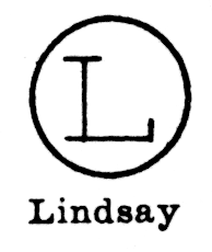
There were two mutually independent Lindsay foundries, both in New York City. This is the one which became known as the Lindsay Type Foundry. 1852-1903. Originally Robert & John Lindsay (1852 - ca. 1856). Then Robert & John & Alexander W. Lindsay (ca. 1856 - [by 1870]). By 1870 Alexander W. Lindsay left this firm to form his own, A. W. Lindsay Type Foundry (see above). The original foundry continued under the name Lindsay Type Foundry, and later as Robert Lindsay & Co. It was not a part of the original 1982 American Type Founders amalgamation, but was purchased by ATF "around 1903" (see Annenberg, pp. 174-176).
The chart probably by Harnish identifies this mark as "Lindsay," without distinguishing which Lindsay. I will assume that it is this one.
(Photograph by Richard L. Hopkins, Hill & Dale Private Typefoundry & Press.)
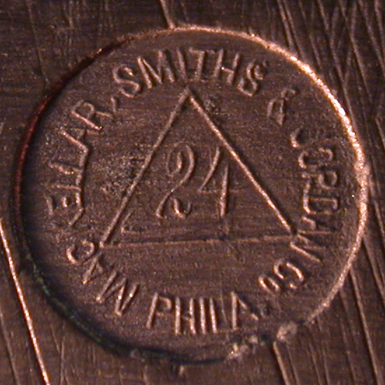
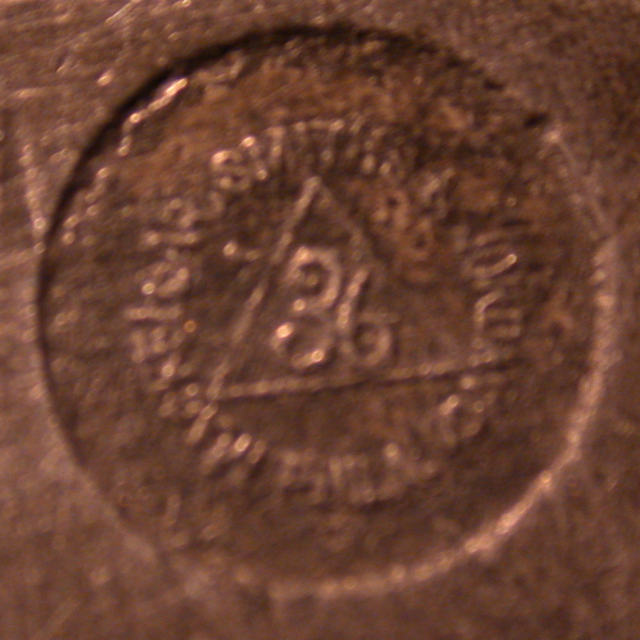
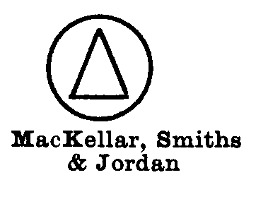
MacKellar, Smiths & Jordan Type Foundry, Philadelphia, PA. Preceded by L. Johnson & Co..
Some care must be taken in the distinction between variations of the "triangle in circle" mark apparently used by L. Johnson & Co. and certainly used by their successors, MacKellar, Smiths, and Jordan. Lasko distinguishes the two marks, saying that L. Johnson & Co. "had a familiar triangle pin mark where the apexes of the triangle touched the circle enclosing it" while MSJ, the "successors to L. Johnson & Co. used a variation of their pin mark, a triangle with apexes that did not touch the circle border." {Lasko, pp. 10-11}
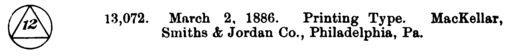
MSJ registered their version as a trade-mark on March 2, 1996 (Registration No. 13,072) and claimed that it had been in use by them since December 1, 1885. The language they used in their trade-mark registration could describe either mark. Here is the abstract of this registration, from the Official Gazette of the United States Patent Office, Volume 34 [Jan. 5 to Mar. 30, inclusive, 1886], No. 9 (March 2, 1886), p. 926. There was no illustration in this abstract.
Confusingly, at least one 19th century compendium of trade-marks illustrates the 1885/6 MSJ trade-mark with the "triangles touching circle" version. Here it is shown in Wallace A. Bartlett's Digest of Trade-Marks (Registered in the United States) for Machines, Metals, Jewelry, and the Hardware and Allied Trades. (Washington, DC: Gibson Bros., 1893), p. 106. Note that this is probably an error.
Here are several examples of the mark as used by MSJ:
(Photographs by Richard L. Hopkins, Hill & Dale Private Typefoundry & Press.)
(Photograph by Richard L. Hopkins, Hill & Dale Private Typefoundry & Press.)
(Left from Carroll, right from Harnish)
The chart probably by Harnish shows the same image as that of Harnish shown above right.
Lasko draws the triangle-not-touching-edges mark of MSJ. Earlier, he drew the triangle-touching-edges mark of the Johnson foundry.
Rehak draws a pin mark for "MacKELLAR" which consists of a small tirangle, centered, with the point size inside it (and no other text).
(Photograph by Richard L. Hopkins, Hill & Dale Private Typefoundry & Press.)
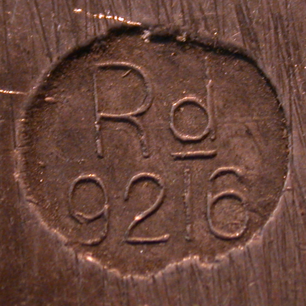
MacKellar, Smiths and Jordan sometimes employed a pin mark with the abbreviation "Rd" (for "Registered") along with a number. They also published these numbers in their specimens, along with the designs registered.
Initially, these numbers were a puzzle. They are not the US design patent numbers for the relevant designs, they are not US utility (MSJ: "Mechanical") patent numbers for MSJ patents, nor are they US 19th century Trade-Mark registrations for MSJ. But Gregory Jackson Walters has solved this puzzle: they are English design registration numbers.
From 1843 on, under a succession of Acts (such as the "Patents, Designs and Trade Marks Act" of 1883), English and foreign designs could be registered with the Board of Trade ("BT") in England. MacKellar, Smiths and Jordan did so on various occasions.
Note that Stephenson, Blake in England also registered some of their designs in this way, and at times included the registration numbers on their pin marks.
Searching for these registrations can be done online, though with varying degrees of information available. The basic searching guide is the page at The National Archives (of the United Kingdom, at Kew) on registered designs, at: http://www.nationalarchives.gov.uk/records/research-guides/reg-design-trademark.htm
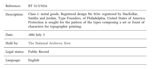
The example above, of Registered design 9216, happens to be within a series of archival records which have been partially cataloged. This means that we can use the UK National Archives advanced search page at: http://discovery.nationalarchives.gov.uk/advanced-search Searching there on the terms:
MacKellar Smiths Jordan
returns six hits in the registration records. (This doesn't mean that MSJ only registered six designs in England. Rather, it means that those English design registration records the contents of which have been cataloged contain only six MSJ designs.) Below is an image of the one relating to 9216 (click on it for a PDF of all six):
The key here is "BT 51/5/9216". "BT" is the Board of Trade (of the United Kindom, at that time). "51" is one of two series of volumes (50 and 51) of designs registered at the BT under the "Patents, Designs and Trade Marks Act" of 1883 for all classes of items. "5" is volume 5 of this series. Finally, "9612" is the actual registration number of MSJ's design. Following this, we find that the registration itself has been cataloged:
But the actual registration document, which presumably includes a drawing of the design, has not been digitized. So we know that it exists, that it was for type, and that it was on 1884-07-03. But to go further we would have to either (a) visit the National Archives in Kew and examine the original volume, or (b) pay the National Archives to produce a digital or photocopied copy. (I've done business with them on other items; they aren't inexpensive or quick, but they do good work.)
Sometimes they used both the triangle and "Rd". In the image below, the faint writing over the triangle is the Registered number. By inspection of the original type with a microscope, Steve Saxe has been able to determine that it reads "96696".
This example provides an illustration of a situation where the volume of registered designs at the UK National Archives has not yet been cataloged. Following the procedures above, we find first that it is in BT 51: http://discovery.nationalarchives.gov.uk/browse/r/r/C440289? Within BT 51, it must be in volume 146 (BT 51/146), which covers "Designs 88364 - 106183, 1887 Dec. 1 - 1888 Aug. 23". But the individual records of this volume have not yet been cataloged, so that's as far as we can go without special efforts. Still, it's useful to have a date range.
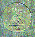
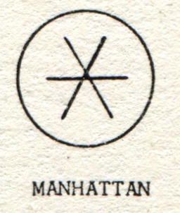
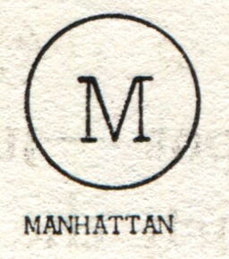
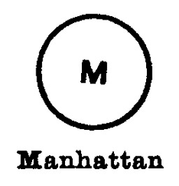
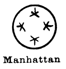
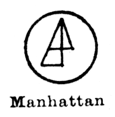
Manhattan Type Foundry, NY. 1886-1892.
Lasko writes: "For a foundry with a short life, it had an incredible number of pin marks." (p. 11). But perhaps it had one fewer than he thought.
Lasko calls the six-pointed figure shown below a "sextile."
(Left from Carroll, right from the chart probably by Harnish.)
(Left from Carroll, right from Harnish)
The chart probably by Harnish shows the same image as that of Harnish shown above right.
Lasko calls the five-pointed figure which appears within the marks shown below a "modified sextile." It isn't a symmetric five-pointed star, but rather a six-pointed star with one point cut off.
[CAUTION: Robert A. Mullen, who wrote the definitive book on St. Louis typefounding, has identified in his collection a piece of type with an identical pinmark (less the point size) which is from a font of Laclede Old Style ( Laclede Type Foundry) - which didn't exist when the Manhattan Type Foundry amalgamated into ATF. So the identification of this mark is now uncertain; it may well be Laclede, not Manhattan.]
(Drawing from the chart probably by Harnish.)
The photograph on the left, below, was identified by Richard L. Hopkins as Manhattan, but the photograph on the right is of a pin mark from a font of Laclede Old Style cast no less than 27 years after the Manhattan Type Foundry ceased business.
(Photograph above left by Richard L. Hopkins, Hill & Dale Private Typefoundry & Press. Photograph above right by Robert A. Mullen, Xanadu Press.)
Lasko claims that the mark below is a composite of 'M', 'T', and 'F', but I can't quite make this out.
(Drawing from the chart probably by Harnish.)
Lasko shows four pin marks for this foundry. The first is the "sextile" design similar to that shown in Carroll's first drawing. The second is the "four modified sextiles" mark discussed above. The third is a large 'M' similar to that shown in Carroll's second drawing. The fourth is the triangular mark.
Rehak draws a pin mark for the Manhattan foundry which is in form like the single centered sextile figure drawn by Carroll, but with the sextile very much smaller.
Rehak draws a second pin mark for the Manhattan foundry which consists of a medium-size bold slab-serif 'M', centered, with the text "MANHATTAN" outside of the circle of the pin mark, in an arc over the top.
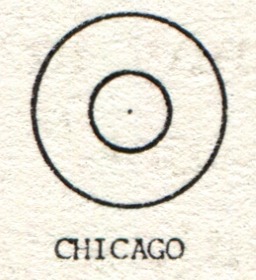
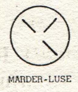
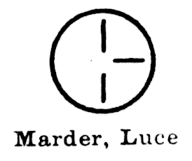
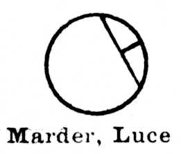
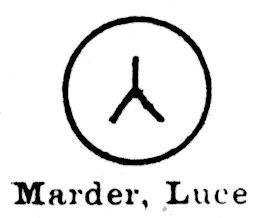
Started as the Chicago branch of White's Type Foundry (1855 - ca. 1860/1863). Became the Chicago Type Foundry of Marder, Luse & Co., Chicago, IL. ca. 1860/1863 - 1892.
(Left photograph by Richard L. Hopkins, Hill & Dale Private Typefoundry & Press. Right image by Stephen O. Saxe.)
(From the chart probably by Harnish.)
This circle pin mark shown above left appears in the same image in Harnish.
(From the chart probably by Harnish.)
Lasko shows first one pin mark for the Chicago Type Foundry for the period 1855 - ca. 1863. Lasko says "THE CHICAGO TYPE FOUNDRY. 1855 - ca. 1863. Chicago, Illinois. The pin will usually read CHICAGO TYPE FOUNDES or CHICAGO TYPE FOUNDRY, but on the smaller sizes of type the ancient symbol of eternity, a circle, appears. ... This foundry was the forerunner of Marder, Luse & Co." The mark he illustrates is similar to the circle (without the central dot) shown above as "Chicago" from the chart probably by Harnish.
Lasko later shows four marks for Marder, Luse.
The first one he shows is equivalent to the first "Marder, Luce" [sic] mark shown above from the chart probably by Harnish (that is, three line segments forming a cross with one missing segment). Lasko shows it oriented vertially, as Harnish does; Carooll showed it at 45 degrees.
The second mark shown by Lasko for Marder, Luse is equivalent to the second "Marder, Luce" mark shown above from the chart probably by Harnish (that is, it consists of a chord line at the upper right, with a perpendicular from its midpoint to the edge of the pin mark circle).
The third mark shown by Lasko is open to question. It consists of the text "M&L" across the top and "CHICAGO" across the bottom. Saxe indicates that Marder, Luse never used the ampersand when abbreviating their name, and that this mark belongs instead to M & L Typesetting (Chicago). The mark shown in the photograph by Richard L. Hopkins for M & L Typesetting is identical (plus the point size) to that drawn for Marder, Luse by Lasko.
The fourth mark shown by Lasko for Marder, Luse is equivalent to the third "Marder, Luce" mark shown above from the chart probably by Harnish (that is, it consists of three lines meeting in the center, oriented so that the top line is vertical. The lines do not touch the edge of the circle. The version in Harnish is more of an "inverted Y", while the version in Lasko shows the three lines at 120 degrees to each other.
Rehak draws a mark resembling the circle (without the central dot) shown above as "Chicago" from the chart probably by Harnish. He labels it "CHICAGO".
Rehak also draws a figure essentially similar to Carroll's second figure and Harnish's first "Marder, Luce" figure (that is, three line segments forming a cross with one missing segment) Rehak's is oriented at about 30 degrees, where Carroll's is oriented at 45 degrees and Harnish's is vertical. Rehak labels this "MARDER-LUSE".
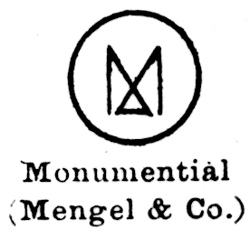
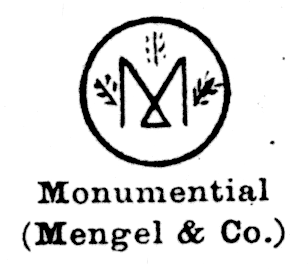
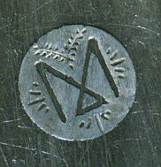
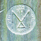
1881-1892. Baltimore. John G. Mengel & Co.
The association of the name "Monumental Type Foundry" with John G. Mengel & Co. is attested in Lasko, in the chart probably by Harnish, and in Annenberg (p. 199, side-note). I am indebted to Stephen O. Saxe for pointing out the latter to me (I'd missed it) and for further noting that Baltimore was known as "The Monumental City."
(From the chart probably by Harnish.)
(From the chart probably by Harnish.)
Lasko draws 'M' marks similar to that shown in all of the photograph above by Saxe (that is, both with and without the branch ornamentation).
My thanks to Stephen O. Saxe for identifying this as M & L Typesetting of Chicago rather than Marder, Luse & Co., who never used an '&'. (LETPRESS list posting on 2014-02-04).
(Photograph by Richard L. Hopkins, Hill & Dale Private Typefoundry & Press.)
Note that the mark shown by Lasko in his Fig. 37, said by him to be Marder, Luse & Co., is probably M & L Typesetting.
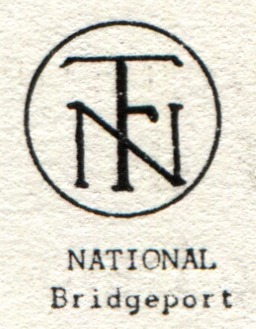
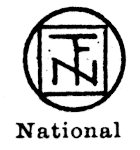
No less than five companies or persons at one time or another made or sold type in the United States under the name "National." This pin mark is that of the National Type Foundry, of Bridgeport, CT. It is known to have operated in the 1920s.
(From the chart probably by Harnish.)
Lasko draws a version of the superimposed N/T/F mark which adds a square box around it, very much like that shown in the chart probably by Harnish, above.
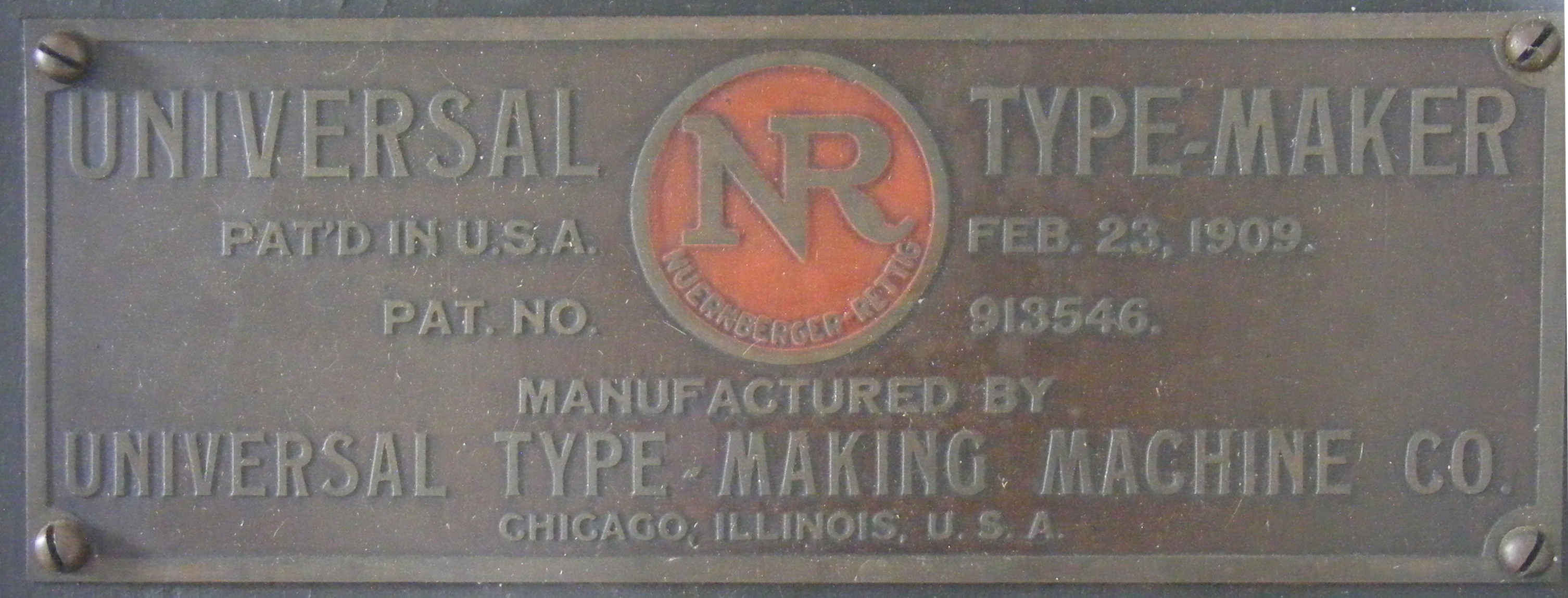
The Nuernberger-Rettig is a type casting machine, not the name of a type foundry. Here's the nameplate of a Nuernberger-Rettig type caster (a relatively late machine manufactured after the company name changed). It still shows the combined 'NR' logo, though.
The pin mark below is definitely the Nuernberger-Rettig logo, and so this must be an N-R pin mark. Not all type cast on N-R casters bears this pin mark, however.
(Photograph by Richard L. Hopkins, Hill & Dale Private Typefoundry & Press.)
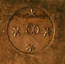
The photograph below shows the top half of a Universal Type-Making Machine Co. (that is, Nuernberger-Rettig) 30 point Compositype-Linotype (that is, 0.043 drive) mold along with a piece of type that was cast in it. This is an ex-Sterling Type Foundry mold, and the Sterling 'S' is visible in bth the pin and the type.
Some Universal Type-Making Machines (Nuernberger-Rettigs) were equipped with molds which had an unusual rounded pin. I have seen examples from the two surviving ex-Sterling Type Foundry machines; I do not know if pins of this type were used by other foundries. Sometimes this pin was engraved with the mark of the foundry (e.g., the Sterling 'S'), sometimes it was plain.
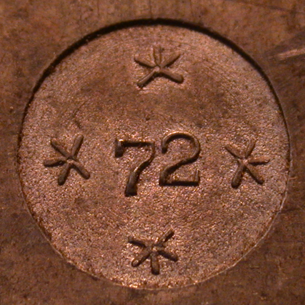
The photograph below shows a 72-point mold, ex-Sterling Type Foundry, which has such a pin, along with a piece of type similar to that which would have been cast on it. (The type is a piece of spacing material with its jet still attached; this jet is not of the recessed form used in many other Nuernberger-Rettig molds.) The Sterling 'S' is clearly visible on the pin. (This type cannot have been cast in this mold, both because its pin mark is smooth and because its jet is of the wrong form to have been produced by this mold; nevertheless, it is similar.)
The chart probably by Harnish lists the NR mark as "unidentified."
The following is based on Annenberg's account of the California Type Foundry:
In the 1866-1868 timeframe, in San Francisco, William Faulkner and his sons set up a type foundry using materials from James Conners' Sons. Annenberg does not record a corporate or foundry name for this operation, although he does reprint an (undated) advertisement for the "California Type Foundry Co." with "Wm. Faulkner & Son, Agent." As Faulkner retired in 1873 (the date of the reorganization of the foundry (see below)), this suggests, but doesn't quite prove, that they were using the name "California Type Foundry" prior to 1873.
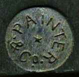
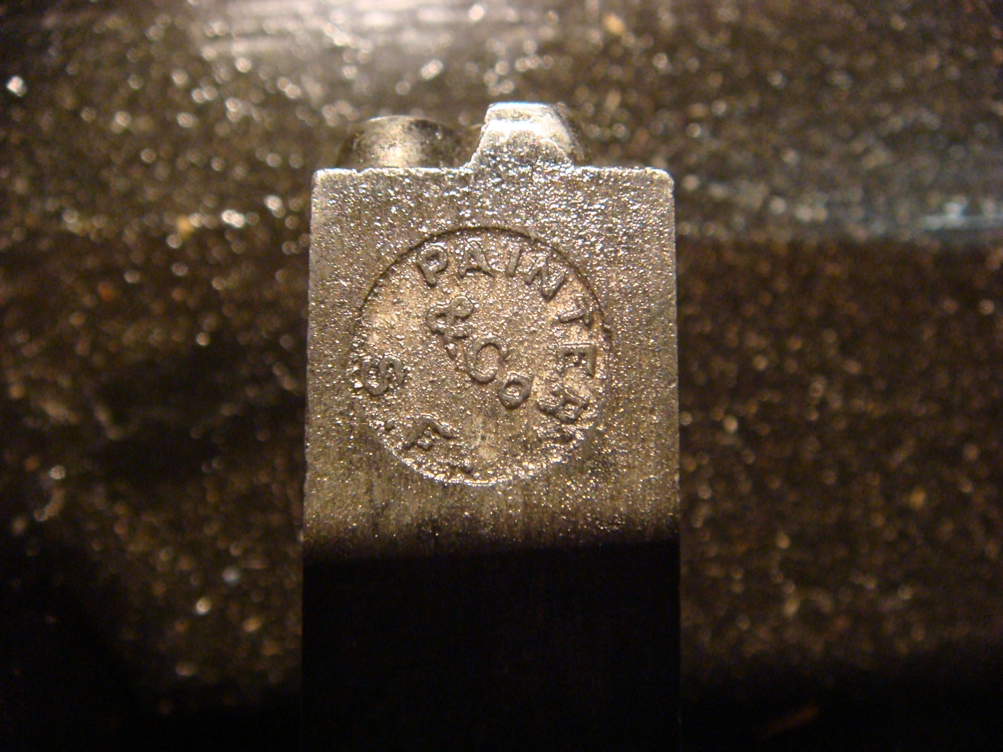
At some point soon after this, Jerome B. Painter, who had previously been the West Coast agent for the Johnson Type Foundry set up a type foundry in San Francisco using equipment purchased from Johnson.
In 183 the Faulkner operation was reorganized as the California Type Foundry. Annenberg then says "It was through that corporate structure that Jerome B. Painter was able to purchase the corporation and operate it as an independent division of his own foundry, Painter & Co., until both plants were consolidated into one building and one management." Annenberg indicates that the last specimen of "Painter & Co." was 1894, and that, also in 1894, a specimen has the name "Painter & Co." replaced by "California Type Foundry" (with the business name "Painter-Cornell Company").
Specimens exist through 1902; the firm was not amalgamated into ATF.
So the pin mark below must be either that of Painter & Co. (as it says) between ca. 1868 and 1894, or the California Type Foundry after 1894 if they didn't update the pins in their casters.
(Photograph by Nick Sherman, from flickr and in the pinmarks group at: https://www.flickr.com/photos/nicksherman/3848834563/in/pool-pinmarks/ License: Creative Commons Attribution-NonCommercial-ShareAlike 2.0 )
San Francisco, CA. 1882-1892. Palmer & Rey Inc.
Lasko draws a mark with "PALMER" in an arc above and "REY" in an arc below, both reading right-side-up.
Republic Type Foundry, Chicago, IL.
The Republic Type Foundry is little remembered today, but it has an interesting position in the history of type. Harry Weidemann, who began the typefounding side of the 20th century revival of "antique" (that is, 19th century) types in America reported that he had his first revival face electroformed from sorts that he picked out of a hellbox at Republic.
(Photographs by Richard L. Hopkins, Hill & Dale Private Typefoundry & Press.)
Lasko draws a mark similar to that shown in the Hopkins photographs above, but without the point size.
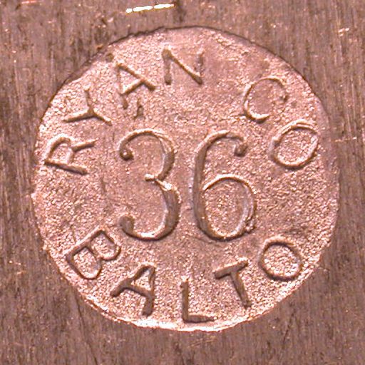
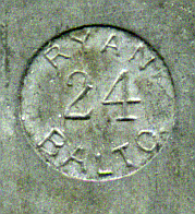
Baltimore. 1854-1892. John Ryan Type Foundry
After the John Ryan Type Foundry amalgamated into ATF in 1892, they became part of ATF's manufacturing foundry H in Baltimore - q.v. for a similar ATF mark . Later, John E. Hanrahan, who had been the head type designer of the Ryan foundry, left ATF to help form the National Compositype Company (which, while unsuccessful as a type caster manufacturer, played an important role in the types available to the Thompson and Nuernberger-Rettig casters.
My thanks to Robert A. Mullen (Xanadu Press) and to Stephen O. Saxe for confirming that the mark below is that of the Ryan foundry.
(Photograph by Richard L. Hopkins, Hill & Dale Private Typefoundry & Press.)
Lasko reports marks with "RYAN CO" and "RYAN CO BALTO", and draws one with "RYAN" lettered horizontally just above-center.
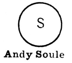
Andrew R. Soulé, private type founder. Andy Soulé was active in the American Typecasting Fellowship circa 1980, and in that year presented an important early paper on matrix electroforming at the second biennial American Typecasting Fellowship conference.
CAUTION: This mark is shown on the chart probably by Harnish, but other sources show a very similar 'S' mark for the Sterling Type Foundry (see below) .
However, as shown in the mold photographs in the Sterling section, the Sterling mark when cast on their Nuernberger-Rettig pivotal type casters emoloyed at least at times a "dished" pin. As it is statistically unlikely that Soulé was casting on N-R machines, the presence of an 'S' on a dished mark is probably a good indication that it is Sterling, not Soulé.
(From the chart probably by Harnish.)
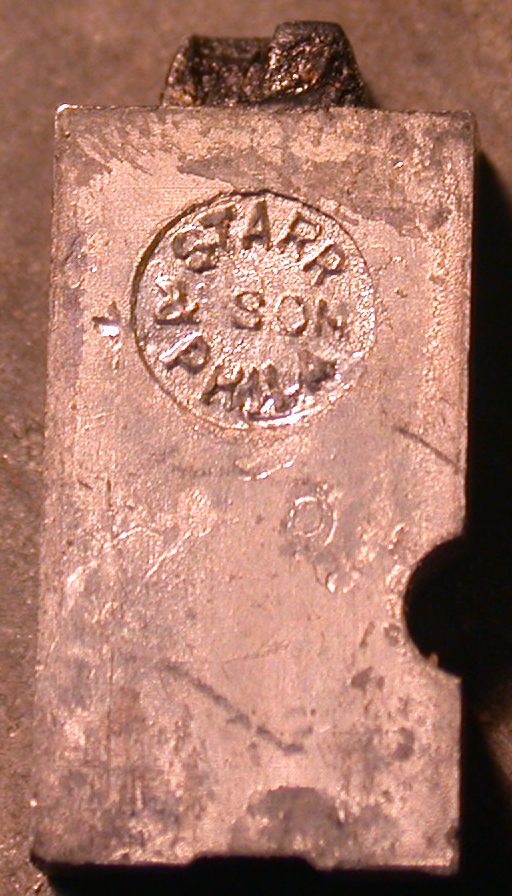
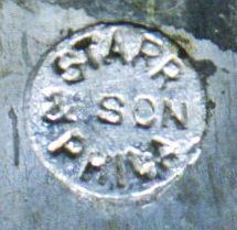
This is a very rare type, which is why I've reproduced the photograph of it in its entirety. The Starr family played an important, but bafflingly complex, part in the history of American typefounding in the first half of the 19th century. Edwin Starr (one of six brothers, five of whom were involved with printing) helped Elihu White set up his first type foundry (by engaging in industrial espionage) and in his later travels did more than anyone else to spread the knowledge of hand type casting through America. His son Thomas W. Starr perfected the process of electrolytic matrix making as we know it today.
In other words, the principals of the foundry of E. Starr and Son were two of the three most important technological figures in typefounding for the first 3/4 of the 19th century (the third would be David Bruce, Jr., inventor of the pivotal type caster).
The foundry which produced this type, E. Starr & Son of Philadelphia, is discussed by Annenberg on p. 115 in the section on the Collins & M'Leester foundry. According to Annenberg, E. Starr & Son was founded in Philadelphia sometime after 1840. No catalogs survive. The business was sold to Collins & M'Leester upon the death of Edwin Starr in 1853.
This piece of type must therefore date from the first decade of the use of the pivotal type caster.
Stephen O. Saxe notes that the types in both of the images below are about half normal type height. They seem to have been cast for small amateur presses, to economize on material.
(Photograph by Richard L. Hopkins, Hill & Dale Private Typefoundry & Press.)
(Image above right by Stephen O. Saxe.)
Lasko also identifies a pin mark for E. Starr & Son pp. 12-13 and Fig. 46, but the mark he shows has only "STARR" (above) and "PHILA" (below), without the "& SON" in the middle.
This foundry has no main entry in Annenberg, but might be Stephens' Printers Warehouse (Boston), cited on Annenberg p. 241.
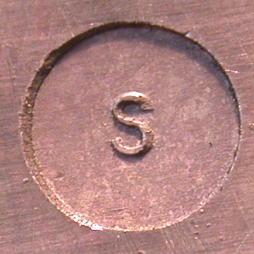
Sterling Type Foundry. 1922-1930 by Ollie E. McLaughlin in Charlotte, MI. 1930-1982 by Frank Sassamon in Charlotte, MI. 1983-present by David C. Churchman and David W. Peat in Indianapolis, IA.
(Photograph by Richard L. Hopkins, Hill & Dale Private Typefoundry & Press.)
CAUTION: The chart probably by Harnish shows a very similar 'S' mark and identifies it as that of Andrew R. Soulé, a late 20th century private type founder. However, as shown in the mold photographs below, the Sterling mark when cast on their Nuernberger-Rettig pivotal type casters emoloyed at least at times a "dished" pin. As it is statistically unlikely that Soulé was casting on N-R machines, the presence of an 'S' on a dished mark is probably a good indication that it is Sterling.
(From the chart probably by Harnish.)
Here, repeated from the Nuernberger-Rettig section above, is a photograph of an ex-Sterling Type Foundry Universal Type-Making Machine (Nuernberger-Rettig) mold showing its pin and the a type cast in it.
Here, repeated from the Nuernberger-Rettig section above, is a photograph of an ex-Sterling Type Foundry 72 point mold showing a different form of pin (distinctively rounded) and a piece of type cast from a similar mold. (The pin shows the Sterling 'S' pin mark, the piece of type is of similar form but it has a smooth pin mark.)
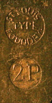
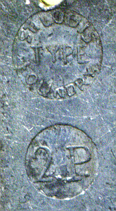
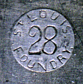
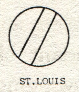
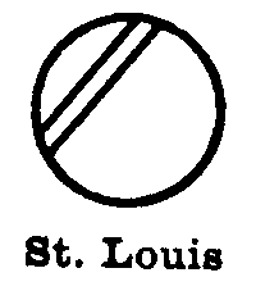
St. Louis Type Foundry. St. Louis, MO. 1849 - 1892.
It is my guess that in the photograph below the '2P' indicates a pre-point-system body size (Double Pica). Similar examples with an 'E' are known ("English" body size).
(Left photograph by Robert A. Mullen, Xanadu Press. Right image by Stephen O. Saxe.)
(Left from Carroll, right from Harnish)
The chart probably by Harnish shows the same image as that of Harnish shown above right.
Lasko shows a mark much like that shown by Harnish. Lasko also remarks that this was the "only" mark of the St. Louis Type Foundry, but the photograph by Mullen, above, indicates otherwise.
Rehak draws a mark similar to that of Carroll, but with the double-line pattern exactly centered and at 45 degrees. He labels it "ST. LOUIS".
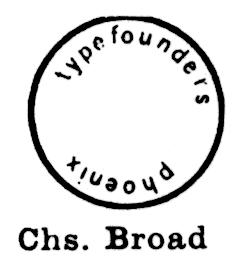
Typefounders, Inc., Phoenix, AZ. Charles Broad. [late 1950s?] - 1967.
This firm is usually called "Typefounders of Phoenix" in conversation today, but in their literature they always referred to themselves as "Typefounders, Inc."
Note that the mark shown in the chart probably by Harnish, below, has "phoenix" running in the direction opposite of that of the Typefounders, Inc. of Phoenix Thompson Type Body Piece shown later.
(From the chart probably by Harnish.)
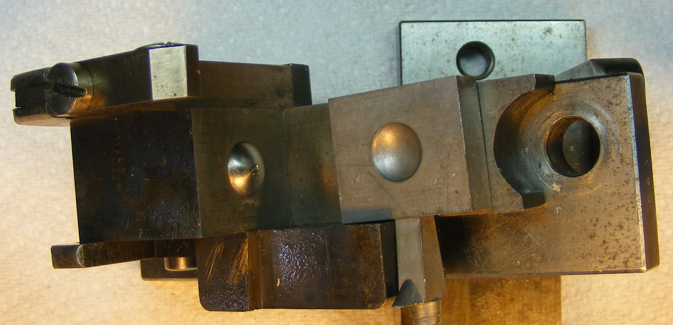
Here is a photograph of a Thompson Type-Caster Type Body Piece (aka "point blade") which has been modified to incorporate a pin. As noted earlier in the Baltotype section, this "pin" is not necessary for the casting of type on the Thompson (as the drag pin is necessary for the pivotal type caster). Its sole function here is to produce a trademark on the type.
Note that this "pinned" Type Body Piece has passed from Typefounders, Inc. to the Los Angeles Type Foundry to Barco / F&S Type Founders (Chicago) to the CircuitousRoot Type Foundry. Any one of these operations may have used it (though I have not - so far). The presence of a "Phoenix" pin mark on a type is therefore not necessarily a guarantee that it was cast by Typefounders, Inc., of Phoenix. A similarly "pinned" 24 point Type Body Piece also survives.
Lasko shows a mark similar to that shown on the Thompson Type Body Piece, above, save that his drawing omits the point size.
Rehak draws a mark which has "PHOENIX TYPE FOUNDRY" and the point size in the center. He does not actually print an attribution of this mark to any particular foundry. This raises the question of whether it refers to some other, as-yet unattested, type foundry in Phoenix. Charles Broad always, consistently, referred to his company as "Typefounders, Inc." and never as the "Phoenix Type Foundry."
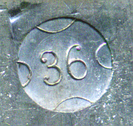
Union Type Foundry, Chicago, IL. 1883-1892. Amalgamated into ATF, but it is not clear whether any of its materials were actually consolidated into ATF operations.
(Photograph by Richard L. Hopkins, Hill & Dale Private Typefoundry & Press.)
(From the chart probably by Harnish.)
Lasko draws a mark similar to that shown in Hopkins' photograph above, but without the point size.
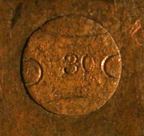
The mark shown below has been identified as probably Union Type Foundry by Stephen O. Saxe.
(Photograph by Richard L. Hopkins, Hill & Dale Private Typefoundry & Press.)
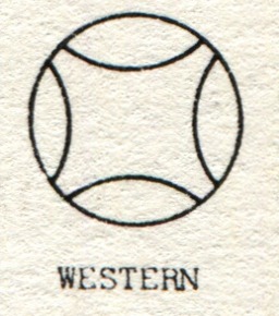
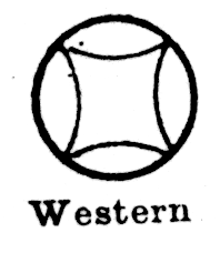
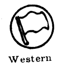
Western Type Foundry. St. Louis and Chicago. 1906-1918. Associated with Charles Schokmiller; absorbed Wiebking & Hardinge's Advance Type Foundry. St. Louis and Chicago. 1906-1918. Acquired by BB&S, but while independent distinct from The Great Western Type Foundry of Barnhart Brothers & Spindler.
My thanks to Robert A. Mullen (Xanadu Press) for confirming that the mark below left is indeed that of the Western.
(Photograph by Richard L. Hopkins, Hill & Dale Private Typefoundry & Press. Image above right by Stephen O. Saxe.)
(Photograph above left by Robert A. Mullen, Xanadu Press.)
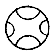
CAUTION: I have been assuming here that all marks which consist of four arcs arranged around the circle of the pin mark are Western Type Foundry. But the chart probably by Harnish distinguishes between the form in which the arcs' ends toch (which is claimed to be Western) and the form in which the arcs are distinct (which is cited as unidentified):
(From the chart probably by Harnish. The mark on the right is the third "Unidentified" example.)
It is curious that the Western Type Foundry appears to have been the only American type foundry to use a flag in their pin mark.
(From the chart probably by Harnish.)
Lasko draws a mark generally similar to that shown by Carroll, except that in Lasko's drawings the four semicircles touch each other at their ends.
Lasko also draws a pin mark for the Western which consists of a small flag on a flagstaff, very much like that shown in the chart probably by Harnish, above.
Rehak draws a variation of the "four semicircle" design much like Carroll's (the ends of the semicircles do not touch), except that in Rehak the semicircles touch each other along their arcs.
Unidentified No. 1. Moved to Union Type Foundry.
Unidentified Nos. 2a & 2b. Are these Union Type Foundry (with the 'U' on its side) or Damon & Peets (the second one has the suggestion of a vertical line, making it a 'D')?
(Photograph above left by Richard L. Hopkins, Hill & Dale Private Typefoundry & Press. Image above right by Stephen O. Saxe.)
Unidentified No. 3. Moved to L. Johnson.
Unidentified No. 4. Moved to Lindsay Type Foundry.
(Photograph by Richard L. Hopkins, Hill & Dale Private Typefoundry & Press.)
Unidentified No. 6. Moved to Mouldtype
Unidentified No. 7. Moved to Mouldtype.
(Photograph by Richard L. Hopkins, Hill & Dale Private Typefoundry & Press.)
Unidentified No. 9. (See also the next image, by Stephen O. Saxe.
(Photograph by Richard L. Hopkins, Hill & Dale Private Typefoundry & Press.)
Unidentified No. 10. Steve Saxe thinks that Deberny & Peignot is a possibility.
(From the chart probably by Harnish.)
Unidentified No. 14. Stephen O. Saxe thinks that this is type from the Wicks Rotary Type Caster. But I'm not so sure. The Wicks was a high-speed machine capable of casting 60,000 types per hour. It was intended to supply types for typesetting machines (not composing type-casting machines) in non-distribution operation. All of the references I can find indicate that it was intended for text body sizes, not display sizes. The concept of a rotary machine casting nearly 17 types per section at a 48 point body size is, frankly, terrifying. This is twice the rate of fire of the contemporary Maxim machine gun. But maybe it could.
Or could it be Wimble (Sydney, Australia)?
Unidentified No. 15. Wimble? Washington? Not Western.
Unidentified No. 16. Wimble? Washington? Not Western.
Unidentified Nos. 17a, 17b & 17c. Is this ATF Foundry B (mostly ex-Conner)? Or is it Crescent (which generally used the shield of the National Type Foundry (Chicago) that it absorbed?
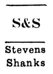
Unidentified No. 18. The chart probably by Harnish identifies this as "STEVENS SHANKS", but I am not confident in this attribution. Like Marder, Luse and Stephenson, Blake, the Patent Type Foundry of Stevens, Shanks & Sons Ltd. used a comma in their name, not an ampersand.
(From the chart probably by Harnish.)
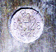
Unidentified No. 19. The only printing-related patent I can find for this date (1879-10-28) is not a design patent but a utility patent, No. 220,999, to Richard Smith (of MacKellar, Smiths and Jordan) for "Curve-Bodied Printing-Type." That probably isn't it.
Unidentified No. 20. Is this the Farmer, Little cross?
I Should Know, Item A. The three photographs by Richard L. Hopkins below show pins as installed on mold components. Unfortunately, although Rich actually showed me these components and identified them, I didn't write down what he said and have forgotten both the casting machine and the type foundry information.
(Photograph by Richard L. Hopkins, Hill & Dale Private Typefoundry & Press.)
The photgraph below shows a different "54pt" pin (its is reversed, as compared to the one shown above) being removed. Note that this is a static "pose" for the purpose of demonstrating the form of the pin. It is not meant to suggest that the pin moves when operating; it does not.
[Lommen] Lommen, Mathieu. "A History of Lettergieterij 'Amsterdam' voorheen N. Tetterode (Typefoundry Amsterdam): 1851 - 1988. In "Quaerendo: a quarterly journal from the Low Countries devoted to manuscripts and printed books", Vol. 26, No. 2 (1996): 111-143. An extract of this, translated by John A. Lane, appeared in what seems to be a journal, "Type & Characters". Two different PDFs of this are floating about the web; if they're still up, you can find them by searching on: matthieu lomman lettergieterij amsterdam
PLEASE NOTE: The individual photographs and images on this page frequently have copyright states and licensing terms which are different from the page as a whole. You cannot simply copy this page, but must examine the status and permissions of each image individually; please do so and respect the wishes of those who have generously contributed to this resource.
The photographs by Richard L. Hopkins are copyright by him and are used here by permission. In use here they are licensed under the Creative Commons Attribution - Noncommercial - NoDerivatives 4.0 license.
The photographs by Stephen O. Saxe are copyright by him and are used here by permission. In use here they are licensed under the Creative Commons Attribution - Noncommercial - NoDerivatives 4.0 license.
The photographs by Jens Jørgen Hansen, Bogtrykker are copyright by him and are used here with permission. They are NOT licensed by him for further re-use and may not be copied without his permission.
The photographs by David Bolton are copyright by him and are used here with permission. They are NOT licensed by him for further re-use and may not be copied without his permission.
The material by John S. Carroll and Herb Harnish was published in the US without copyright notice at a time when such notice was required to secure copyright. It therefore passed into the public domain upon initial publication. The digital reprints of it here remain in the public domain.
The photograph(s) by Nick Sherman are copyright by him and have been licensed by him for re-use under particular CreativeCommons licenses, as noted in each instance. Please note that the terms of the Creative Commons licenses he has selected typically differe from the terms of the Creative Commons license under which the framework of this page is licensed.
The photograph(s) by Lars Schwarz are copyright by him and have been licensed by him for re-use under particular CreativeCommons licenses, as noted in each instance. Please note that the terms of the Creative Commons licenses he has selected typically differe from the terms of the Creative Commons license under which the framework of this page is licensed.
The Google digitizations of public domain works such as the volumes of The Inland Printer from which extracts are used here, available via The Hathi Trust, are in the public domain. The extracts used here remain in the public domain.
The photographs by David M. MacMillan ("DMM") here copyright by him but are licensed under the same Creative Commons Attribution-ShareAlike license as the framework of this page.
All portions of this document not noted otherwise are Copyright © 2015 by David M. MacMillan and Rollande Krandall.
Circuitous Root is a Registered Trademark of David M. MacMillan and Rollande Krandall.
This work is licensed under the Creative Commons "Attribution - ShareAlike" license. See http://creativecommons.org/licenses/by-sa/3.0/ for its terms.
Presented originally by Circuitous Root®
Select Resolution: 0 [other resolutions temporarily disabled due to lack of disk space]