This Notebook covers Lanston Monotype Machine Company matrix and typographical topics insofar as they are concerned with composition (cellular) matrices and their types at least in part. In other words, if the document or subject covers just composition mats, or both composition and display, it's here. If it covers only display, it is not. For Lanston display matrix/type information, see ../../../ Noncomposing Typecasters -> Foundry Specimens & Typography -> Lanston Monotype Machine Company. (I've put that information in with the typefoundries, even though Lanston was a matrix and composing machine maker, because people tend to think of type in terms of typeface first (ignoring type technologies.))
This Notebook covers only the American firm, the Lanston Monotype Machine Company (and its successors). The English firm, known best as The Monotype Corporation Limited, was one of the most important contributors to type styles during the 20th century. Unfortunately, the details of copyright law forbid the reproduction of any of its specimen material published after 1925. For a bibliography of specimen books for the English firm, go "up and over" one level to the Notebook of "Matrix Data, Specimens, & Typography (UK): The Monotype Corporation Limited.
Note that the type series numbers for the American and English Monotype firms are entirely unrelated to each other.
Individual Lanston Monotype faces will also be identified in the CircuitousRoot Type Index.
See also the List of All Type Specimen and Matrix Information on CircuitousRoot .
Type Series Lists and Indexes
Lists published by Lanston, bibliography for other published lists, and my own composite list.
A Composite Specimen of Lanston Monotype Faces
By at least 1916, Lanston Monotype was publishing its specimen books in loose-leaf format. Because of the flexibility of this format, there is no such thing as a "standard" Lanston specimen book for most of the 20th century. Each individual copy potentially differs from all others.
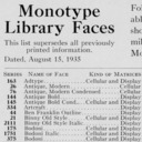
Through at least 1921, Lanston did not name its typefaces. They were identified only by their series number. At some later point, Lanston Monotype began naming them. This Notebook is a composite of all of the specimen pages and sections I can find, compiled as if they constituted a single specimen book, from Lanston Monotype loose-leaf specimen books with named typefaces.
For earlier Lanston Monotype specimen books where the faces were only numbered (and for other Lanston specimen material), see the Notebook of "Other Specimens", below.
Other Lanston Specimens
This Notebook collects Lanston Monotype specimen books published before Lanston began naming their typefaces. It also includes Lanston Monotype specimen material not intended for inclusion in any specimen book.
For the mid-20th century Lanston specimen book published (in loose-leaf format) after Lanston began naming their typefaces, see the CircuitousRoot Notebook of "A Composite Specimen of Lanston Monotype Faces", above.
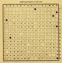
Matrix and Case Arrangement Information
Matrix technical information. Matrix case arrangements.

Typographical Education
[NOTHING HERE YET]
But note that typography as a subject (sometimes with useful details of typefaces and ornaments used) appeared in other Lanston publications such as Monotype: A Journal of Composing Room Efficiency .
The list of Lanston Monotype typefaces by series number prepared by David M. MacMillan is in the public domain.
The Monotype Type Faces specimen book identified here as "MTF1", and each element of its contents individually, was (were) published in the US without copyright notice at a time when such notice was required to secure copyright. It (they) therefore passed into the public domain upon initial publication. Their digital reprints here remain in the public domain.
The Lanston Monotype publication(s) "Broad-Stroke" was (were) published in the US without copyright notice at a time when such notice was required to secure copyright. It (they) therefore passed into the public domain upon initial publication. Their digital reprints here remain in the public domain.
All portions of this document not noted otherwise are Copyright © 2010 by David M. MacMillan and Rollande Krandall.
Circuitous Root is a Registered Trademark of David M. MacMillan and Rollande Krandall.
This work is licensed under the Creative Commons "Attribution - ShareAlike" license, version 4.0 International. See http://creativecommons.org/licenses/by-sa/4.0/ for its terms.
Presented originally by Circuitous Root®